
This is the 3rd in a blog post series called “Avoiding Data Pitfalls” (1st, 2nd) that I’ll conclude with this blog post, as I’m turning the rest of the content into a book that I hope to publish next year.
There’s a pitfall that’s quite easy to fall into when creating dashboards with multiple charts and graphs: using color in ways that confuse people. There are many ways to confuse with color, including the oft-maligned red-green encoding that color blind viewers can’t decipher. That’s just one of many, though, and I’d like to use this blog post to illustrate three additional versions of the “confusing color” pitfall that I see people like myself fall into quite often.
Then, I’ll wrap it up by talking about the design goal that I aspire to achieve any time I create a dashboard with multiple views.
Color Pitfall #1. Using the same color hue for two different variables
The example for the first type of this common pitfall comes from a New York City Marathon dashboard (click the “Participation Trends” option at the top) that was created using Qlik. Qlik is a competitor to the company I work for, Tableau, but let me be clear that the product Qlik makes isn’t to blame for the mistake, here. I see this error made with any and every data dashboard product, including Tableau.
Without further ado, here is the portion of the dashboard that I propose could be improved upon by using a different color scheme:

Fig. 1: A NYC Marathon dashboard that uses the same color hue for different attributes
Following my tenet to provide critique with humility, here are some pluses (things I like) and deltas (things I would change) about this dashboard:
Pluses: I like the use of color in the histogram that shows the clear cut-off points, where finishers cross the line in droves immediately before the turning of the hour, especially the 4th hour of the race. This shows how goal-setting can affect the performance of a population, and it’s fascinating.
Deltas: Notice that the same green hue, though, applies to the increase in number of finishers from Italy, Netherlands, people who finished between 4 and 5 hours, and Switzerland. Likewise, the same yellow is used to encode the increase in the number of finishers from Germany, Mexico, and people who finished between 5 and 6 hours after starting. Similarly, red has multiple meanings. Of course there is no actual relation between these particular groups, though it may seem like there is at first glance.
To avoid this confusion, I propose using entirely different color schemes for the histogram and the treemap (and not repeating any colors within the treemap itself), or, better yet, not putting these two charts next to each other at all, as they tell completely different stories.
Color Pitfall #2. Using the same color saturation for different magnitudes of the same variable
Similarly, I’ve made the mistake of using the same color saturation to effectively create two conflicting color legends for the exact same dashboard. Consider this trivial (population?) map that I created with data about mileage of California roads by county to illustrate the point:
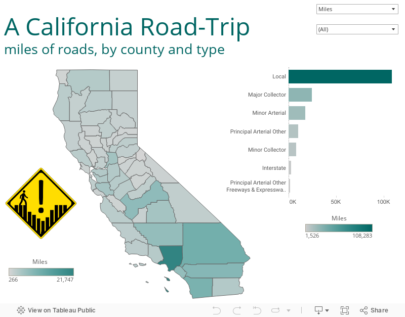
Notice that there are two different sequential color legends on the dashboard that use the exact same turquoise color (R:0,G:102,B:99). In the choropleth, the fully saturated turquoise color maps to a specific county (Los Angeles County) with 21,747 total miles of roads. In the bar chart, the full turquoise color saturation maps to a specific road type (Local roads) with a total of 108,283 miles for the entire state. Just eyeing the dashboard in passing, the viewer may connect Los Angeles County with Local roads, and think they are connected. Or, the reader may look at the wrong color legend (if both are in fact included) and be misled about how many miles of road the county or type actually include.
From a software UI perspective, this error was easy to make because all I had to do was drag the “Miles” data field to the Tableau Color shelf in the map Sheet, and also drag it to the Color shelf in the bar chart Sheet. These two Sheets have totally different aggregation types, but I can easily force the same color encoding if I’m not paying attention.
How to Avoid this 2nd Type of Color Pitfall
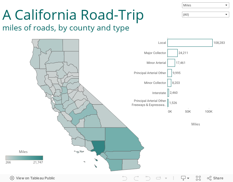
Notice that the color encoding on the bar chart is actually redundant. We already know the relative proportions of the miles of different road types by the lengths of their corresponding bars, which is quite effective all by itself. Why also include Miles on the color shelf, especially considering the fact that the color would conflict with the choropleth map, where color is totally necessary?
My colleague Dash Davidson came up with a good solution: remove color from the bars altogether and just leave an outline around them:
Color Pitfall #3. Using too many color encodings on one dashboard
It’s very common to use too many color schemes on a dashboard, especially with big corporate dashboards where the various stakeholders call for everything but the kitchen sink to be added to the view.
Here’s a dashboard I create to illustrate the point – my first dashboard that uses the Sales SuperStore sample dashboard that comes with Tableau Desktop:
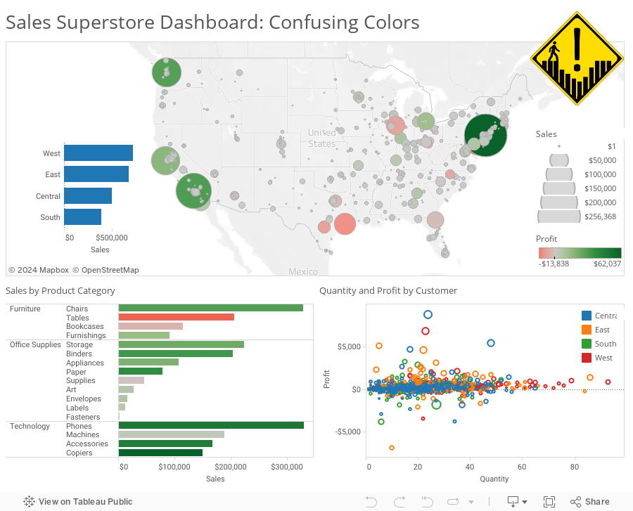
In this dashboard we see not just one red-green color encodings but two, and they have different extremes for the exact same measure (Profit). We also see red and green used in the scatterplot encoding, but now they refer to different regions instead of different profit levels. Finally, we have another bar chart that uses no color scheme, but each bar is blue – the same color as the Central region in the scatterplot.
You get the point. This isn’t what we want to create. I think I broke all of the rules in creating this one.
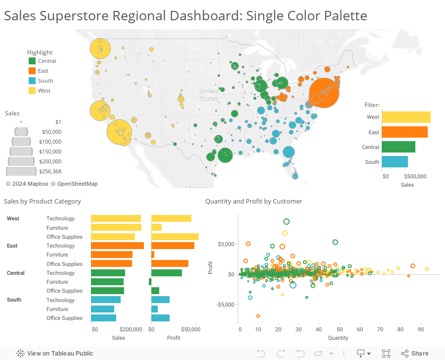
My Design Aspiration: One (and only one) color encoding per dashboard
This goal isn’t always possible, but as much as possible, I try to include one and only one color scheme on every dashboard I create. The reason is that I find it takes me a lot longer to figure out what’s going on in someone else’s dashboard when they’ve used more than one. It’s that simple.
This means I often have to make a tough choice – which is the variable (quantitative or categorical) that will be blessed with the one and only one color encoding on the dashboard? It’ll become the variable that receives the most attention, so it should be the one that is most related to the primary task the user will perform when using the dashboard.
For example, if the dashboard was created for a sales meeting in which the directors of each US sales region talk about what’s working well and what’s not working well in their respective regions, then the “Region” attribute could very well take the honored place of prominence:
I hope this was helpful! Do you have any pet peeves or recommendations when it comes to using colors on data dashboards?
Thanks for reading,
Ben
