
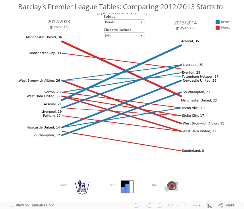
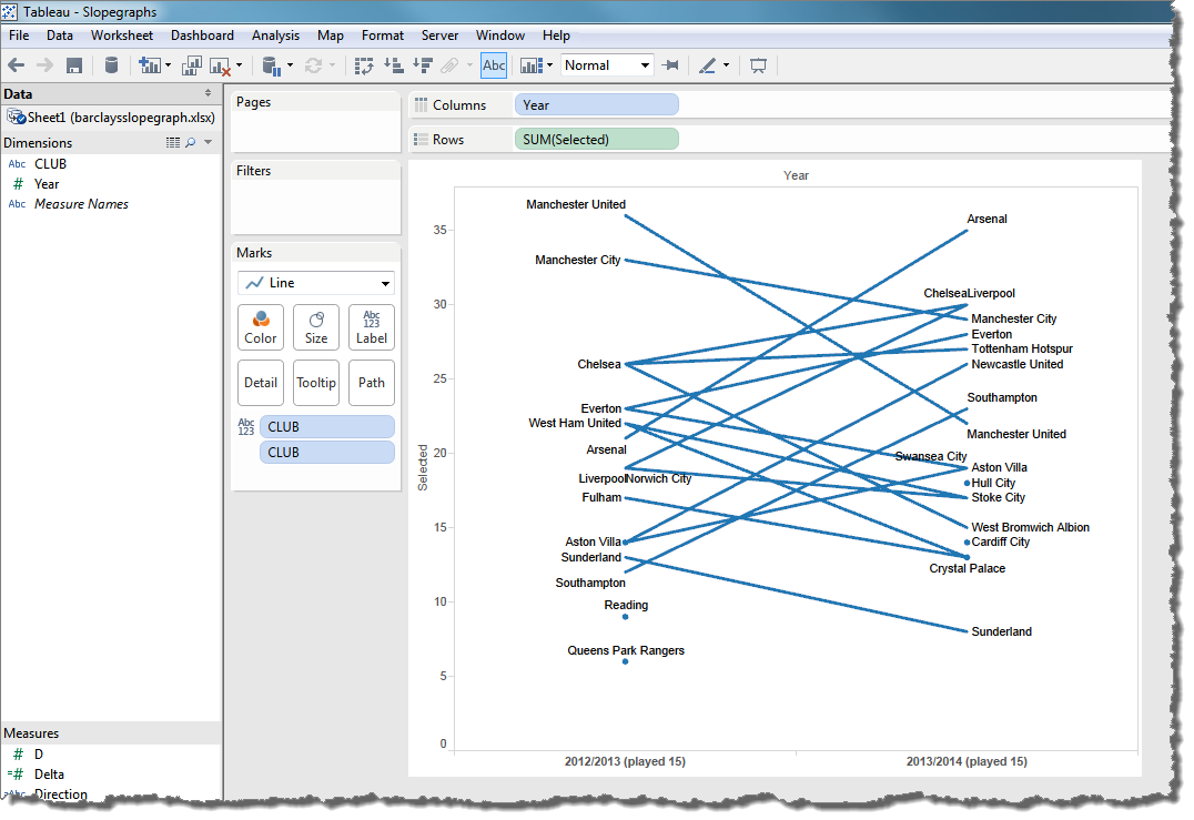
Andy Kirk of Visualising Data recently blogged and tweeted about his addiction to slopegraphs. In a show of support, I re-created his Barclay’s Premier League comparison chart, followed by a quick how-to tutorial below. Using the slopegraph with an added drop-down selection filter, it’s easy to figure out why Manchester United has performed so poorly in comparison to their first 15 games of last season: it’s their anemic offense.
Change the Select drop-down to “Goals For” and “Goals Against” and see which one changes the most:
Now, heres’s how to make it:
Step 1: Get the data
The Barclay’s Premier League site includes league tables for each season up to a chosen game number:
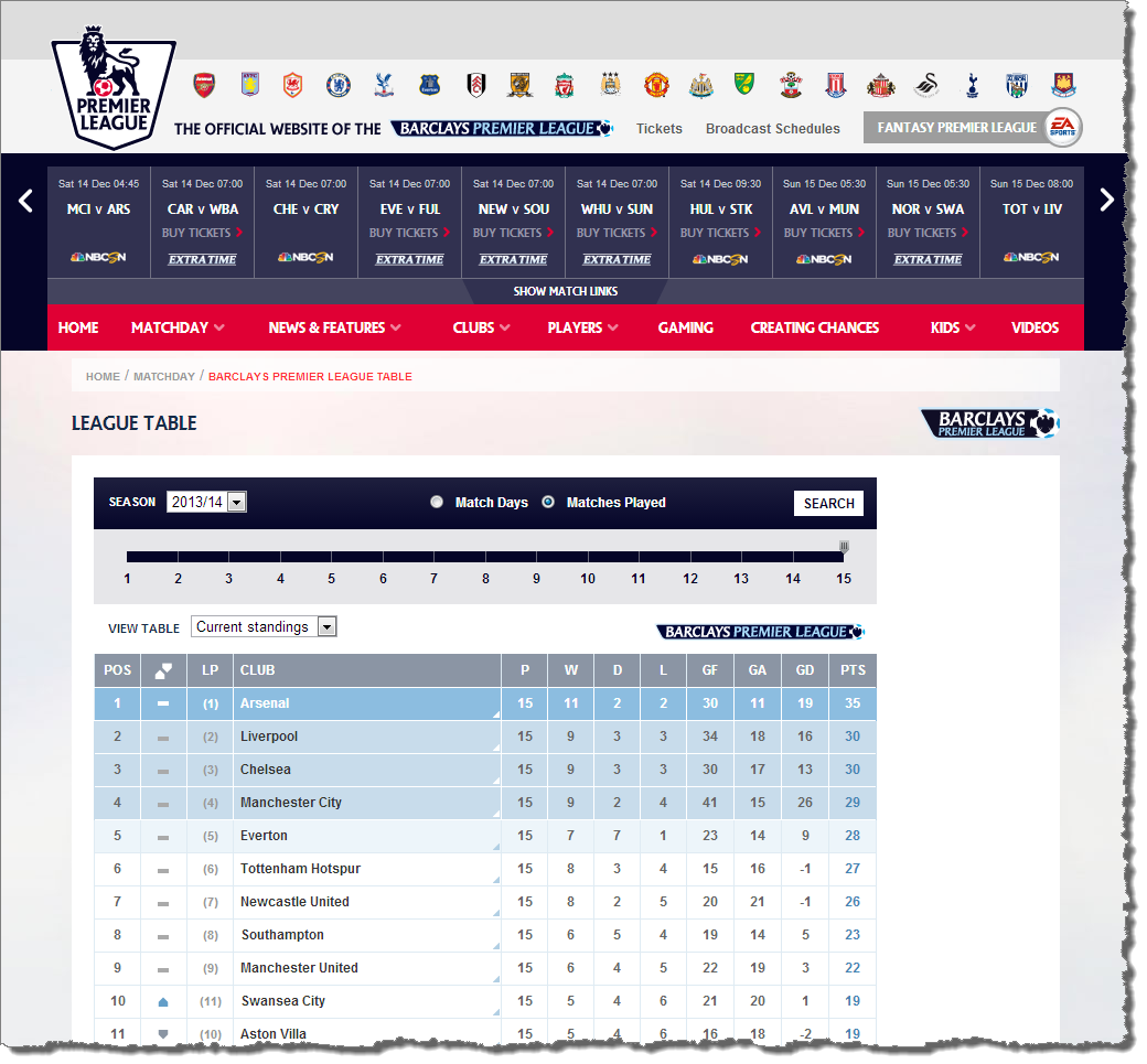
The teams’ results up to game 15 for both the 2012/13 and 2013/14 seasons were copied and pasted into an Excel spreadsheet, with an added column for Year:
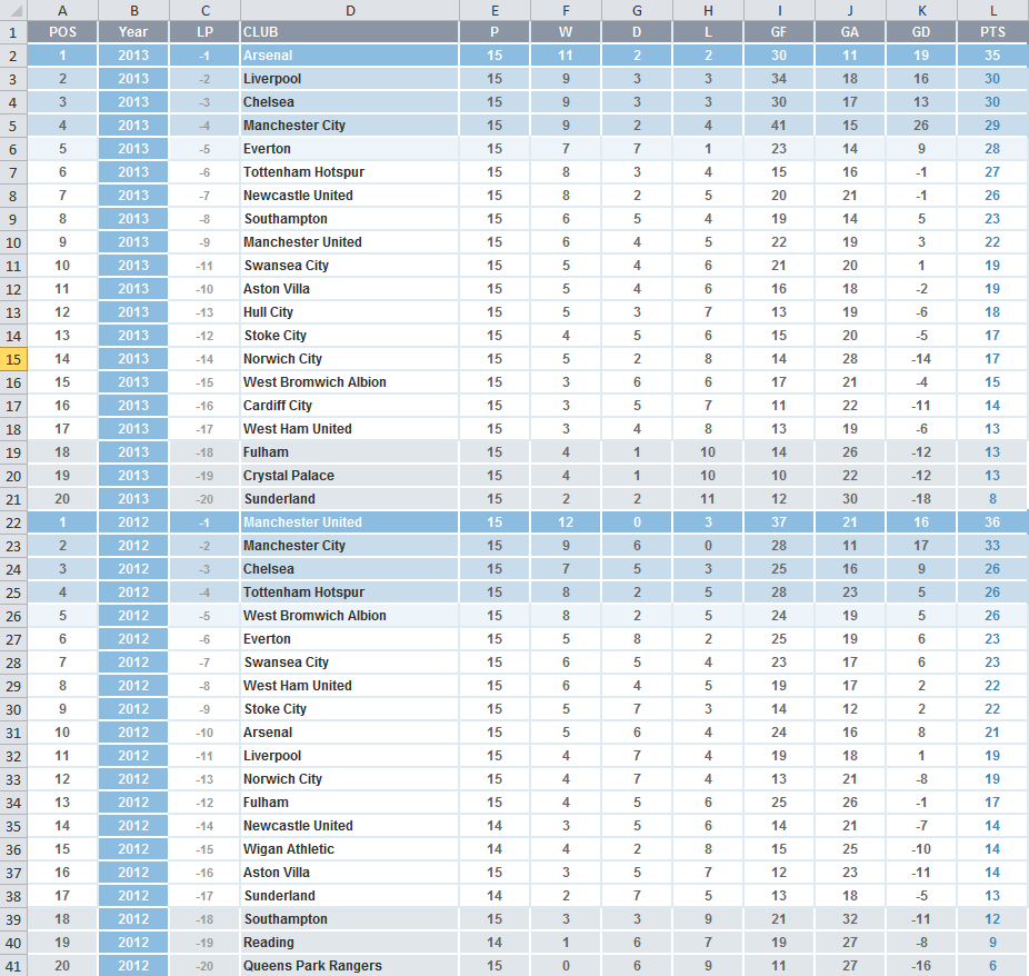
Notice that this spreadsheet is structured differently thank Andy’s. Andy had one column for 2012/13 results and another column for 2013/14 results. I’ve structured the spreadsheet in this way so that I can use Year as a Measure in Tableau.
Step 2: Connect Tableau
This is a very straightforward step: Open Tableau, click Connect to Data, and find your Barclay’s results spreadsheet.
Step 3: Create a parameter and matching calculated field
Before creating the slopegraph, let’s make a Parameter that will allow users to choose which stat to chart.
Right click anywhere in the Dimensions or Measures panel to the left and select “Create New Parameter”
Fill out the dialog box as shown below:
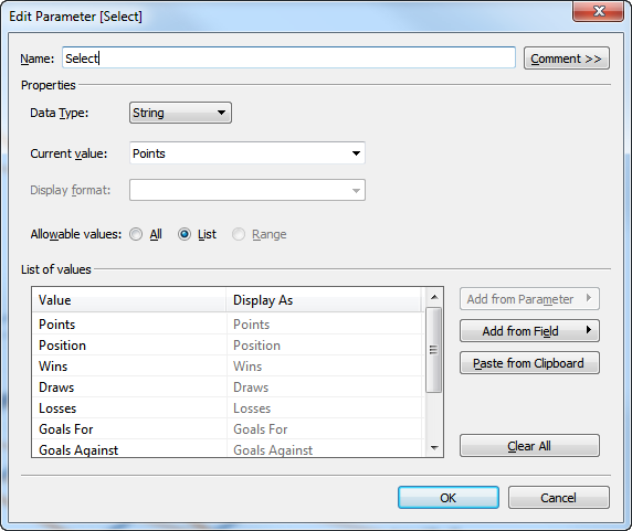
Click OK, and then right-click the newly created Parameter in the area to the bottom left and select “Show Parameter Control”.
You’ll see a drop-down select appear in the upper right. You can use this to change the value of the Parameter.
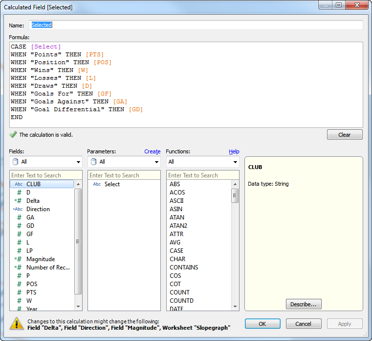
We now need to create a Calculated Field to link to the different team stats based on the user’s choice. Right-click on the Parameter and select “Create Calculated Field” and fill out the dialog box as shown below:
Step 3: Create the basic slopegraph
Now that we have this “Selected” data field mapped to the Parameter, we can use it to create our basic slopegraph as follows:
- Drag “Year” to the Columns shelf, and change it to Discrete (blue pill) by clicking the down arrow and selecting “Discrete”
- Drag the “Selected” calculated field to the Rows shelf
- Change the Marks type from “Automatic” to Line
- Drag the “CLUB” Dimension to the Detail card and resize the view (making it wider)
- Drag another instance of the “CLUB” Dimension to the Label card, and then click on Label and select “Line Ends” in the “Marks to Label” area
Step 3, #1-5 are shown below:
Step 4: Add line coloring and thickness
In order to make the lines one color for increasing values and another c0lor for decreasing values and change their thickness based on the magnitude of the change, we’ll need to create three more calculated fields as shown below
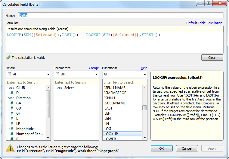
“Delta”: The first calculated field computes the change in value of the selected statistic from one year to the next:
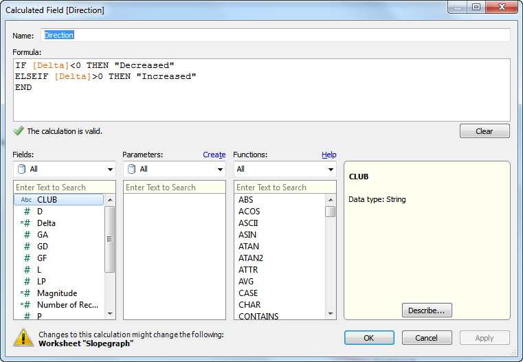
“Direction”: The second calculated field gives one string for increasing values and another for decreasing values. This will be useful for coloring the lines
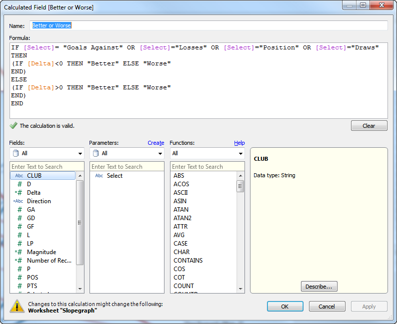
{UPDATE} A comment from Jay below resulted in a change from “Direction” to “Better or Worse”, in which the color is dependent on whether a team got better or worse, not whether the chosen statistic increased or decreased:
“Magnitude”: This final calculated field yields the absolute value of the change, or the magnitude. This will be helpful for making lines thicker or thinner based on the magnitude of the change:

Now that these fields are created, let’s do the following to complete the slopegraph itself:
- Drag “Direction” to Color
- Drag “Magnitude” to Size
- Drag “Selected” to Label and change the Label so that the Club name and the value are in line with a comma separating them
- Filter out the Clubs that were either promoted or relegated after the 2012/13 season
- Clean up the fonts (change them all to Gill Sans MT)
Step 4: #1-4 are shown below:
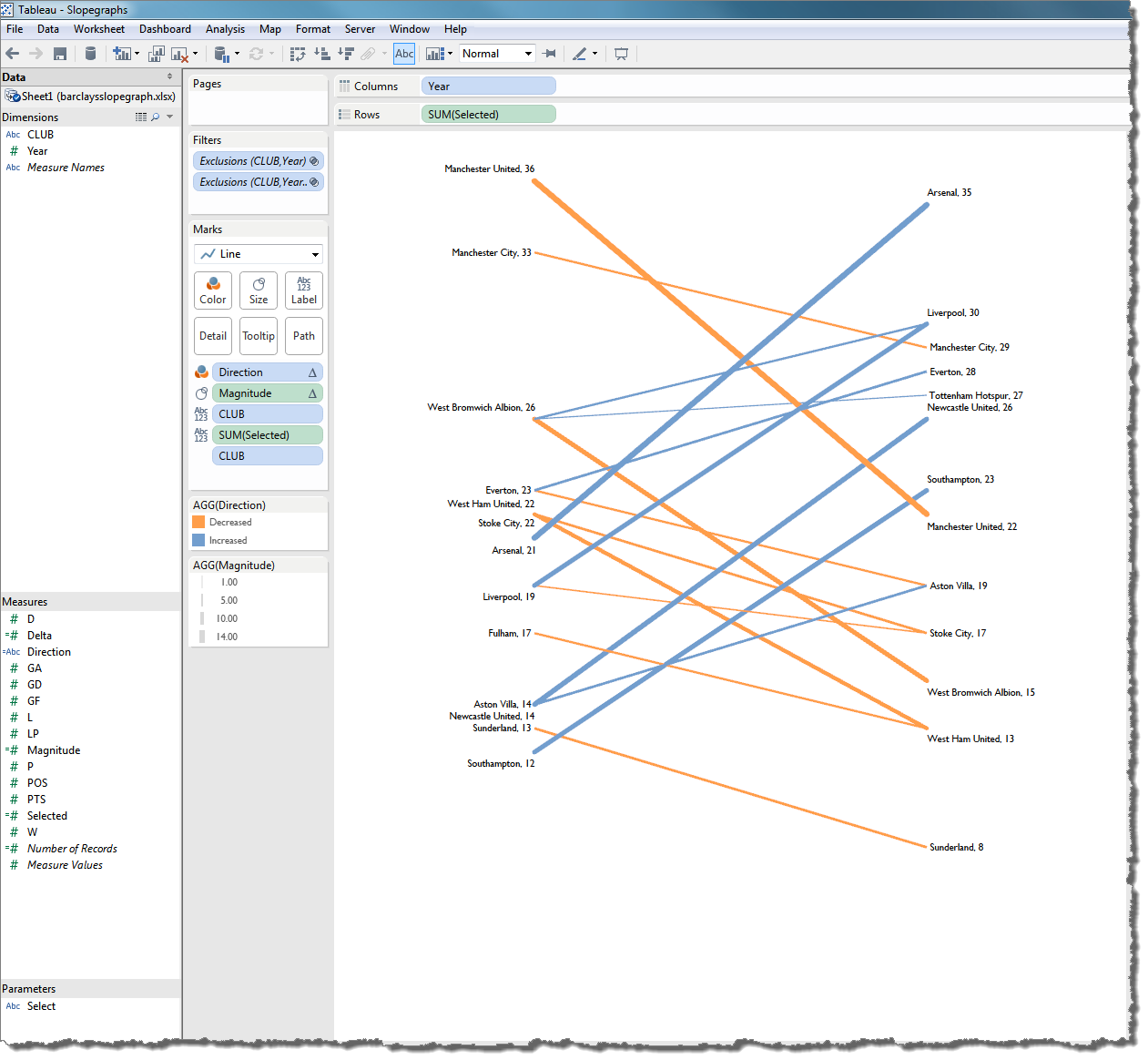
I’ve also formatted the tooltips to yield a nice result when mousing over any of the line ends, and I’ve hidden Marks that were placed in awkward positions on the slopegraph that I couldn’t adjust.
Step 4: Design the dashboard
Now that the Slopegraph itself has been created, I prefer to place it on a Dashboard, add the Parameter control and a Drop-Down filter for Clubs as floating dashboard objects, and add a title and data source / reference information at the bottom:
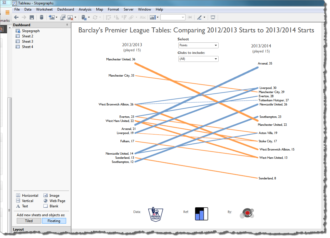
With this view, we can do a whole lot more than find out what’s behind Manchester United’s poor performance, we can also notice other big changes, such as Liverpool’s suddenly prolific offense (Select “Goals For”), or Southampton’s dramatic improvement in defense (“Goals Against” through 15 drops from 32 last year to only 14 so far this year).
This is the value of the slopegraph. It allows us to make a whole host of point-to-point comparisons, and the largest magnitude changes literally jump to the surface.
In closing, many thanks to Andy for this awesome work and for coming clean about his love affair with this neat little chart type.
Best,
Ben

Oops, forgot that comment threads are reading those brackets as HTML. I’ll try that again:
IF [Select]=”Goals Against” OR [Select]=”Losses” OR [Select]=”Position” OR [Select]=”Draws” THEN
(IF [Delta] < 0 THEN “Better”
ELSEIF [Delta] > 0 THEN “Worse”
END)
ELSE
(IF [Delta] < 0 THEN “Worse”
ELSEIF [Delta] > 0 THEN “Better”
END)
END
Hi Jay, I really like you’re idea, so I went ahead and implemented it. Thanks for the suggestion.
Ben, I wrote a little about slopegraphs in Tableau as well. To get round the label issue (when there are too many labels in one place, I used a table calc to shift things around: http://www.datadrivenconsulting.com/2011/06/slopegraphs-in-tableau/
Pingback: 2 minutes with… David Napoli of Colorado HealthOP | Paul Banoub's VizNinja Blog
Thank you very much for this tutorial. I am relatively new to Tableau and I learned a lot from this post.
Thanks so much for this tutorial. Very helpful!
You’re welcome Kelly. I like you version here: https://twitter.com/hellomista/status/502345610251366400/photo/1
Pingback: Data Viz News [69] | Visual Loop
Pingback: Data Viz News [69] | Visual Loop
Pingback: Data Viz News [69] | Visualoop
Pingback: TableauTips: Highlight don’t filter – ivisualize.co.uk
Pingback: 2016 Matchup Guide, Part 4: Tableau | 64to1
Pingback: Slope graphs – learningtableaublog
Pingback: When Should We Use A Slope Graph? | POINTS OF VIZ
I know this is a somewhat old article, but wanted to share a guide that I put together recently. Many people have found the 6 step process very helpful!
What you will learn in the 1,100+ word guide:
– Why slope graphs are a great way to show “before” and “after” data
– The 6 steps to creating Tableau slope graphs (sometimes also called slope charts)
– How I transformed a boring before-and-after table into an awesome interactive Tableau dashboard
I hope this helps!! https://newprediction.com/tableau-slope-graphs/