
In case you weren’t paying attention, earlier this month future NFL Hall-of-Famer Tom Brady threw for over 500 yards in a single game for the first time in his career.
His 517 yard tally against the Miami Dolphins on September 12th was over 100 yards more than his previous career best (a 410 yard performance against the K.C. Chiefs on September 22nd, 2002 – almost 9 years earlier).
Not only was it a personal best, he also set the Patriot’s team record with his performance.
But was this a statistically significant event, and if so, to what can we attribute it? Did he complete a higher percentage of his passes? Or maybe he just threw more passes than he usually does. How can we break it down?
Control Charts with Tableau to the rescue:
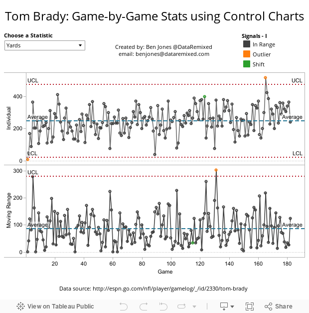
Breaking it Down:
Unsurprisingly, The answer to the first question is that yes, 517 yards is an “outlier” (or, beyond a control limit). Choose “Yards” in the upper left and you will see that the orange circle representing the game on 9/12 is above the upper control limit (UCL) – a statistically significant event according to Shewhart.
But what was different about this game than any other?
Scroll through the various quarterback statistical variables in the upper left and you will notice only one other value is an outlier for the record-setting game and that is “Long” (longest single pass of the game).
In the 4th quarter, with less than 6 minutes left, Brady threw a 99 yard touchdown strike to Wes Welker, racking up the most yards possible for a single play from scrimmage.
All of the other statistics are in control – meaning Brady’s performance was not abnormal (for Brady, anyway) in respect to attempts, completions, completion percentage, average yards per pass, or even quarterback rating (Brady has delivered superior performances in terms of quarterback rating 27 times in his career).
How is this Helpful?
This analysis illustrates the usefulness of Control Charts, and the awesome ability Tableau can give us to create and visualize many such charts in a convenient way.
These charts use standard table calculation functionality of Tableau along with the Shewhart calculations for Control Limits (different than what Tableau shows how to use here, which uses standard deviation and so is more sensitive to the normal assumption).
Coming soon:
How to construct a Shewhart Control Chart in Tableau.
Take Care,
Ben @DataRemixed

You’ve mislabeled the control limits in the run charts as USL and LSL.
Thanks Jon – will make the correction as soon as I can connect to the Tableau Public server.
Any updates on coming soon below:
Coming soon:
How to construct a Shewhart Control Chart in Tableau
P.S. Great Job on XmR Chart.
Hi Ross – a short video “how-to” guide should be posted in a day or two – sorry for the delay and thanks for leaving a comment!
Here it is: http://dataremixed.com/2011/10/how-to-make-control-charts-with-tableau/
Is a line chart really the best choice given your caegorical scale?
Hi Rick – thanks for leaving a comment! I’m a big fan of visualizing data in many different ways. In this case, since the independent variable (game number) is ordinal (first game, then second game, etc.) I believe a line chart is appropriate since the slope between adjacent points highlights the change in the dependent variable from game to game, which was the goal of my analysis. The addition of the process control limits aids further in giving the statistical perspective. Was it the best choice? Not sure and I’m open to other suggestions.
This dashboard has been updated to include both “trends” (6 in a row either all rising or all falling) and “shifts” (9 in a row either all above or all below the mean).
Thanks for the informative video, Ben. Our hospital is wanting to use control charts for complicance rates. Any way we can get you to develop a video for constructing a p-chart (where the upper and lower control limits can change with each data point) in Tableau?
Hi Susan – that’s a excellent request, as technically speaking Tom Brady’s completion percentage should be a p-chart, not an individuals chart, right? I’d thought of making a p-chart template in the past, but haven’t gotten around to it yet. I’ll see if I can bump it up higher in the queue. By the way, I love that you are using SPC to track quality of care in the hospital setting! Thanks for visiting & commenting, I’ll see what I can do and shoot you a note when I get something to look at.
I’ve been trying to create a p-charts with Tableau as well. I use a stats package to generate the limits (SAS), but I’m sure there’s an easier way in Tableau. Let me know what you find out.
Any chance you have built a template for a P chart?
Cool stuff. I’ll have to look into Tableau’s capabilities for spc a bit more. I use Tableau a lot, but have never even considered it for this — we’ve built our own spc app that we like a lot.
But on the topic of this individuals/moving range chart, I would say as a quality engineer that the selection of variables or chart type is inappropriate — the data as displayed don’t really reveal much about Tom Brady (or any football quarterback). For example, in the case of parameter=yards, any game where he throws between 0 and 400 yards is ‘in control’.!? More likely the data has to be transformed or normalized or somehow worked before spc applied to it…
But, very cool work. thx.
Hi David – thanks for the comment! Having gone the whole six sigma master black belt route, I often saw fellow “belts” transform data sets to make them normal so they could apply statistical tools that only applied to gaussian distributions. Honestly, I never liked doing it. That’s why I like control charts using these very specific control limit calculations (I’ll refer you to Wheeler), as they don’t require the data to be normal. So the control limits for yards being between 0 and 400 is statistically valid. That’s how much variation exists in his historical yardage totals. Whether that information is helpful to you or not is another matter. It was helpful to me because it allowed me to confirm that his 517 yard day was “out of control”, or an outlier. Thanks again, Ben
Pingback: User Defined Functions and Process Control Charts | Drawing with Numbers
Ben,
Thanks for the great post! Any reason why you have used SUM([Chosen Stat]) instead of AVG([Chosen Stat]) in UCL and LCL calculations? In the literate UCL and LCL are calculated by adding or subtracting 2.66 times the average moving range to the process average.