
Time is precious so I am a big believer in merging interests, but only where the merger doesn’t drop the value of each thing below some minimally acceptable threshold. What am I talking about? Here’s an example: Like the outdoors AND want to be a good parent? Take your kids on a hike. Of course that only works if they also think it’s a good idea. And as long as your idea of a “good hike” isn’t Mount Kilimanjaro. Point being – merging interests only works sometimes, and sometimes you end up botching one or both. It’s great when it works, though. This is a good example.
My father, Richard Jones, is CEO of SensingPlanet, a company that has created a novel arc-detection sensing system that is designed to alert for forest fires. He saw my IronViz submission – an interactive “tornado-finder” application, and asked if I could create a forest fire viz. I needed a good project idea for my final submission to Alberto Cairo’s Knight Center online course, and it was high time for a new blog post here at DataRemixed, so I decided to kill three birds with one stone. As Hannibal Smith would say, “I love it when a plan comes together“.
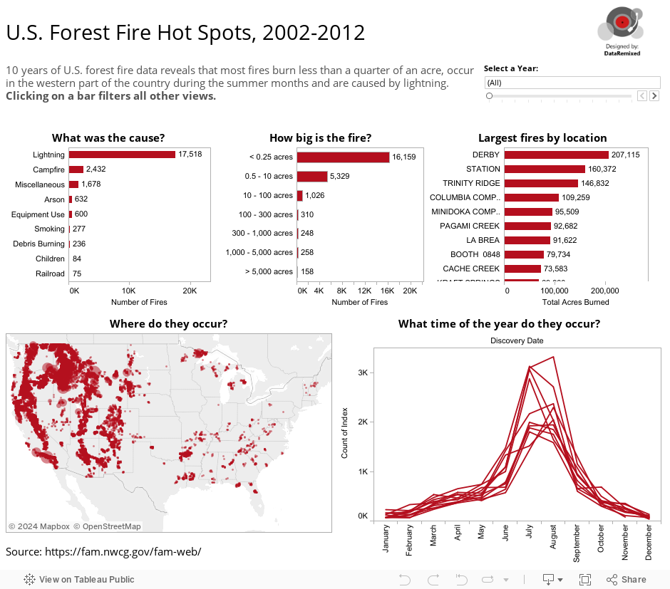
Here’s the final project, a rare attempt for me that only makes use of a single color (data obtained from FAMWEB):
Key take-aways
I’m not sure that this viz uncovers some incredibly surprising insight – sometimes the best outcome is simple confirmation. I would say that there are far more forest fires every year than I thought – upwards of 10,000 each year. And I knew that lightning was the top cause, but not that it accounted for fully half the recorded forest fires over this time period (actually through November 14, 2012). I suppose the regional density shown in the US heat map predictably maps to, well, forests, but the cluster in northeastern Minnesota piques my curiosity. Good data analysis suggests as many questions as it answers. Making it “useful” is the real purpose, though.
How to make it useful
Learning all about historical forest fires is great for history buffs, but I’m not one. How could this be used? I’m also not a forest fire expert, and I would imagine much of this has been done already, but here are some thoughts off the cuff:
- Asset placement: it would certainly help a company like SensingPlanet and it’s customers locate the optimal locations for sensor placement around the country, as well as strategic placement of other fire-fighting resources. If this were the primary purpose, the viz could be modified to provide another bar chart output of highest frequency regions, or a zip code look-up.
- Fire prevention: The data could help planners focus public communication efforts to reduce burned acreage. Messaging about campfire safety is likely to have a much larger impact than educating about proper cigarette disposal, for example.
- Fire fighting goal-setting: Once a fire has started, one obvious goal is to minimize it’s final size. This data could help a fire fighting agency set annual targets, like say, “increase the overall percentage of fires that end up burning less than 0.25 acres from 60% to 70% in 2013.”
- Budgeting: Knowing how many fires to expect helps determine how much money and what staffing levels to allocate to this activity. There is a much more in-depth economic analysis that could be done related to the various costs, etc.
I’m sure there are many, many more such uses of this 100,000 row data set. Can you think of any more? Data can light a fire of a different kind.
Thanks for stopping by,
Ben

Hi Ben, this is impressive work. I also like your riff on merging interests very much. I’d like to add that its increasingly difficult to take on tasks unless they serve multiple ends, given the various demands of work, family and personal development. It occurs to me that this efficient and productive approach is the superior alternative to the much overrated “multi-tasking”
Hi Bryn – thanks for the kind words, and I’m glad my little tangent made sense to you.
Pingback: data 연습 |
where did you download the data, can pt me to specific location? did u do any data transformation or combine data? tks.
Hi Nathalie. I got the data from FAMWEB, but I’m not quite sure where anymore as it’s been over a year since I did this project. The FAMWEB site is very difficult to navigate.
I was unable to try your app, your toolbar is in the way and i could not enlarge the Spokane, wa. area?? to see the local fire pattern?? Answers…
Hi Robert. Thanks for the comment. I updated the blog post with a larger version of the dashboard, which is fairly dated and in need up update with more recent data. Use the controls in the top left corner of the map to zoom and pan.
Do you have any objections to this being posted on another website with credit?
Hi MacKenzie, no, I don’t have any objections, and thanks for asking! Send me the link when you post it.