
I had the pleasure of presenting a data visualization workflow to the Boston Predictive Analytics Group with Tanya Cashorali last night (huge thanks to Bocoup for providing the meeting space and John Verostek for organizing the event).
The workflow we presented involves using a library called PitchRX in R to scrape pitch data from the PitchFX database, which Tanya covered (she also has a write-up on her website sportsdataviz.com), and then connecting Tableau Public to the data set to see what’s going on. We mined and visualized pitches by Jonathan Papelbon from the 2008 through the 2012 MLB season, or around 6,000 pitches in total.
Here’s the dashboard I put together for the group:
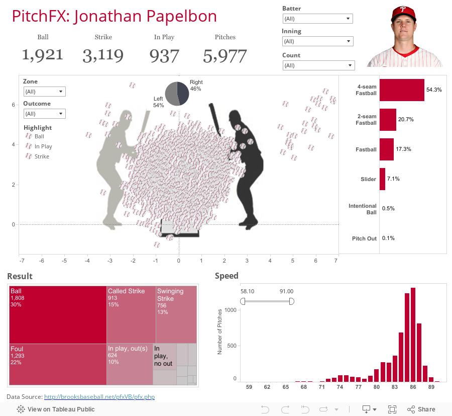
This is a first cut at what an exploratory (as opposed to explanatory) dashboard could look like, and I’m not quite sure what all the stories in the data are yet, but here are some tidbits that popped out to me:
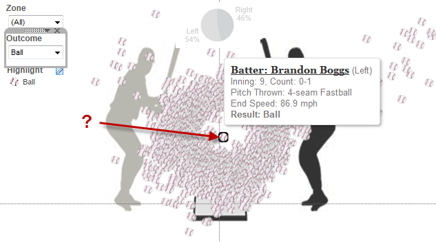
- If you want a good chuckle, select just the pitches that resulted in balls and check out the gift Brandon Boggs was handed by the umpire on the 0-1 fastball of his at-bat during the 9th inning. That’s the nature of the game, I suppose.
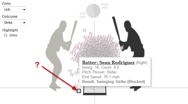
- Also, filter to just strikes and ponder what Sean Rodriguez was thinking when he swung at the 0-2 pitch in the dirt during the 16th inning. Maybe I’d swing at just about anything in the 16th inning too, so I should be careful to criticize.
- Next, I was surprised to see that Papelbon actually threw more pitches to left handed batters (54% of all pitches) over the course of the past 5 seasons. Really, more lefties?
- Lastly, sliders are almost exclusively thrown to right handed batters (81% of all sliders were pitched to righties). That’s a good insight for the scouting report, I’d imagine. I’m guessing baseball geeks will be able to find a ton more here.
The real point here is that there’s room for multiple tools in every data worker’s toolkit. Tanya and I showed how you can combine different tools in a complementary way to get the best results. In this case, R does all the plumbing, and Tableau handles the fixtures and window dressing.
Thanks for stopping by, let me know if you have any feedback about the dashboard, or if you’d like to see the how-to.
Ben

This is super cool! (and not just saying that cause I’m a Paps fan) The dashboard looks great, I like that it’s compact, clean, and visually appealing without being blinged-out. One suggestion is to move the speed slider on the bottom right-hand chart to the top where the other interactive controls are (top right), grouping them together for usability. I also think there might be a better way to display the Results data – I found the treemap a little challenging to “see” the magnitude of differences. Maybe that chart could be columns and the speed chart a curved line?
Awesome work, thanks for sharing!!
Beautiful work!
Thank you Victor!
Great job Ben! Really like the way this dashboard looks!
Thanks Matt!
Wow. Super cool.
I have few generic questions
1. How to integrate twitter data into tableau
2. How to integrate video ?
3. Out of box charts apart from 23 charts can be implemented in tableau ? For ex organizational chart ? How feasible ?
Hi Hari – thanks for the comment. Here are some answers to your questions:
1. With Tableau’s partnership with DataSift and Google Big Query, some pretty amazing twitter dashboards are popping up
2. I wrote a recent blog post about embedding dynamic YouTube videos in your dashboard
3. It’s definitely feasible to make non native charts in Tableau, and the best place to start is the Tableau forums. In this thread, Tracy Fitzgerald provides a sample org chart.
Thanks, I hope these answers help!
Ben