
Earlier this week I had the pleasure and honor of presenting after Giorgia Lupi of Accurat at Data Visualization New York. My presentation focused on how to use Tableau as a data discovery tool, and luckily for me, the amount of data about New York is as abundant as everything else about the city. There was no shortage of material, from garbage to graffiti to rat sightings and electric consumption. New York hiccups, and it gets recorded.
Sharing data on the web with Tableau Public is both my job and my hobby, but this presentation allowed me to demonstrate how quickly Tableau allows users to find insights in data. Data discovery is a very important part of the overall process, which I conceptualized as a horse race track:

I made the analogy that using Tableau is like riding Secretariat – you get the distinct advantage of being able to race around the track a rapid rate, transitioning between the phases and quickly identifying patterns, outliers and trends in your data.
I also made a somewhat philosophical point that data is only one type of input in the overall learning process. Using data has its benefits and limitations. A benefit is that you can obtain valuable “explicit knowledge” – who, what, when and where? A limitation is that it’s often difficult to answer “why?” and “how?” using only data. Consider riding a bike: what’s a better way to learn, reading about it or doing it? And consider New York: no matter how many charts you see about the city, nothing replaces the unique experience of walking its streets and riding its subways. Tacit knowledge. Often the best outcome of data discovery is that you know what questions to ask in the analog world.
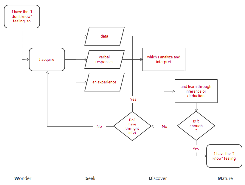
Here is a diagram showing the overall learning process, and how data fits in as a specific type of input:
As I mentioned, there was a wealth of data to explore and visualize about New York. I explored a number of those data sets, and here are a few of the projects I recreated during the 1 hour time slot I was given (focus was on learning, not fit & finish).
Click to open an interactive version:
1. “Know what” – Garbage data: DSNY Collection Tonnages (get the data here)

2. “Know where” – The Bridges of NY & NJ (get the data here):

3. “Know when” – Rat sightings in NYC (get the data here)

It was an amazing and unique experience for me. I had a lot of fun presenting (not shown here is the Homer Simpson bologna viz I created in response to Accurat’s project “A Slice for Everyone“), and I met a number of fellow visualization enthusiasts, including Naomi Robbins. Naomi was gracious enough to sign a copy of her newly reprinted Creating More Effective Graphs, which I am currently reading and hope to review soon.
I’d like to say a special thanks to meetup organizers Christian Lilley and Paul Trowbridge for the invitation to present, and to McKinsey for hosting the event.
Thanks for stopping by,
Ben

Pingback: Tableau: Ben Jones – Remixing it up in New York | Michael Sandberg's Data Visualization Blog
Pingback: Weekly Wisdom Roundup #201 – July 8th 2013 | The Weekly Roundup
Pingback: Weekly Wisdom Roundup #201 – July 8th 2013 | SimoleonSense