
I went to SeaVis after work today, and I spent some time looking at something I haven’t looked at much since college: The Periodic Table.
We were considering the periodic table because there’s a periodic table of visualization methods out there. Turns out people have made periodic tables out of just about everything. There’s a periodic table of beer, Pokemon, The Empire Strikes Back, you name it. You know it’s way out of hand when there’s a Periodic Table of Periodic Tables. I kid you not.
Anyway, Robert Kosara gave a scathing (yet coherent) rant on why these flavors of periodic table totally miss the point. The arrangement of the elements into groups and periods actually means something in the periodic table of elements. Position doesn’t have any meaning with the goofy ones, so why put it into the periodic table format at all? You can read more about Kosara’s thoughts in his 2009 blog post.
My take on the whole thing is that yes, they’re lame, but they’re probably mostly harmless. I guess I just ignore them, really. What I WAS interested in, though, was how the actual periodic table could be improved upon: by adding the ability to size and color each elemental “square” in the grid by various physical parameters like atomic weight, atomic radius and density. I found these variables on a couple different Wikipedia pages, and I was off and running. Here’s what I made:
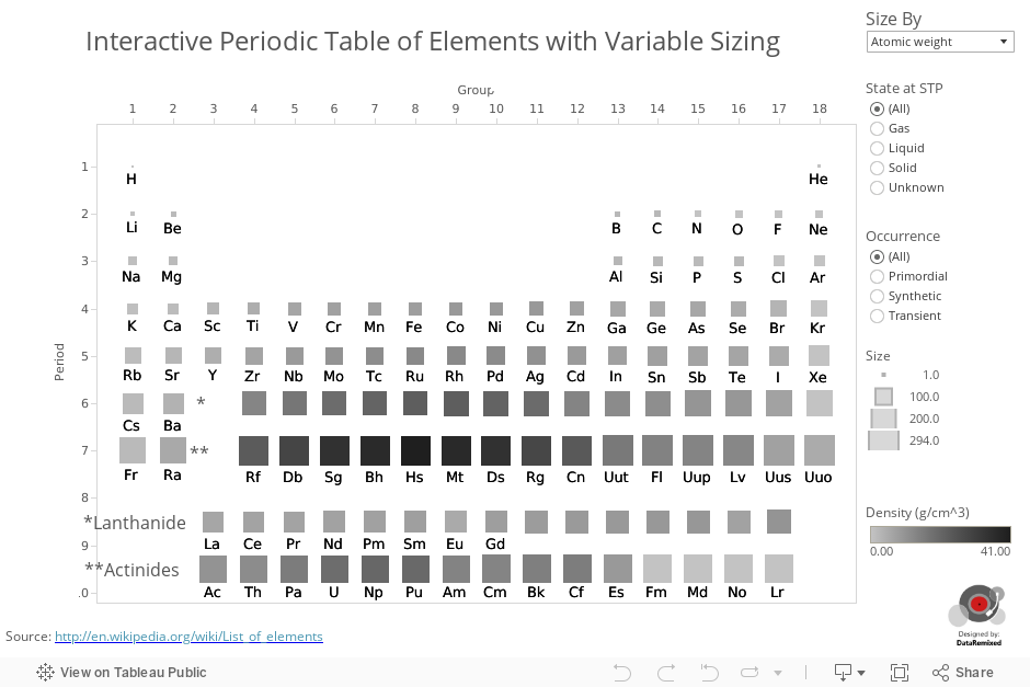
I like it because each square in the periodic table carries with it the ability to encode quantitative information about each element into the size and color of the square. Why not take advantage of these parameters to gain an appreciation of how the elements compare in the physical realm?
That’s what I set out to do, and I think I’ve accomplished it. Is it “better” than the original? I know, that’s probably a blasphemous notion to many, but there certainly are aspects of the interactive version which are better than the original static version. If you want to find all primordially occurring elements that are solids at standard temperature and pressure (STP), it would take a while searching the various color encodings of the original static table. With the interactive version, you must actually interact with the table, but with two simple clicks you can immediately see which elements meet those criteria, and how they compare in size or weight.
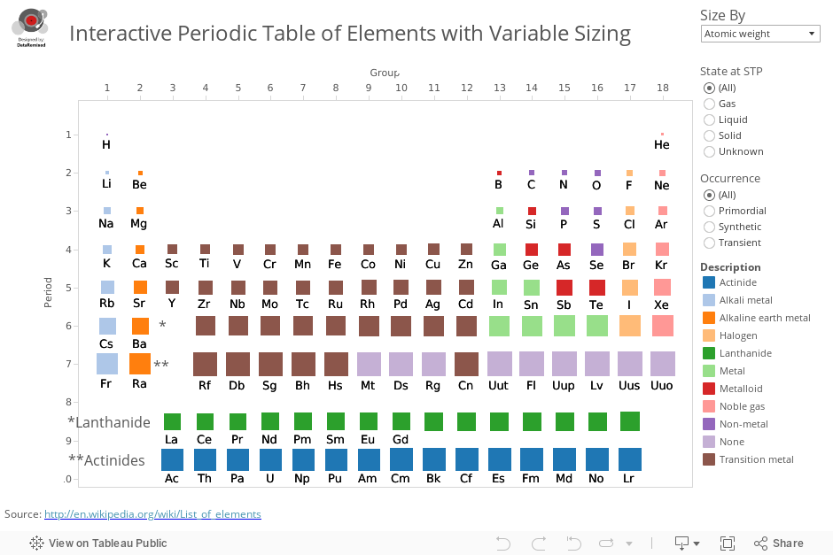
The color scheme of the original is the one thing this version lacks. What it gains is the ability to visualize relative size and weight. It’s a trade-off I suppose. Here is a version that colors the squares not by increasing density, by categorically based on description:
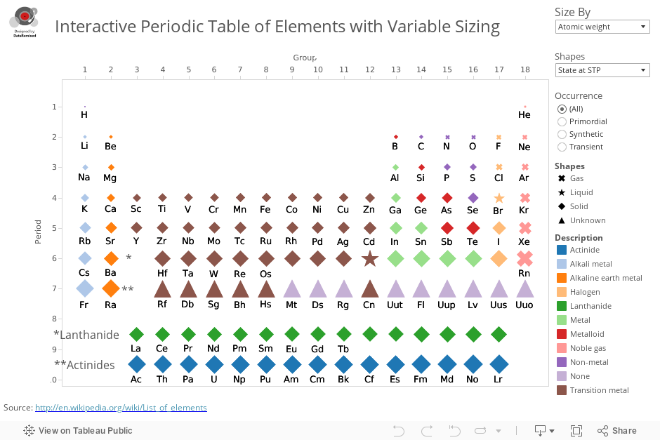
Here’s yet another version that makes use of the fact that the shape of the element mark can be used to encode either the Occurrence or State at STP characteristic. The shapes don’t all have to be squares. The advantage here is that the table can toggle between two modes which let you scan the entire table and see all different occurrence types or states at STP:
Of the three versions above, which do you prefer? Of the three interactive versions vs. the original static version, which do you prefer? Obviously we won’t always have the advantage of being able to interact, so the static version has a clear value, but the time it takes to answer a variety of questions can be reduced with interactivity.
Well, regardless of whether or not either of my fancy interactive periodic tables are “better” that the legendary original static version, I’m pretty sure that this little project would have made my 10th grade chemistry teacher proud. Here’s to you, Mr. Galanda from Thousand Oaks High AP Chemistry, wherever you may be. I always think of you on Mole Day, 10/23 at 6:02am.
Thanks for stopping by,
Ben

Pingback: Data Viz News [39] | Visual Loop
Ben, I’m digging the second one. It’ makes it easy to see the categories but it’s not too much to figure try to figure out (in my opinion).
Hi Emily! Thanks for commenting. The second is my favorite also. I thought I’d like the third best before I made it, but realized that the very small shapes are difficult to differentiate.
Hey Emily. Yep, I’m with you.
Hi Ben,
Really nice charts! I liked #2 the most because it provides a lot of useful information without looking to confusing. Chart #3 has too many shapes for me, and I’m not able to get as much out of it. Chart #1 is nice too, but adding colours really made it come to life for me.
Hi Navaneethan, I agree with all of the points you make. Thanks for commenting. Another drawback to the version with shapes (#3) is that the smaller shapes can be hard to differentiate.
Each one resonates differently with different viewer, depending on their perception. I personally love the third one because it conveys multiple attributes with each element. Love it.
Pingback: Links, Tweets & Ideeën (12) - Datajournalistiek.nl
Very cool! I quite like the shading based on density. That shows a property that you really don’t see on a more traditional periodic table. Suggestion: Add atomic number to the tooltip.
Pingback: Visualizations about Data Visualization | geovisualist
Pingback: In Search of Fame and Glory in Las Vegas: Visualising the Periodic Table using Wikipedia data | CraigsList - Well it's a blog really....
Hey Ben,
Just a heads-up that I have created a viz based upon your fine effort – and lodged as an entry in the Wiki Viz contest.
http://craigsdewar.com/2015/03/21/in-search-of-fame-and-glory-in-las-vegas-visualising-the-periodic-table-using-wikipedia-data/
Hope you like…..
cheers
Craig