
{Note: a version this blog post was also published on the Tableau Public blog as part of the Storytelling Month series}
Every data set contains a myriad of stories. I’m using the word “story” in a liberal way here, not necessarily in the “bedtime story” kind of way, or even the “headline news story” kind of way. By “story”, I simply mean a sequence of data-driven statements that progressively explain the world we live in.
With even simple data sets, these types of data stories abound, some more interesting than others. Whenever I run workshops along with my Tableau Public teammates, we’re amazed at how each group, given the exact same data set, comes up with unique insights.
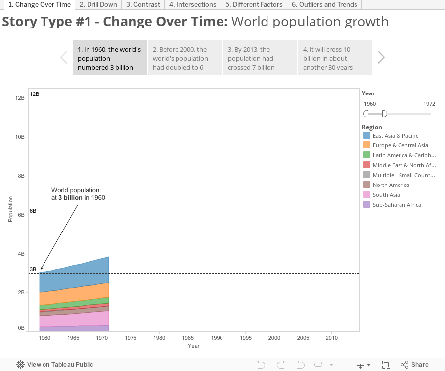
Earlier this month the UN celebrated World Population Day – a day to “raise awareness of global population issues” according to its Wikipedia page. I decided to play a game and see how many different data stories I could tell with the a simple spreadsheet of population, birth rates and death rates for every country since 1960 as obtained from the World Bank’s online data repository.
I came up with six simple “types”: 1) change over time, 2) drill-down, 3) contrast, 4) intersections, 5) different factors, 6) outliers and trends. Use the tabs across the top to see the different stories, and use the tiles within each story to read each story point:
I ended this experiment with a feeling that I was just scratching the surface, and that there are many more data stories to be found and told from even this simple data set on world population.
I encourage you to consider these six story points types as thought-starters for whatever data set you are working on. Ultimately your data will have its own story, and it will likely be a combination of these building block story types and others that are out there. Also, help me out by downloading the workbook and see how many more you can tell. Leave a comment below with your version, or tweet me a link to it.
Thanks for stopping by,
Ben

Too bad the maps in #2 and #5 are based on the ugly and inappropriate Mercator projection.
Cf. http://siwm.bitballoon.com/
You’re telling me Germany is in the wrong place?
https://www.youtube.com/watch?v=vVX-PrBRtTY
We are looking for Tableau Resources at Bay Area, CA
— texara.bigdata@gmail.com
Hi Ben, thanks for sharing your ideas on uncovering stories in data. If I may ask, what’s the difference between contrast and different factors?
Thank you.
Hi Dessie,
With “contrast”, the story-teller is showing how subgroups differ from one another, as opposite ends of a spectrum. With “factors”, the story-teller is showing how multiple elements combine to produce a final effect, as variables in an equation. Does this make sense?
Hi Ben,
Ah okay, yes, I get it now; yup, it does make sense. If I may try a light-hearted interpretation:
For “contrast”, the 2 main characters, “ME & Africa” and “EU”, are singled out for comparison in the story of “The Increase in World Population”.
As for “different factors”, the audience is shown the protagonist, “Sub-Saharan African countries”, and a strongly conflicting aspect of his nature is revealed.
Thanks a lot for your reply and clarification.