
“All the rivers run into the sea, yet the sea is not full; to the place from which the rivers come, there they return again.” Ecclesiastes 1:7
It was purely coincidental that during #MappingMonth a Tableau Public author reached out to me and asked me if it was possible to create a map with rivers as interactive polylines. He was in the process of gathering coordinates manually from Google Maps, and he felt there had to be a better way. I knew he was right – if we could find a data set with latitude and longitude coordinates for each river, then we could use the Path shelf to draw each river as a line on a world map.
What, exactly, is the use-case for a map of the world’s rivers? I admit I don’t quite know, but it was an interesting challenge, and certainly made for a fun and educational project for my two sons to help me with. You gotta get creative to make sure they learn something during the summer.
After Tableau mapping guru Allan Walker pointed me in the direction of NaturalEarthData.com, here’s what we were able to create (see below for a brief tutorial, and a #MappingMonth surprise):
How to Map the World’s Rivers
Step 1: Get the Shapefile
To start with, I had to find the Shapefiles for all of the world’s rivers. At least the big ones. As I mentioned, Allan Walker pointed me in the direction of NaturalEarthData.com’s 1:10m Physical Vectors, and uber map geek Nathaniel Kelso helped me find the files to download (he also runs a github account with links to download every NaturalEarthData download file). This resource is truly amazing – it has shapefiles for coastline, oceans, reefs, glaciated areas, and a few more – all freely available. I downloaded a zip file of rivers and lakes centerlines. Step 1 complete.
Step 2: Convert the Shapefile to CSV
This step used to be arduous and time consuming until Alteryx published a Shapefile to Polygon Converter to their Analytics Gallery. It’s a web app that requires a free login, and allows you to take that zip file you just downloaded and turn it into a CSV or a TDE (Tableau Data Extract). Most people are familiar with CSV, so let’s follow that option. Here is the CSV file that the Alteryx converter created for me. Here’s what the CSV file looks like – in particular, note the fields “Polygon ID”, “Subpolygon ID” and “Point ID”. They will play an important role in step 3:

Step 3: Connect Tableau to the CSV and create a Map
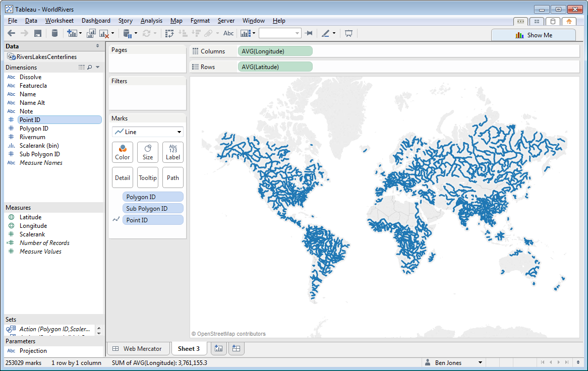
Now that you’ve got your CSV, it’s a fairly easy step to use it to create a map in Tableau. Start by connecting Tableau to this CSV, and then do the following in a new Sheet:
- Double click Latitude (goes to Rows) and double click Longitude (goes to Columns)
- Change Marks from Automatic to Lines
- Drag Polygon ID and Sub Polygon ID to the Detail Shelf
- Drag Point ID to the Path Shelf
You should now have the basic map of the rivers of the world, and your screen should look something like this:
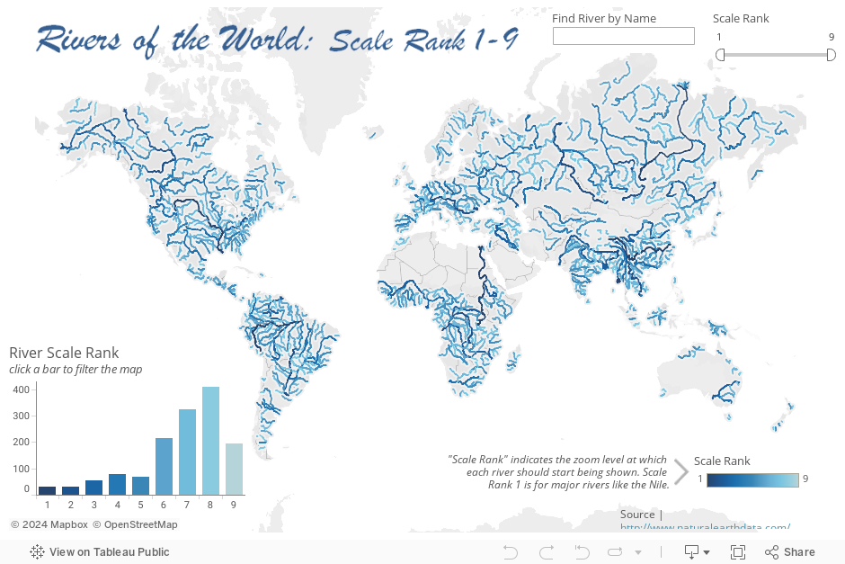
To complete the viz, I colored the rivers by Scalerank, added two Quick Filters (Scalerank and river Name), formatted the Tooltips, and added the map along with a histogram of Scalerank to a dashboard. I asked my son Aaron to pick the title font, and he picked Brush Script MT because he said he thought the letters looked “rivery”. I couldn’t argue with that, so we made a PNG with transparency and added it as an image (because Brush Script MT isn’t a safe web font).
Now here’s to you, Mr. Robinson
I said I had a surprise, and here it is. I’ve been playing around with (read: obsessing about) different map projections lately. I figured out how to convert the latitude and longitude coordinates into x, y values of the Robinson projection, a projection that the National Geographic Society used from 1988 to 1998, before ditching it in favor of the Winkel tripel. I won’t get into too much detail here, but suffice it to say, the Robinson is a pseudocylindrical projection that’s really only suitable for creating thematic maps of the entire world. Compare it with other projections using this handy summary image. More to come on this soon, but for now, here is the rivers dashboard in the Robinson projection:
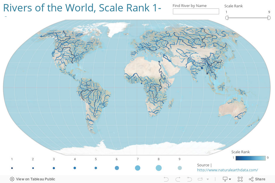
Notice that Greenland doesn’t loom as large as it does in the Mercator projection, which distorts it’s size quite a lot (it’s actually 1/8 the surface area of South America). Also notice, however, that the Robinson projection “curves” inward at both poles (latitude lines get shorter as you move away from the equator) – this means that if you were to zoom in to the street level in, say, Finland, streets that cross at a right angle in the real world wouldn’t appear to on the map. That’s what you get with Mercator in return for some area distortion. Every map has its pros and cons.
If you’re interested in building a Robinson projection yourself, here are the equations to make the conversion within Tableau. I recommend either drawing the coastlines and graticules yourself, or finding a good Robinson map image and adding it as a Background Image, fixing the position carefully. Here is the map image I used. It works fairly well when zoomed out to show the entire world, but I hid the Zoom controls since it really doesn’t work well when zoomed in.
Thanks for stopping by,
Ben

Well that is really rather splendid.
Odd that the Mississippi is not a Rank 1 river, but the Missouri is.
I noticed that, too, Joel. It looks like the Lower Mississippi (and the Missouri) are Scale Rank 1, but the Upper Mississippi is Scale Rank 5. Not sure why that is the case.
Pingback: Somewhere else, part 161 | Freakonometrics
Very cool. Though if I put one of these rivers into Google Maps, the resolution is quite bad. Tracing for example the Eel River in California, it runs across mountain tops. Is there a data set with better resolution that actually traces the rivers in Google Maps?
Hi,
This is a brilliant article and helped me with a similar project I am working. Do you know if it is possible to get the coordinate data for other water routes? For example, I need to show canals in Amsterdam taken.
Thanks
Hey Trevor! Thanks for the comment. I found waterway shapefiles for the Netherlands here (not sure how legit “mapcruzin.com” is though) and created this viz that lets you search by waterway type. You can also zoom in on a city by typing in the city name using the Map Search feature in the top left corner of the map. Hope this helps!
Thank you so much for this tutorial. I followed it to convert a shapefile to TDE for ‘mapping the roads of the world’ viz. I am still learning, and your tutorials have been very helpful.