
Vox published an interesting post today called “America has stopped paying attention, but Ebola is still ravaging Sierra Leone”. It made me wonder whether it’s just America that has stopped paying attention, or if in fact other parts of the world have moved on as well. I turned to Google Trends to look at relative search popularity of the string ‘ebola’ over time for various countries. Here’s what I found:
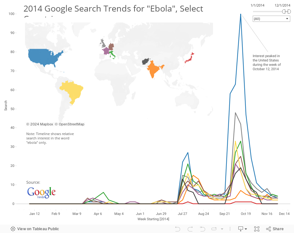
A quick glance suggests that other unaffected countries have moved on as well. At least these nine have. More specifically, people in these other countries are also using Google to search for the English word ‘ebola’ far less frequently than they were earlier in the year, especially during early to mid October, when the hype hit it’s peak (except in India, where search was highest in early August).
One interesting country to look at is Japan. The dashboard above seems to indicate that no one in Japan cared at all about ebola, all year long. Is that true? No, it’s not true, and it highlights one of the limitations of using this type of data to answer this question. If you do a similar Google Trends search for エボラ, the Japanese word for ‘ebola’, here’s what you get:
It helps to understand exactly what your data is telling you, and what it isn’t telling you.
Ebola is the same word in English, Spanish, Portuguese, German, Italian, and Hindi, so the other countries probably don’t have a similar problem. I wasn’t able to find the Pashto or Dari (Afghanistan) translations of the word “ebola”, but suffice it to say that Google search trends are far less effective a proxy for popular interest in Afghanistan, where only 5.9% of the population uses the internet, according to The World Bank.
Finally, if we compare relative Google search popularity for ‘ebola’ in heavily affected countries like Liberia, Sierra Leone, and Guinea, here’s what we find:
Project Notes:
- Get the raw data Excel file here
- Since Google Trends only allowed me to compare 5 countries at a time, I had to run two separate queries, with United States included in both queries to maintain a common reference point of comparison.
- After running the queries, I downloaded the data as a CSV by clicking on the gear icon in the top right corner of the Google Trends page.
- I combined both CSV downloads into one spreadsheet and used the Tableau Reshaper Excel Add-in (Windows only) to convert the resulting cross-tab table into a long list of data values – a single row for each week for each country.
As always, let me know if you have any thoughts about this topic, my approach to understanding it, or the visualization I created to communicate my findings.
Thanks for stopping by,
Ben
