
 Happy New Year! In 2015 I’ll be publishing a periodic series of blog posts entitled “Avoiding Data Pitfalls” where I’ll suggest ways to avoid common errors people make when working with data. The pitfalls range from philosophical to technical, and from analytical to visual. I’m familiar with these pitfalls because I’ve fallen into them myself, some of them repeatedly. If I’m the only one that these posts keep out of trouble, then it’ll be worth it.
We fall head first into a pitfall when we fail to remember that a gap exists between our data and reality. Do people really fail to realize this? I see (and make) this mistake quite often. I’m starting with this one because it’s foundational, dealing with the grounds and limits of our knowledge. How does it work?
It works like this: we get some data, and run with it, never stopping to think about where it came from, who collected it, what it tells us, and, importantly, what it doesn’t tell us.
It’s easy when working with data to treat it as reality rather than data collected about reality. Here are some examples:
- It’s not crime, it’s reported crime.
- It’s not the number of meteor strikes, it’s the number of recorded meteor strikes.
- It’s not the outer diameter of a mechanical part, it’s the measured outer diameter.
- It’s not how the public feels about a controversial topic, it’s how survey respondents are willing to say they feel.
- It’s not how many people suffer from a particular disease, it’s how many times a doctor diagnosed people with a particular disease.
You get the picture. This distinction may seem like a technicality, and sometimes it is (the number of home runs Hank Aaron “reportedly” hit?) but it can also be a big deal. Let’s see an example of how missing it can lead us astray:
Example #1: Actual vs. Recorded Earthquakes
Consider earthquakes. The USGS provides a Earthquake Archive Search form that lets visitors obtain a list of historical earthquakes that meet various criteria. A query of earthquakes of magnitude 6.0 and above from 1900 to 2013 yields the following, somewhat alarming, line plot:
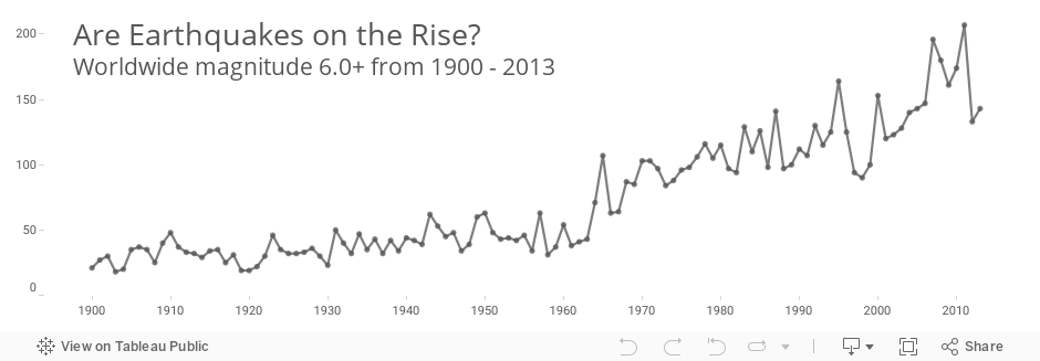
Are we really to believe that earthquakes have increased in frequency by this much? Obviously not. The world that measured and collected earthquakes in the early 20th century was very different than the one that did so in the last decade. Comparisons across decades, and even within some decades (the 1960s), aren’t “apples-to-apples” due to the changes in technology.
If we separate the line plot by magnitude and add annotations that describe advances in seismology, we see that the rise is only in the smaller group (magnitude 6.0-6.9), and coincides with dramatic improvements in instrumentation:
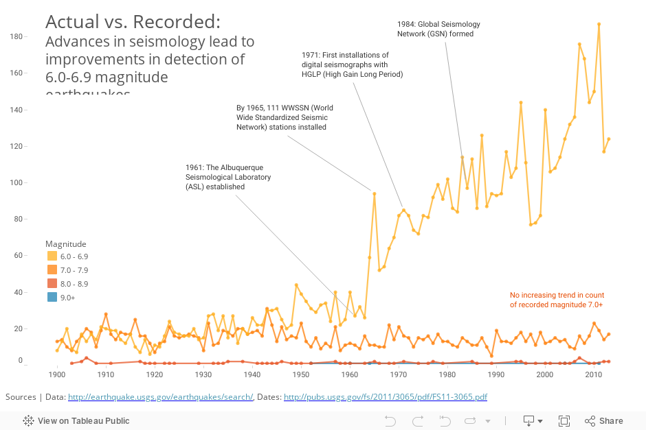
It’s safe to say that the rise in recorded earthquakes is primarily due to the improvements in our ability to detect them. There may also be an upward trend in actual earthquakes over this time, but our data doesn’t reveal it to us due to the continual changes in the quality of the measurement system. When it comes to earthquakes, the gap between data and reality is getting smaller. The problem is that the “data-reality gap” is changing over the time period we’re considering. And it’s hard to know for sure exactly how many magnitude 6.0 earthquakes we missed in any particular year.
Let’s look at another example – counting bicycles that cross a bridge.
Example #2: Counting Bicycles
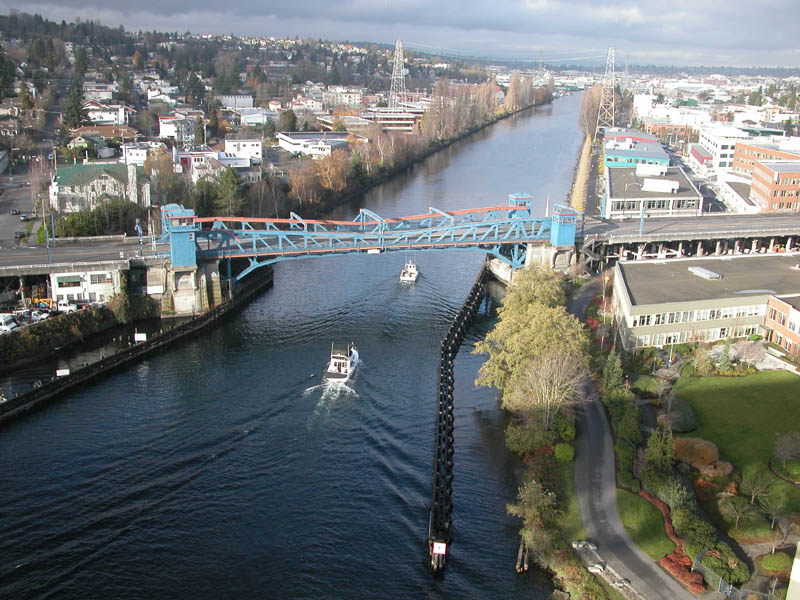
Everyday on my way to work I walk across the Fremont Bridge. It’s a bright blue and orange double-leaf bascule bridge that was built in 1917. Since it sits so close to the water, it opens on average 35 times a day, which supposedly makes it the most opened drawbridge in the United States. Here’s what it looks like:
The City of Seattle Department of Transportation has installed two “inductive loops” on the pedestrian/bicycle pathways of the bridge that are designed to count the number of bicycles that cross the bridge in either direction, all day every day. The city also provides hourly counts going back to October 2, 2012 at data.seattle.gov. Downloading this data and visualizing it yields the following timeline:
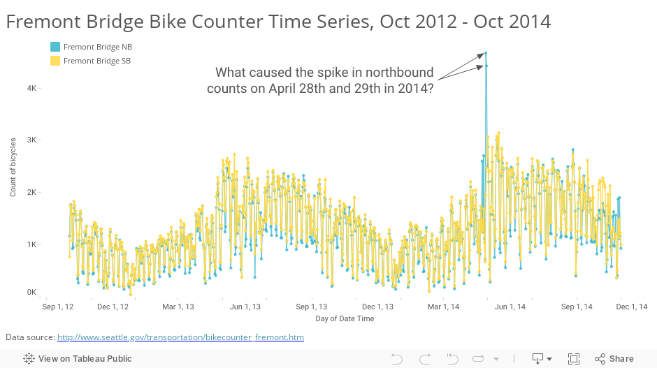
I showed this data at a recent luncheon of the Puget Sound Research Forum, and asked what the attendees thought of these spikes. I honestly didn’t know what had caused them. A few ideas sprang from the crowd – was it “bike to work day”, really good weather, or maybe there was some big bike race or club event? Notice how each of these ideas is based on the assumption that there actually were more bikes that crossed the bridge on those days.
David Bauer was in the audience and found the answer for us: equipment error. The counters just glitched for a few hours on both days. You can read all the details of these anomalous readings and the correspondence between a local blogger and a city employee at the Seattle Bike Blog. I won’t repeat it here, but suffice it to say measuring things can be tricky. Turns out a low battery was the culprit.
Let’s consider one last example: counting Ebola deaths.
Example #3: Ebola Deaths
This past year, the whole world watched in horror as Ebola ravaged West Africa. It’s still happening, by the way, we’ve just stopped noticing. In any case, the WHO provides data about fatalities in weekly situation reports. I had an interesting discussion on twitter with Alex McDonnell about this data. In it he referred to errors in the WHO reports.
Errors? About one of the world’s most closely followed topics? From one of the world’s most respected organizations? You bet.
Let’s take a look at a timeline of cumulative deaths from Ebola as reported by WHO and CDC. Notice the drops in cumulative death counts – the handful of times when the lines slope down:
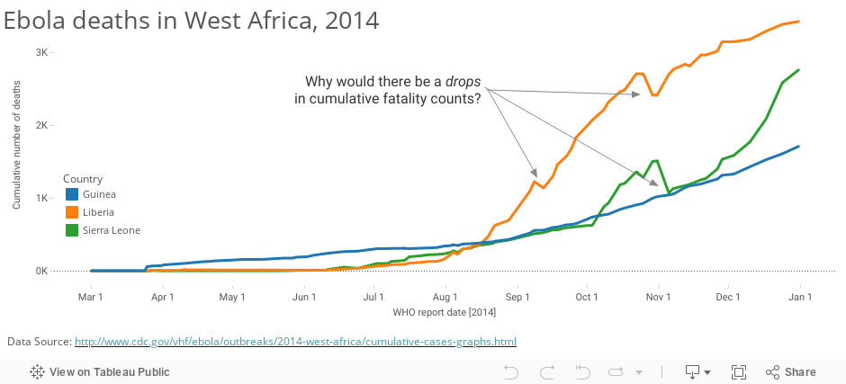
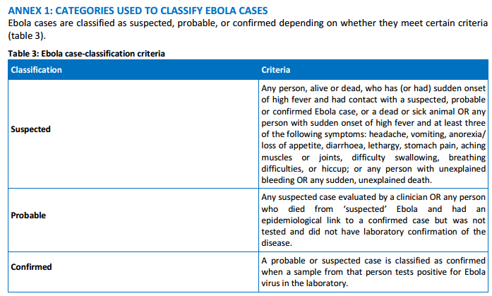
Of course it makes perfect sense: the task of diagnosing disease and ascertaining causes of death in some of the more remote locations, where the equipment and staff are often severely limited, must be incredibly difficult. If you read the WHO situation report you’ll notice that they classify cases as “confirmed”, “probable” and “suspected”. It’s not always so obvious. Here are the criteria:
The WHO and CDC actually do a very good job of speaking clearly about “reported” cases (the Dec 31st WHO situation report includes the word “reported” no less than 61 times).
I don’t bring up this example to criticize the people or organizations involved with fighting and documenting the Ebola outbreak. Far from it. This example merely demonstrates that the gap between data and reality can exist even when the stakes are high. Classifying diseases and deaths in chaotic conditions can be tricky business indeed.
How to Avoid Confusing Data with Reality
Notice that in these three examples – 1. earthquakes (a dubious trend), 2. bicycle counting (a spike or outlier), and 3. Ebola deaths (a downward slope in a cumulative line plot) – something in the view of the data itself alerted us to a potential “data-reality gap”. Visualizing the data can be one of the best ways to find problems with it.
Earlier in the game, though, it helps to remind ourselves that every data point that exists was collected, stored, accessed, etc, via imperfect processes. The more we know about these process – the equipment used, the protocol followed, the people involved, the steps they took, their motivations – the better equipped we will be to assess the “data-reality gap”.
Here are six seven suggestions to help you avoid confusing data with reality:
- Clearly understand the operational definitions of all metrics
- Draw the data collection steps as a process flow diagram
- Understand the limitations and inaccuracies of each step in the process
- Identify any changes in method or equipment over time
- Seek to understand the motives of the people collecting and reporting. Could there be any biases or incentives involved?
- Visualize the data and investigate any shifts, outliers and trends for possible discrepancies
- Think carefully about data formatting, processing, and transformations (thanks Keith!)
Ultimately, each data collection activity is unique, and there are too many possible sources of error to list them all. These are some typical ones that I’ve come in contact with, and you may have your own suggestions. I’d love to hear them.
In Conclusion
At the core of this first “data pitfall” is our attitude toward data. Do we arrogantly or naively see ourselves as experts on a topic as soon as we get our hands on some data, or do we humbly realize that our knowledge is imperfect, and we may not know the full story?
We can’t ever perfectly know the “data-reality gap” because that would require perfect data. What we can do, though, is seek to identify any gaps that may exist, and take that into account when we use data to form our opinions.
Thanks for reading,
Ben

Great post Ben, and a helpful reminder. I’ll be sharing this with my clients. I’m looking forward to the rest of the series!
Thanks Susan! Happy New Year to you. Would love to hear what your clients say about it.
Thank you for this post. You conveyed in elegant charts what I’ve been trying to tell my students and colleagues in words for quite some time.
Thank you Marcelo. I’m glad the charts helped illustrate the concept.
A great reminder, Ben, of what we all need to be more vigilant about. It’s so easy to assume that just because a data set renders itself on our screen (especially in something as sexy as Tableau), that it is inherently flawless. Disciplined data familiarity (i.e. taking the time upfront to explore the contours of the data you get) is an important skill to develop for anyone, especially analysts. It definitely doesn’t happen often enough.
Reminds me of a quote from Orwell: “To see what is in front of one’s nose needs a constant struggle.”
-Mike
Well done Ben! These are the basics that everyone should understand about data, and its manipulation. I will be sharing this profusely.
Thank you for highlighting this important topic that we might have inadvertently forgot, been unaware, or worse, ignored. Great post!
Hi Ben
Really liked this post and looking forward to more in the series. Will be sure to share it internally.
Cheers
@paulbanoub
vizninja.com
Ben,
You are sneaking into the territory of the process improvement consultant by writing this series, and I love it! We use measurement studies as a key element in understanding our data sources. You have provided excellent examples and explanations in this first post of the series! Awesome job.
Whenever I show erroneous data to my clients, I get quick reactions like: “you caught us with our pants down on that one!”. Now that might be a little more than I hoped for, but the reactions I’ve seen to erroneous data has been hilarious at the beginning of projects. However, it is never funny to find these problems deep into a project, so that is why your series is spot on!
Always remember what my motto is: Treat all data as guilty until proven innocent! I have yet to find a data set that doesn’t exhibit some type of issue related to “gaps in data vs reality”.
Ken
Hi Ken! Thanks for commenting. Yes, the MSA or Gage R&R study in process improvement was always I step I thought I could skip…until I did it. And I like your motto.
Great stuff as usual my friend!! The details of our understanding, as well as our presentation make all the difference…
Enjoy…
Excellent blog post. I had a question about your “Actual vs Recorded” chart.
I wanted to know how you were able to label the points with text and a pointer?
I opened the twbx but don’t see a text box? What feature am I missing?
Thanks!
Hi Vaidy, if you right-click on the mark you want to describe, you can select “annotate” and then either Mark, point or area. Here’s an online help article that shows how.
Hi,
I’m just listening to your presentation on web, and you requested examples of various pitfalls. I did more than decade of scientific research in Physics and Astrophysics.
One of the pitfalls we have to take care off is making sure that our instruments record what we wish them to record, instead of random stuff. Like, once detection of turning on the machines at the construction site few blocks away from our lab. Or second fun one, detection of the footsteps of the visitor to the telescope.
Cheers!
Pingback: Messin’ With Data | The Timeless Historian
Informative and very well written.
My worst mistake was assuming customer behaviour was best observed through analysing data by financial year. Doh, customers don’t care or even mostly know about company financial years and because of this I missed an important trend that crossed over FYs.
Pingback: Data Viz News [80] | Visualoop
Pingback: Best of the visualisation web… January 2015 | otiro
Pingback: Dataviz – Practicum In Digital History