I spend a lot of my free time with my family in nature, and it occurred to me recently that there is something particularly captivating about data visualizations that resemble nature. It makes sense if you think about it. As a species, we’re awed and inspired by majestic landscapes, and we’re drawn in by the intricate patterns we see in the world around us.
It’s the same with data visualizations. We use words like “enlightening,” “stunning,” and “beautiful” to describe the really good ones. Some people tire of the use of these adjectives, but I think there’s a good reason they have found their application here. They describe our inner experience.
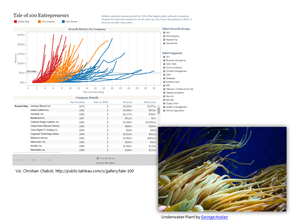
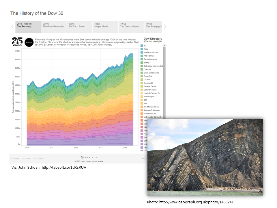
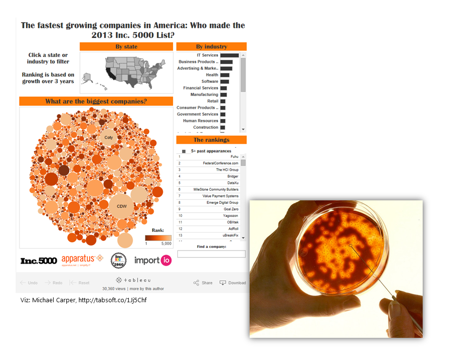
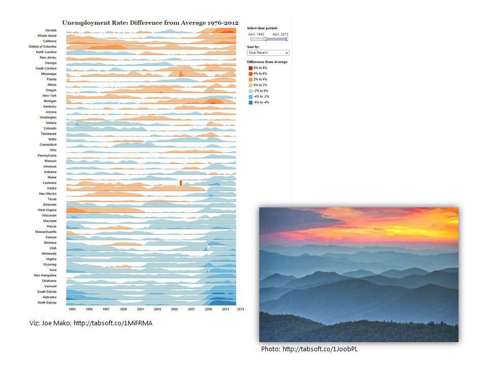
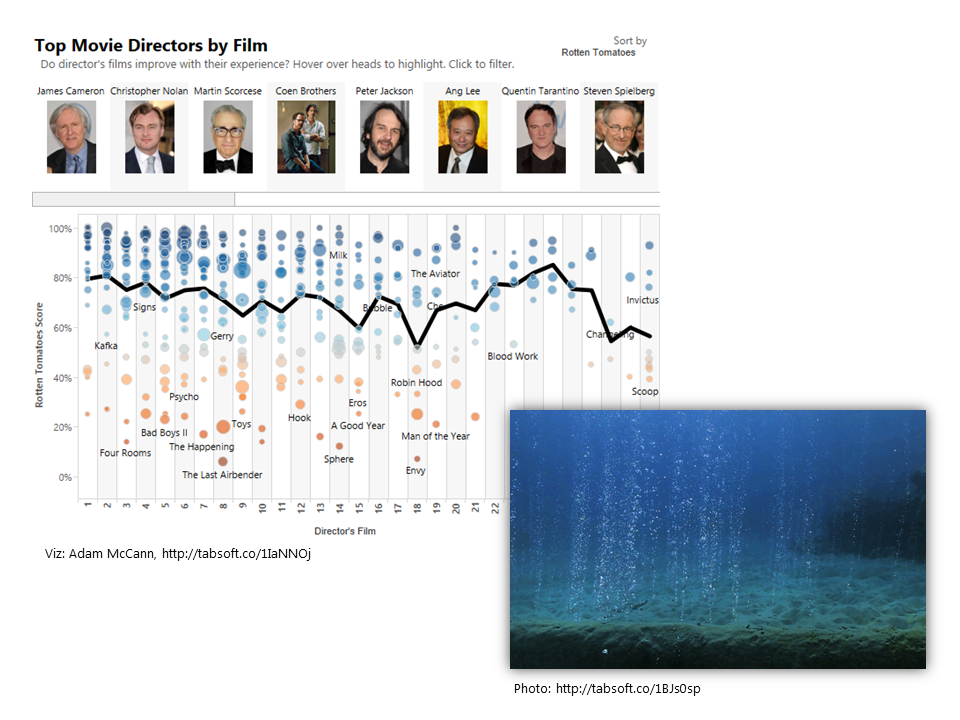
To illustrate the point, I chose five visualizations published to the new Tableau Public “Greatest Hits” gallery and found five corresponding images from nature.
Here is the same content posted to Slideshare:
I’m not suggesting we all go out and start making visualizations that look like sand dunes or tadpoles, as appealing they might look. And relatively few visualizations will work in “petri dish” form, though one about rapidly growing companies just might be in that small set. I’m just sharing my observation that I tend to stop and look closely at patterns that are familiar.
And we can take an important cue from nature as well. Many of nature’s patterns are both mesmerizing and incredibly informative, like the tree rings that encode important data about the life of a tree. If you can inspire as well as inform, then why wouldn’t you do both? Nature does.
Thanks for stopping by,
Ben


This is an interesting perspective, Ben. It makes me wonder if the reason we respond to certain visualizations is because they mimic a natural pattern that our brains are already “trained” to appreciate, or at least to acknowledge as something interesting and worthy of our attention.
-Mike
Pingback: Weekly Bookmark Highlights (weekly) | Ed.Media.Tech.