
I have a few thoughts I’d like to put out there, in the spirit of contributing to the ongoing dialogue within the field of data visualization. I’m still relatively new to this field, having participated as a practitioner, consultant and teacher for about ten years. That decade has left me with more questions than answers, and I find more opportunities than ever to expand my knowledge and skill set, and more people than ever with unique perspectives to learn from.
There are a few things, though, that I feel particularly passionate about. The three concepts I describe below amount to “tenets” that I’d like to humbly propose others in the field consider adopting. I definitely didn’t receive them in the form of a carved stone tablet from on high. It’s just stuff I think is true and important.
1. There are no black and white rules
I don’t believe that we can ever declare that a particular visualization type or design decision either “works” or “doesn’t work“. This binary approach is very tempting, I’ll admit. We get to feel confident that we’re avoiding some huge mistake, and we get to feel better about ourselves when we see someone else breaking that particular rule. I started off in this field with that mindset.
The more I’ve seen and experienced, though, the more I prefer a sliding gray scale of effectiveness over the black-and-white “works” / “doesn’t work” paradigm. It’s true that some choices work better than others, but it’s highly dependent on the objective, audience and context. This paradigm makes it harder to decide what to do and what not to do, but I believe this approach embraces the complexity inherent in the task of communicating with other hearts and minds.
Sometimes the most effective choice in a particular situation might surprise us. Consider two analogous examples: chess and writing. Data visualization is like chess in that both involve a huge number of alternative “moves”. Garry Kasparov decided to sacrifice his queen early in a game against Vladimir Kramnik in 1994. He went on to win that game in decisive fashion. Data visualization is like writing in that both involve communicating complex thoughts and emotions to an audience. Cormac McCarthy decided to eschew virtually all punctuation in his 2009 novel The Road. He won the Pulitzer Prize for that novel. Would I recommend either of those decisions to a novice? No, but I wouldn’t eliminate them from the set of all possible solutions, either. This diagram in Tamara Munzner’s Visualization Analysis & Design illustrates why:
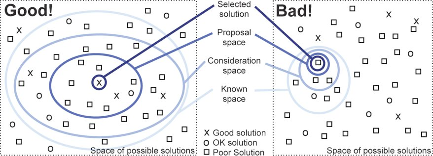
If we start with a larger consideration space, it’s more likely to contain a good solution. On the other hand, labeling certain visualization types as “bad” and eliminating them from the set of possible solutions paints us into a corner. Why do that?
For example, consider the word cloud. Most would argue that it’s not terribly useful. Some have even argued that it’s downright harmful. There’s a good reason for that, and in certain situations it is harmful. It’s difficult to make precise comparisons using this chart type, without a doubt. And using a word cloud to analyze or describe blocks of text, such as a political debate, is often misleading as the words are considered entirely out of context. Fair enough. Let’s banish all word clouds, then, right? Let’s malign any software product that makes it possible to create one, right?
I wouldn’t go so far. Word clouds have a valid use, as well, even if it is rare. What if we had a few brief moments during a presentation to impress upon a large room of people, including some sitting way in the back, that there are only a handful of most commonly used passwords, and they are pretty ridiculous. Wouldn’t a word cloud suffice? Would you choose a bar chart, a treemap or a packed bubble over a word cloud, in this scenario? You decide:
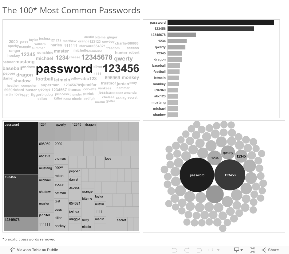
I admit it – I’d likely choose the word cloud in the scenario I described. The passwords jump right off the screen at my audience, even for the folks in the back. It doesn’t matter to me whether they can tell that ‘password’ is used 1.23 times more frequently than ‘123456’. That level of precision isn’t required for the task I need them to carry out. The other chart types all suffer from the fact that only a fraction of the words fit in the view. The audience can’t scan the full list at a glance to get a general sense of what’s contained in it – names, numbers, sports, batman.
If what you take from this example is that Ben thinks word clouds are awesome, you’ve completely missed my meaning. In most instances, word clouds aren’t very good at all, just like sacrificing one’s queen or omitting quotation marks entirely from a novel. But every now and then, they fit the need pretty well. We could probably come up with other scenarios where we would choose one of the other three chart types instead. Choosing a particular chart type depends on many factors. That’s a good thing, and frankly, I love that about data visualization.
2. Critique needs to be given with humility
Since there are so many variables in play, and since we hardly ever know the objective, the audience, or the full context of a particular project, we need to be humble when providing a critique of someone else’s data visualization. All we see is a single snapshot of the visual. Was this created as part of a larger presentation or write-up? Did it also include a verbal component when delivered? What knowledge, skills and attitudes did the intended audience members possess? What are the tasks that needed to be carried out associated with the visualization? What level of precision was necessary to carry out those tasks?
These questions, and many more, really matter. If you’re the kind of person who scoffs at the very mention of word clouds, your critique of my example above would be swift and harsh. And it would largely be misguided.
Open dialogue is necessary in data visualization, and healthy debate should be encouraged. When engaging in dialogue and debate, though, I try to remind myself that I don’t know all the details. Seeking to understand some of these details is an important first step. Then providing a few “pluses” and a few “deltas” almost always works. What works well (pluses), and what ideas do I have to make the visualization work better (deltas)? It’s really not that hard.
3. Freedom to innovate is necessary for growth
Lastly, I enjoy that there are so many creative and talented people in this space who are trying new things. I believe that freedom to innovate is necessary for any field to thrive, and I try to do what I can to make sure such a freedom persists in data visualization.
Making blanket statements about certain visualization types, design choices, tools, or even individuals or groups in this space isn’t helpful, and tends to reduce the overall spirit of freedom to innovate. I don’t have data to back that up, by the way, it’s just the way I feel. You may agree or disagree.
And “innovation” doesn’t just involve creating new chart types. It can also include using existing chart types in new and creative ways. Or applying current techniques to new and interesting data sets. Or combining data visualization with other forms of expression, visual or otherwise. As long as we can have a respectful and considerate dialogue about what works well and what could be done to improve on the innovation, I say bring it on.
Adding the winning ideas to the known solution space is good for us all.
I hope these tenets make sense to you. Let me know if you agree, if you’d change anything about my list, or if you’d add any tenets of your own.
Thanks,
Ben

Ben,
Thanks for mentioning humility and context in judging a data visualization. Even ubiquitous treatments like the venerable word cloud can work in the right situation.
Great point: we all benefit from “adding the winning ideas to the known solution space.”
Well done!
-Steve
Thank you Steve. It was great meeting you at ONA last month. I’m a fan of your work at Maps4News.
Ben,
This was a great post. Your point about “binary approaches” reminded me of Daniel Cohen’s Ted Talk about arguing: http://on.ted.com/Cohen. I think you would enjoy it.
I did enjoy the video, thanks for sharing. I’d like to think people in data viz can argue in a healthy way.
It’s funny how often these basic tenets need to be re-emphasized, both to new & experienced practitioners. I encounter very similar tenets in most creative endeavors, namely:
1. Learn the rules and then learn when to break them to best convey the story/emotion you’re aiming to communicate
2. Recognize that there is always hidden context in what people produce. Aim to understand that context and then use that context to provide a meaningful critique.
3. Encourage and don’t discourage play. Play is how we all learn, but that instinct dulls as we age. We feel that we need to “study” vs. play in order to learn, but we’re far more likely to clock in our “10,000 hours” toward mastery if we’re having fun along the way.
While these tenets are hardly new, it is important for people to read/hear them often and from different people. So thank you for offering your voice to the chorus. 🙂
-Mike
Thanks Michael, I agree with your comments about play. Einstein said “Play is the highest form of research.”
Great stuff Ben, agree whole heartedly
Thanks Matt! Looking forward to talking more with you on the topic on Friday.
Nice post, Ben! Again, you’ve hit the nail on the head. We should definitely know the rules and when it’s okay to bend them for the specific circumstance we’re dealing with. Generally speaking, there are no absolutes. I definitely agree with the critique comments. Communication is huge! We need tact when conveying our opinions or commentary. In my limited time in this space, I’ve learned that there are so many decision points along the way, that we’re never going to have a perfect viz because it depends on perspective. We need to honor that (and I hope I do). One thing I think is important is personal growth/evolution/perspective. We evolve our learning based on information we’ve studied as well as the environment around us. Just because we held a position a year ago does not mean we should be stuck in that position forever; our perspective changes and that’s okay. Thanks for the commentary, Ben!
Yes, I feel I could fine-tune any particular data visualization indefinitely. “Done is better than perfect” rescues me from that – and to your point, recognizing that there’s really no such thing as perfect. Also, what you and Matt Francis are doing with your podcast is a great example of how critique should be done. You give your honest opinions in a fun and approachable way. Thanks for that.
Thank you for sharing Ben!!
I agree with your points, and have found my own personal “sliding grey scale” expanding for years. Experience helps you see things differently, and recognize that a taboo visualization type may be just what you need for the content, context and story… It gives you the courage to see interesting intersection which you may have never considered before…
Well done my friend!!
Thanks Greg. It’s interesting how experience makes some people more close-minded, and others more open-minded.
Pingback: Looking Back to 2015 and Looking Forward to 2016 | PolicyViz
Pingback: Episode #42: Ben Jones | PolicyViz