
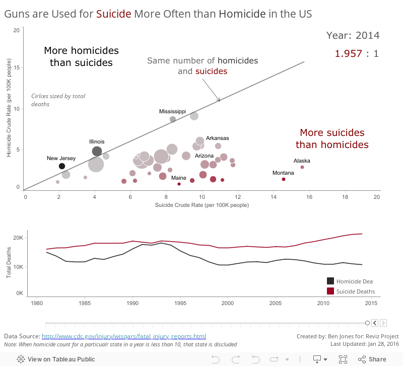
Nelson Davis, Matt Chambers and Alex Duke have formed the Reviz Project which you can read more about here. Their first challenge was to visualize the relationship between gun homicides and gun suicides in the United States. Data is sourced from the CDC.
I took a quick pass at visualizing the ratio between suicides and homicides for each state and over time using a scatterplot (I’m a scatterplot junkie) and a timeline. Hover over each state circle in the scatterplot to filter the timeline below to show the trend for a chosen state, and use the slider at the bottom of the timeline to explore the relationship between these two variables for a particular year in the scatterplot:
The dashboards they created to visualize this same data are quite elaborate (you can find them on their blog). While this month’s data story is very sobering, it’s always fascinating to me how different people, starting with the same raw data, and – in the case of Nelson, Matt, Alex and I – the exact same tool (Tableau), can come up with very different results, and very different insights.
That’s why data visualization has such a strong social component to it.
Thanks for reading,
Ben
