Wow. A whole year without a single blog post. So sorry everyone, I honestly don’t know what happened. Time files…
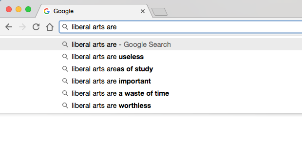
Are Liberal Arts useless or important? Google autocomplete seems divided on the question:

Last week I was delighted to present a webinar along with my colleagues Andy Cotgreave and Michael Correll on how the Liberal Arts are impacting Business Intelligence (BI). The webinar was the second in a series of ten that Tableau is publishing on trends that we are seeing in the BI space. You can watch a recording of the webinar for free (along with a login to Tableau’s website) by clicking here.
Of the ten trends, this is one that is particularly near and dear to my heart.
Why?
Because in my capacity as Outreach Programs director at Tableau, I get to see the work of talented people employing their creative abilities along with their analytical abilities to present data in clever, witty, funny, tragic, and moving ways using Tableau Public. And I also get to interact with professors around the world who are using Tableau’s Academic Programs to teach data to art students. Yes art students.
And I feel that the world of data and analytics are much better off because of the fact that we’re embracing, along with a desire to convey information as accurately as the situation requires, an aspiration to capture and convey the emotion and the human side of the data. Rather than being in conflict with one another, these two elements are actually complementary goals, and the strongest communication evokes them both. It’s facts and feelings. Not one, not the other, but both.
I’ve always been so impressed with data artists because they have mastered the art of communicating to other people via three very different languages: numbers, images and words. They are at once highly numerate, artistic, and articulate. There’s a real beauty to that mixture of those three talents, if you think about it. It’s easy to be great at one or two of those. But to be adept all three, to bring them together into one masterfully crafted message? That’s a real triple threat.
In my presentation, I mentioned that business analysts are learning three different skills from liberal arts professionals:
1. Think Like a Journalist: write great headlines; interview your data; call out your sources; capture the “nut graph” (thanks Cheryl!)
2. Express Like an Artist: embrace good design and aesthetics; employ visual metaphors; enhance memorability by including images and human-recognizable objects, where appropriate.
3. Relate Like a Novelist: have a powerful story to tell, or none at all; capture the human element
A field that leaves room for creativity and innovation is a thriving field. I feel like visual analytics has been moving in that direction in the past few years, and I’m proud to be a part of it. I’d like to thank the following individuals and groups whose work I mentioned or showed in my portion of the presentation:
- Giorgia Lupi and Stephanie Prosavec’s Dear Data
- Zillow Economic Research – All Negative Equity Isn’t Created Equal
- Jonni Walker’s 311 Service Requests for Grafitti Removal – Chicago
- Christian Chabot’s Tale of 100 Entrepreneurs
- John Schoen’s The History of the Dow 30
- Michael Carper’s Who Made the Inc. 500 List?
- Borkin et al – What Makes a Visualization Memorable?
- Boeing’s 2017 Current Market Outlook Report
- Joseph Campbell’s The Hero With a Thousand Faces
- KPMG’s Global Automotive Executive Survey 2017
Thanks, I hope you enjoyed the webinar. I’d like to hear your thoughts on this topic, whether you agree with me, or whether you think it’s all a bunch of touchy-feely poppycock.
Ben


Pingback: A Primer on a Liberal Arts Education - TableauFit
Pingback: A Primer on a Liberal Arts Education – TableauFit
very well explained about how liberal arts are saving business intelligence.Thanks for sharing!