I thought it was pretty great that Congressman Mark Takano (CA-41) teamed up with Tumblr and the Society for News Design to create International Chart Day – the first of which will be celebrated on April 26th, 2018. Finally, a day just for the data nerds!
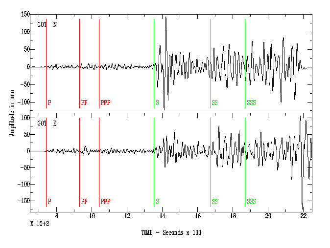
Alright, sure, that same day also happens to be Richter Scale Day, which kind of makes sense if you think about it…
…but the fact that it’s ALSO National Pretzel Day is kind of a stretch even if, you guessed it, there’s such a thing as a pretzel chart.
So wait, why is it awesome then? Isn’t there a day for everything these days? After all, weren’t we reminded just a few weeks ago to mark our calendars for “National Walk Around Things Day“? And didn’t we kind of roll our eyes when we found out that the first Saturday in February is “Ice Cream for Breakfast Day“?
Okay, fine, I admit it was pretty tempting to just declare that all such National and International days jumped the shark the moment this happened:
Today is National National Day Day
— Adam Hess (@adamhess1) October 12, 2014
But no, sorry, this one’s different for me. The others are frivolous and silly, even slightly annoying, but International Chart Day is all about data literacy, and data literacy has never been more important. In a world where claims of fake news are rampant, and one in which we can be rightly concerned that people might be trying to mislead us with the data they’re showing us, I think this statement on the official site is pretty refreshing:
“On April 26, chart lovers will unite to celebrate the first-ever “International Chart Day,” an opportunity for the infographic creating community to engage the public by sharing their favorite examples, further explaining the history and value of charts, and sharing insight in to how to create high-quality, visually engaging, informative visualizations.
The goal is to assist the public in becoming better consumers of data, information and news.”
I can get behind that. National Apple Dumpling Day? Not so much, even if it is on my birthday.
So how can we celebrate International Chart Day in a way that helps achieve the goal? By sharing examples of really great visualizations that are both effective at conveying information and engaging to look at? Sure, let’s definitely do that, and let’s use the hashtag(s?) #ChartDay and #InternationalChartDay to track what others are sharing.
But let’s go beyond that, and let’s say why we think each visualization is so effective. What about each one is a stroke of genius, in your mind? How does it convey a message in a clear and compelling way? Say what works. I tried to do that with five recent “Viz of the Day” winners that my team selected this year. You can see which ones I chose and why I like them here.
Let’s take it even one step further. Let’s have a dialogue about each other’s choices in which we allow one another to muse about what could work even better. Because no visualization is perfect, and there is always room for improvement. If I’ve learned anything in the past half decade engaging with the online community of dataviz types, it’s that growth can come from challenging each other and willing to be challenged. Iron sharpens iron.
With that, I wish you a Happy International Chart Day!
Thanks for reading,
Ben


Love this post. Love International Chart Day. And I really love your call to action – to say why we like certain charts and even what could make them better. Excellent post!
Thanks Lindsay! Also, welcome to the data viz blogging community. Looking forward to following what you share here.