
(This post & accompanying viz are inspired by my brother, Matt Jones, who will be competing in his first full Ironman competition in Wisconsin in two weeks)
A triathlon is a particularly interesting race to visualize because racers compete in three very different sequential events: first swim, then bike, and finally, run.
The below interactive Tableau Public viz shows the top 100 finishers (out of 2,098) in my brother’s most recent tune-up half triathlon, the Vineman 2011 in Guerneville, California.
See if you can use it to determine how individual racers could approach the next race if they want to improve their overall rank:
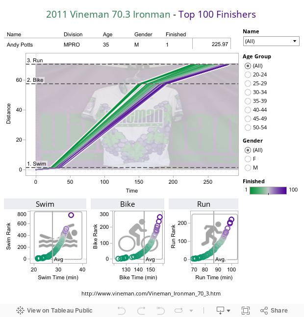
When I showed this viz to my brother, he was quick to point out the results for racer John Dahlz who had very different rankings for the three different parts of the race:
John Dahlz (Overall: 52nd)
- Swim: 3rd
- Bike: 37th
- Run: 218th
Obviously, the strategy for John to move up in overall rank next time would be much different than the strategy for Philip Regnier, who ran a very different race:
Philip Regnier (Overall: 86th)
- Swim: 734th
- Bike: 106th
- Run: 46th
It seems that a winning strategy for John would be to focus on improving his run time, while Philip could make the greatest jump in the standings by knocking down his time in the water and on the bike.
Creating a cool-looking viz is one thing, using a viz to inform strategy is another thing all together.
What did you see?
Ben

I’ve heard it’s all about the run and how much you’ve burnt yourself on the swim and bike. But even the faster runners couldn’t make up the elite gap from the end of the bike.
Hey Matt!! Thanks for commenting.
Good point, it looks like, on average, over half of the race is spent on the bike, and a whole hour longer than running.
For the top 100 finishers, the standard deviation for the bike (7.3 min) was slightly higher than the standard deviation for the run (6.5 minutes), so an elite biker (2 stdev better than average = 14.5 min edge) would have a “leg up” (pun intended) on an elite runner (2 stdev better than average = 13 min edge).
Ultimately it seems to me that the winning strategy is the “Mario” strategy in Mario Kart – don’t have a glaring weakness. The top 30 overall are all better than average in all three categories, which makes sense.
Ben, thanks for the advise. Just wondering why you decided to compare my results with John? Regarding your comments, I would agree I need to work on my swim which as you noted, is in terrible shape. Guess who now is swimming 5 days a week with bi-monthly lessons. Looking forward to a better performance at OceanSide next month!
I also love to bike but didn’t feel that 106th on the bike was to bad. As you know, its hard to guess at how hard to go on the bike to have enough in the tank for a great run. Last year I went as hard on the bike as possible at the Kirville 70.3 and ranked 4th overall but didn’t have my best run as a result. I was able to place 10th overall and Masters Champion which I do attribute to a very strong bike and run…as usual my swim was terrible!
Would you suggest going harder on the bike than you would normally go and give up a bit of the run?
Thanks for the advise,
Phil
Hey Phil! Wow, thanks for commenting, I’m honored you visited my site.
I was looking for top 100 racers with very different results in the 3 stages, and your swim finish rank really popped out at me. It seemed amazing to me that someone who finished 734th in the first stage could wind up in the top 100. You passed more people than anyone else in the top 100 over the course of the bike & run stages, climbing ~650 places after getting out of the water.
To me (not being a triathlete so take it with a grain of salt), it seems like the best approach would be to get closer to the average swim time (you were ~8 min over the avg for the top 100) and average bike time (you were ~6 min over the avg for the top 100). Doing this without hurting your run time (easier said that done, I am sure) would put you in the top 50. In contrast, shaving 14 minutes from your run time would mean you would need to have the 2nd best run time in the whole race – and you’d still climb no higher than 45th overall.
Interesting that your idea – go harder on the bike & give a little on the run – is exactly what Lance Armstrong felt he should have done on his first crack at the competition recently where he placed 2nd. I guess you just have to be sure that shaving 14 minutes (8+6) from your combined swim & bike time doesn’t mean you add that much to your run time.
It seems like maybe Brett Miller’s times (31/144/87min) would be an interesting target to get you closer to the top 50.
All the best at OceanSide, Phil! I’ll be checking your site (ironmanphil.com) to see how it went! Would also love it if you came back and let us know your strategy and how it went.
Thanks again,
Ben