Chess is a great game. If you’ve ever played chess, you know what I’m talking about – the thrill of checkmate is unlike any other gaming experience. It’s even better than when an opponent lands on your hotel on Boardwalk (and that’s saying something).
Chess reminds me a lot of data exploration and data visualization for a number of reasons, which I’d like to share and see whether you agree or not.
#1) There are lots of moves you can make
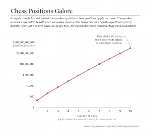
The line chart to the left shows the number of distinct positions that are possible by move number as obtained from data tables on Francois Labelle’s website, Statistics on Chess Positions. After black has moved for the 5th time, there are over 85 million different games that you could be playing. That’s enough to ensure no two games you ever play will be identical, which is a huge part of the draw of chess.
Data exploration is much the same. If you have ever found yourself staring down even a moderately sized data set, you know there are many ways you can approach the game that is afoot. Yes, there are certain “tried-and-true” approaches (bar chart = 1. e4?) that seem to work well in most circumstances, but you can make so many different moves it can be hard to know where to start. That’s why “short cuts” like Tableau’s “Show Me” or Andrew Abela’s flow chart “Chart Suggestions – A Thought Starter” (download here) are so helpful to get the juices flowing (thanks to Andy Kriebel for reminding me about this resource in his recent blog post).
#2) Many moves are mistakes, but some mistakes aren’t what they seem
Generally, sacrificing your queen is a bad thing to do. It really doesn’t take long for kids who are learning to play chess to figure this out. It brings my 6 year old Simon (video playing chess with my brother Matt while beat-boxing) to tears. So it is with data visualization. Don’t use “chartjunk”. There is a reason why Tufte is so revered. Then again, use it, but make sure nobody gets hurt if you do. If you have visited my blog, you will have noticed that I add background images to charts at times, like with this Gretzky tribute, my first post. I realize that by so doing I risk incurring the wrath of the larger dataviz community, but for me it just made sense in that case. I can’t really explain why, and you don’t have to agree. One of the best rules of thumb in chess is “if you see a good move, look for a better one.” Just be okay with the fact that the “better” one may seem unorthodox, or even downright crazy. Even Garry Kasparov sacrificed his queen in critical moments with good success. Go with it, but be prepared for #3…
#3) It’s far better to play with the pros if you want to get better
There is a school of thought in chess that you should continue to play opponents with ratings 100-200 points higher than you. Why? Because any game in which you learn something is a good game, and more experienced players can teach you a great deal, often the hard way.
It’s easy to take the path of least resistance in life – doing what you’ve done before and seeking out the “easy win”. But that approach, like beating up on inferior opponents in chess, doesn’t afford many opportunities to learn. So it is with data visualization. Seeking candid input from experts is the way to get better.
Putting something of yours out there can be nerve-wracking, but you have to have a tough skin and resolve to learn from any critical comment levied your way, no matter how harshly worded. If everyone wants a trophy all the time, they won’t learn what it takes to actually win the game. I’m learning, and hopefully there won’t be too many “fool’s mate” gaffes along the way. Have at, gents and ladies.
Some questions for you:
- How else would you compare data visualization with chess?
- What are your favorite dataviz rules of thumb? Ever seen them broken “well”?
- Who would you nominate as “best mentor” in the field of dataviz?
Take care, and thanks for stopping by,
Ben


Nice post.
(1) Like chess, DataViz takes a short time to learn, but a lifetime to master. (OK, so that’s the “Othello” slogan….)
(2) Favorite rule of thumb, if you have a categorical axis (for example, US states), don’t use the alphabetical order, which is often the default in software. Search for a better ordering (for example, order by the largest mean of a response variable).
(3) Although I like Tufte’s books, my favorite mentor is Tukey. So many basic tools that we use in data analysis were invented or improved by him.
@Rick – agreed, there is always something new to learn. Tukey has been on my amazon wish list for too long now, so thanks for the nudge!
I just discovered your blog. Great post!
1…I’m sure there are many similarities to be drawn, but the first one that came to my mind was that when you’re in the middle of it (whether ‘it’ be a chess game or creating a data visualization), it’s usually not clear what the outcome will be: smart choices (in both cases) will lead to a winner.
2…My personal data viz rule is never use a pie chart. Ever. But yes, it can be broken. I like to say that as long as you can articulate *why* you’re breaking a rule (whether it be using a pie chart or adding chart junk, as you mention in your post), that shows you’ve thought about it enough to make that decision.
3…While I draw inspiration from many, my go to expert in the field of data viz is hands down Stephen Few. His writing is accessible and his guidance is both grounded in theory and highly practical.
I look forward to your future posts!
And I just discovered your blog -so thanks for leaving a comment to help me find it! Your comment is a great one – chess & data exploration are both basically puzzles to solve. There is an immense feeling of satisfaction when you feel you have come across the right solution. As for the lowly pie chart, the only time I have used one is in business. “Know thy customer.” I just picked up “Show Me the Numbers” by Few, so I’m glad you give it the thumbs up.