
Alberto Cairo’s massive open online course on information graphics and data visualization is providing 2,000 data geeks from all over the world with ample inspiration to create interactive dashboards about interesting topics. This week’s challenge is to redesign The Guardian’s DataBlog (of which I am a huge fan) post about US state unemployment.
Here is my submission (posted from 30,000 feet somewhere over New Mexico):
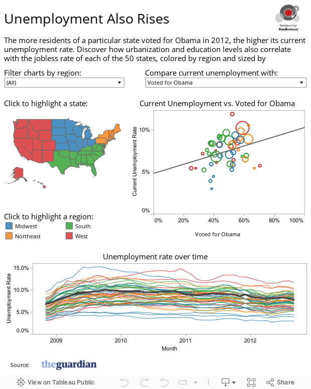
Breaking it down:
- Title: A little tribute to Hemingway, what can I say?
- Lead-in: Calling attention to the recent elections, and how state unemployment correlated with votes for Obama. Also inviting the reader to explore other correlations – urbanization and education. GDP could also be added here.
- Filters & Highlights: This viz uses a drop down to filter the data to one particular region, a map to highlight a particular state (minus Alaska and Hawaii – a definite limitation), and a legend to highlight a region. Clicking on the bubble also highlights the corresponding state in the other views. These interactions are designed to be as intuitive as possible.
The Correlations:
- Votes for Obama – States with higher jobless rates didn’t punish the Obama administration for their unemployment woes – rather, they voted for Obama in higher than average percentages.
- Urbanization – the greater the percentage of a state’s population that lives in urban areas, the higher the unemployment rate, in general. It wasn’t immediately clear to me that this would be the case. I have heard of plenty of employment struggles in rural areas of the country. It seems rural areas are below average in terms of unemployment.
- Education levels – The more a state’s population is educated, the lower the unemployment rates, though these correlations are somewhat weaker. This seems more-or-less self evident and unsurprising.
Some possible improvements to the project:
- Correlation Coefficients: I’d prefer to show R-squared values for these scatterplots – something I’d like to see Tableau add to future versions. Eye-balling the strength of the correlation is one thing. Seeing the exact “goodness-of-fit” is quite another.
- Bubble size legend: there really wasn’t a convenient place to put the legend showing population levels associated with bubble sizes, so I left out the legend and added a note to the lead-in paragraph. Not ideal, but it was better than the alternative, in my view – a large legend that shrunk the size of the more important views.
Thanks for stopping by. As always, your comments, questions, suggestions & criticism are more than welcomed!
Ben

Ben,
Nice chart and post. I started in this direction too on the MOOC, but ultimately went in a different direction. I haven’t used tableau yet, but I think I’ll give it a whirl for the final project.
One comment and one question. Did you do a filter for the battleground states?
Question – are you producing these in the public version of Tableau (and follow-up) where’s the best place to go for tutorials on it?
Thanks
Gavin! Nice to see your comment. No filter on battleground states, but that would be an awesome idea. This project was made using Tableau Public, the free version you can download here. For tutorials, I’ve actually found the Tableau On Demand training pretty helpful in getting started.
Hello Ben,
Happy Thanksgiving and hope your flight home was safe!
Was the class good and worth signing up for the second round?
Re: Hemingway – are we the the new lost generation? Or just wishing you were in in 1920’s Paris?
Just a question… Why did you color code the states by Region? Could it have been possible to color code by candidate voted for in 2008, 2012 (same D, same R, switched to D, switched to R)?
Another idea would be to show a map colored by unemployment and next to it (or below it) map of how states voted.
I know the Guardian data didn’t include it – but a longer history would be a fun thing to look at i.e. is there a correlation over time with how people voted and unemployment.
You Rock!
Anya
Hey Anya – Same to you! The class was really good, and I’d recommend signing up for the 2nd round. We are definitely storytellers like Hemingway, and I’m sure many would contend we are also quite lost. Great question about the regions – there really weren’t any compelling story lines that came from the region color code. I like your recommendations, too – it would be interesting to explore color coding a few different ways to see what tells a more interesting story.
You also rock! Thanks for leaving a comment!
Ben
Hi Ben, also on @albertocairo’s MOOC and was just opening Tableau (having given up on hacking a d3 example to do what I want it too) and there was your homework as viz of the day. Don’t know if you knew or not. When I sort out mine I’ll post it on my brand new blog -myndwork(ng)z -doubt it’ll beat viz of the day status though. FYI Alberto and others on the course are tweeting at #iidviz I’m sure everyone would like to know about your Tableau success, but its not my story to tell.
Thanks Bryn! I saw that, Tableau has been great about showing my work, I’ve really come to appreciate the online community and company support. Thanks for the heads-up!
Ben
Pingback: Centro Knight conclui seu primeiro curso online massivo com … – Centro Knight para o Jornalismo nas Américas (Blogue) | fontes ss
Excelente post!