
I’m hanging tough in week 3 of Alberto Cairo’s online course on Infographics and Data Visualization. For those of you who didn’t get in (the class was capped at 2,000), it looks like they will be offering it again in January. You can find out about registration in the near future at Alberto’s website, thefunctionalart.com. You will find many, many other useful posts there on a regular basis. Bookmark it, add it to your RSS feed, whatever it is you do, do it.
Get the Book No Matter What
Whether you plan on taking the course or not, I highly recommend you pick up a copy of Alberto’s newly published book, The Functional Art. I’ve read it, thoroughly enjoyed it, and will be posting more comments about it shortly. In a word, it’s great. Alberto is an expert when it comes to combining clarity and aesthetics in a graphic, and he gives you an inside view into the information graphics departments of some of the world’s best news publications. The corporate world can learn a lot from people who’s job is to inform you and entertain you at the same time. Obviously most news organizations don’t do both equally well, but Alberto is one of the good guys that knows how to.
About the Course – A Data Visualization Challenge
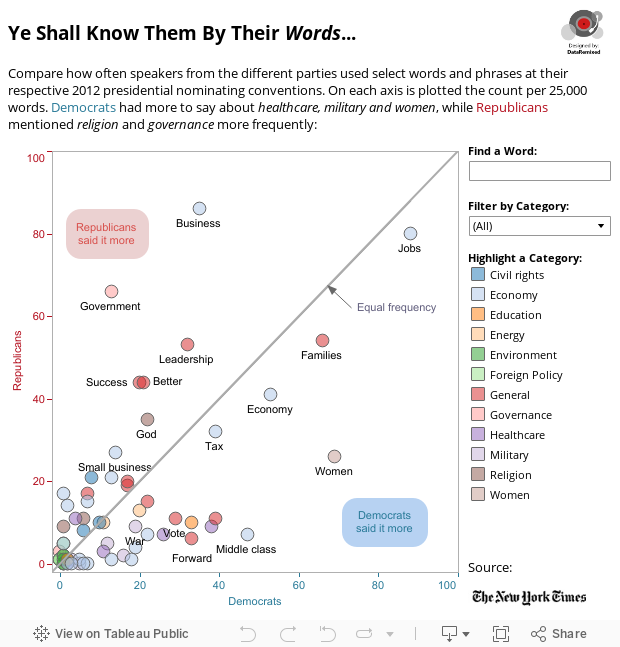
Week 2 presented course-takers with the challenge to address and redesign this New York Times interactive graphic depicting word frequency differences between Democrats and Republicans at this year’s presidential nominating conventions. Click the link and play around with it. It’s pretty fun. My kids especially liked clicking on the “Obama” bubble and dragging it all around the view, pushing the other bubbles out of the way (especially the “Romney” bubble).
But the basic problem that I have with the NYTimes feature, as nifty a piece of programming as it is, is that makes use of divided areas of circles, making a simple comparison relatively difficult. Not exactly best practice. Best practice in this case, according to Jock Mackinlay’s ranking of perceptual tasks, would be either using position or length to encode the relative frequencies.
My Attempt at a Redesign
I would normally use length in some sort of bar chart for this type of comparison (like I did recently here, or here), but this time I thought I’d try a quick attempt to use position to encode frequency (y-axis for Republican frequencies and x-axis for Democrat frequencies), with filter functionality to hone in on certain words & categories:
A Brief “How-To” Guide
This is pretty straightforward interactive dashboard in Tableau, and the only real “trick” that I had to figure out was how to make a 45 degree line extend all the way across the scatterplot. I really wanted this dividing line so that it would be very easy to see which side each bubble is on, but at first I couldn’t figure it out.
The solution, when it finally hit me, was a simple as anything. To do it, I just used a dual axis plot of Democrats plotted against Democrats, with the multiple mark type for Democrats (line size) dropped all the way down and a trend line added with a forced (0,0) starting point. That’s a mouthful, so here’s a screenshot of the sheet:

Adding “The Annotation Layer”
Lastly, I felt that some basic annotation of the two halves of the plot space and the 45 degree line itself would be helpful. Very easy to do: Right click in the chart area > Annotate > Area (twice), and Right click on the 45 degree line > Annotate > Point. A really easy little step to take, and it really makes the layout easier to understand for the reader who stumbles on the graphic for the first time. The title was an attempt at creativity, and the lead-in calls out some of the differences that I noticed.
If you have any comments or suggestions, I’d love to hear it! Leave a comment, and I’ll respond asap. Also, if the brief “how-to” is too brief, let me know and I’ll send more info.
As always, thanks for stopping by!
Ben

Nice work, Ben. Thanks very much for that 45 degree trick – I’ve been wondering how to do that, and you’ve sure made it dead easy! Also, I’m very impressed you were able to get this done during TCC12 week; I’m in the course as well, but with travel, conference, regular workload and family, I just didn’t get back to this class this week.
Cheers,
Tom
Thanks for the comment Tom, and glad the tip is useful for you. And, yes, it’s been a very busy month! 🙂
Excellent work Ben!
Thanks Andy!
Seems the course is open for registration, btw…!
Thanks for the heads-up Tim. Are you registered?