
On some level, we all know that the data we’re using to make conclusions about the world isn’t perfect. We know that there remains some uncertainty about everything the human mind considers. From survey results to clinical studies to engineering bridges, there is always some error involved in the numbers. We tend to neglect this uncertainty, and lead ourselves and others astray as a result.
Case in point: fish labels.
On Fish Labels
When Oceana published the findings of their seafood labeling fraud investigation last month, the results were shocking: “more than 1,200 seafood samples taken from 674 retail outlets in 21 states” yielded a disturbing trend – over 33% of DNA samples didn’t match their label. You can read the news on the Oceana website here.
I first heard about the study while driving to work in Seattle after coming back from the Tapestry Conference in Nashville. At Tapestry, we had discussed uncertainty following Jonathan Corum’s keynote, so the topic was fresh in my mind.
An Inferential Leap
Northwest Public Radio had the following to say about the study: “Seattle and Portland are among the best cities in the country to buy fish that is accurately labeled.” On the surface, it made perfect sense. Seattle and Portland are coastal cities with robust fishing industries. Of course they’d be better than cities like Austin or Denver. The NPR article went on to state that the lower rates may be due to “consumer awareness about seafood in Seattle.” Flattering.
A Look at the Numbers
For fun, I thought I’d take a deeper look, so I found the full report by Oceana here. Let’s take a look at the report to see what can be said about Seattle and Portland, if anything.
If we just look at the overall percent of samples mislabeled by city, we find Seattle and Portland among the best, along with another famous North American fishing hub, Boston:

Case closed then, right? If this were all we were given, we’d make the same inferences as Northwest Public Radio. But were the cities sampled properly to make this statement?
Samples were taken from three types of retail outlets: grocery stores, restaurants, and sushi venues. Here are the results by city and retail category. Mislabeled samples are red bars, and correctly labeled samples are blue bars:

We can see that sushi venues yielded the poorest results, with over 73% mislabeled across all cities (some of the sushi mislabeling was due to “foreign name translation” – e.g. not all types of fish called “yellowfish” in Japan meet the FDA classification).
But the other thing we notice is that very different amounts of sushi were collected in each city. In fact, no sushi was collected in Boston at all.
Breaking Down the Mix
Here is a breakdown of the mix of each retail category in each city’s sample set (thickness of the bars is proportional to mislabeling – thicker meaning a higher mislabeling rate):

So, relatively low amounts of sushi samples were sampled in the Seattle, Portland and Boston. 16% of the samples in Seattle were sushi, while over 35% of the samples in Southern California were sushi, by comparison.
Oceana didn’t follow a stratified sampling plan when they collected their 1,214 samples and as a result, the overall mislabeling rates from each city really aren’t apples-to-apples. This doesn’t mean their study is meaningless, it just means that comparing the overall rates between cities isn’t all that valid. It would be like comparing average human heights in each city, and including way more children in one city’s sample set than the others. It’s just not fair dice.
Comparing Like to Like
Okay, since we can’t really compare the overall rates, what if we just compare the cities within each retail category: so grocery stores to grocery stores, restaurants to restaurants, and sushi to sushi?
Even though a relatively high amount of samples were taken overall, the sample sizes start getting fairly small when you look at each city/category combination, so we should add error bars to the mislabeling rates. This is a case for the binomial proportion confidence interval. There are a number of different ways to compute this interval, but for now we’ll stick with the normal approximation that we all learned in college.
I’ll follow up with a how-to post next. But for now, here is the breakdown of mislabeling rates, with uncertainty taken into account:
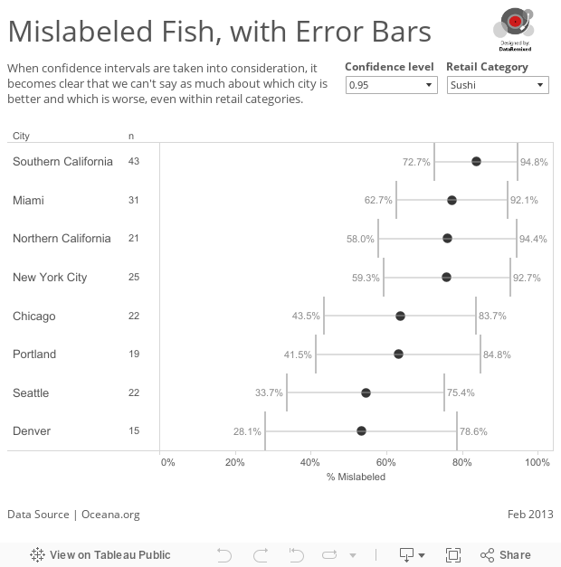
This data visualization tells a very different story. Notice that not every city is included in this chart. That’s because in some cases, there weren’t enough samples to satisfy the requirements of the normal approximation (n*p>5 and n*(1-p)>5), so I filtered these cases out of the chart. Kansas City drops out altogether, for example. Not enough samples in KC (19, 9 and 9) to say much of anything about labeling there.
What can we say about the different cities? Here’s what we can (and can’t) say based on a 95% confidence interval (ignoring the difference in the types of fish samples collected at each place):
- No city is better or worse than any other in sushi mislabeling
- Restaurants in Chicago had lower mislabeling than restaurants in Northern California
- Grocery stores in Seattle had lower mislabeling than in California (Southern & Northern) and New York.
So some comparisons can be made between cities, just not all that many. In the end, Seattlites can take consolation in the fact that the fish in their grocery stores is labeled more accurately than in California and New York, and perhaps this is even partly due to their seafood IQ.
Conclusion
Oceana revealed widespread mislabeling of fish in this country – that can’t be denied. But a massive inferential leap was made in reporting the story. Looking at the numbers through the lens of statistics allows us to make more accurate statements about the findings. Yes, this involves much more work than simply taking the overall mislabeled rate and slapping it into a map or bar chart. And yes, uncertainty can be annoying. But it’s really just freshman stats 101.
Embracing uncertainty just may mean the difference between truth and fiction, and we wouldn’t want fishy results, now would we?
Thanks,
Ben

Brilliant piece of work, Ben. This is such a terrific training post – from now on I won’t try to explain sampling issues or confidence intervals – I’m going to direct them to this site. Thank-you.
Thanks Kelly – I thought you’d appreciate the stats post!