
I spent the past few days with some colleagues in San Antonio at the Investigative Reporters and Editors (IRE) Conference training journalists to use Tableau and meeting others interested in data visualization and data journalism.
I also had the opportunity to participate in a panel discussion with Ryan Murphy of the Texas Tribune, Steve Thompson of the Dallas Morning News and Matt Waite of the University of Nebraska-Lincoln.
My core message is that there are different tools for different situations. I’m a big believer that static charts made with Excel and R have their place, and so do intricate and elegant coded visualization masterpieces. I also see Tableau as a unique tool that affords much of the interactivity with a user interface that is easy to learn. A bowl of porridge that’s often “just right”.
Here are my slides from the presentation. As always, these are my nascent thoughts, and I’d love to get your take:
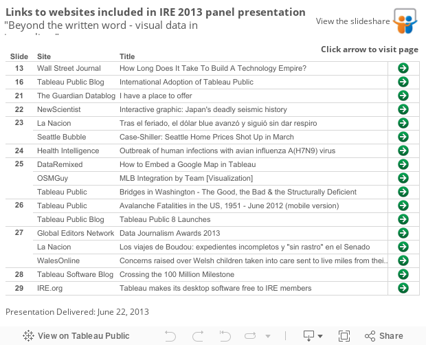
Here are hyperlinks to the visualizations and websites included in the presentation:
As always, thanks for stopping by,
Ben
