
Being a Canadian (eh) living south of the border, I’ve watched the US political process as an outsider looking in for all of my adult life. It’s a fascinating system, with plenty of fine points and flaws, which just means it’s a human system.
I had the chance to visit and present data visualization using Tableau at the TechActivist conference this weekend. I learned a lot about how people deeply involved in the political machinery of this country think, relate to each other and approach their goals. There is no doubt that they all see data as a huge opportunity going forward.
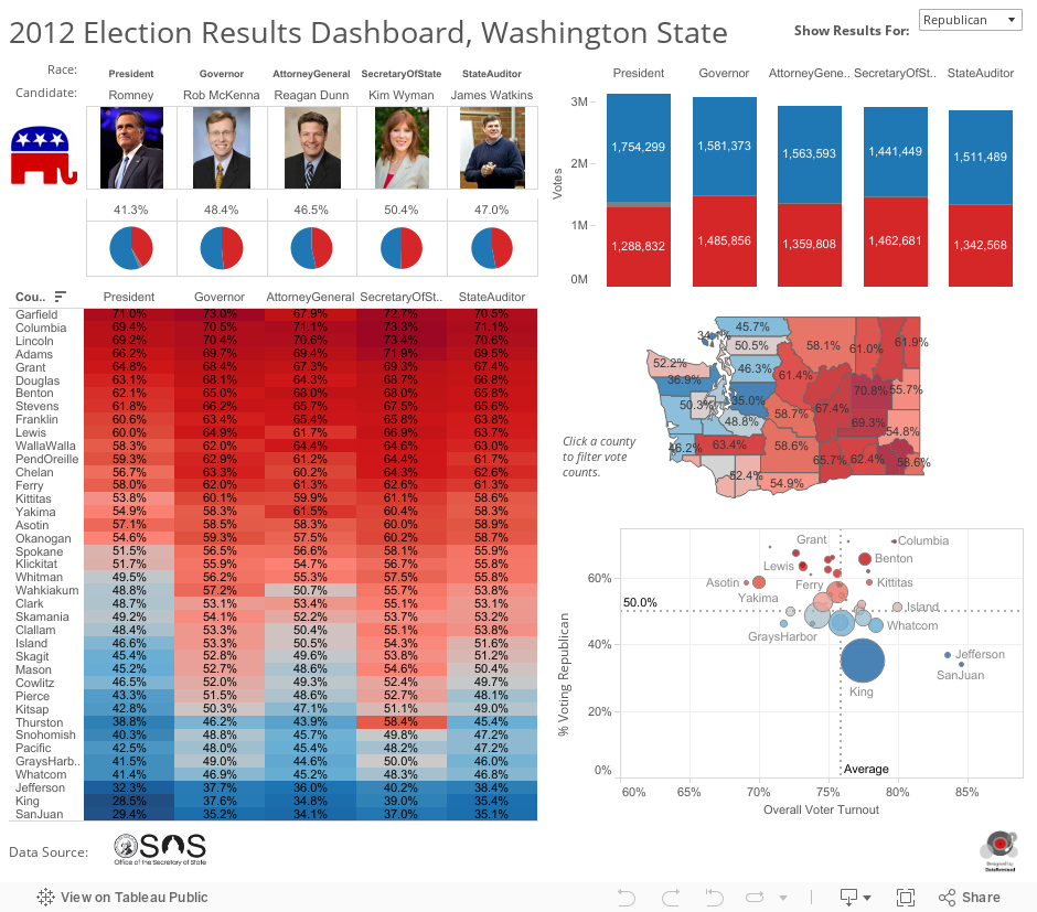
To prepare for the conference, I was given Washington State election results from 2012. My colleagues at Tableau Mike Klaczynski, Jewel Loree and I spent some time playing with the data and mashing it up with census data to see if we could find anything interesting in the results. We presented a number of findings, and created this voting results analytics dashboard at a county level.
Click to see an interactive version, use the drop-down in the upper right to switch between Republican and Democratic perspectives:
Here are the slides I presented based on my cursory research into the subject of data visualization and US politics. I don’t claim to be an expert in politics, but I did find some interesting articles and visualizations that I felt compelled to share:
As always, feel free to leave comments, feedback, suggestions, etc. If you really want to get my attention, go get Tableau Public (it’s free), download the workbook (click “Download” in the bottom right corner of the dashboard) and remix the data to show it the way you’d like to see it.
Lastly, here’s a link to many other election day visualizations created by the aforementioned Mike Klaczynski.
Thanks for stopping by,
Ben
