
DataRemixed.com turns 2 today(!), so I’m giving my website a little more breathing room by increasing the overall width of the site. Now I’ll be able to publish wider visualizations and interactive dashboards, which should hopefully result in better overall quality. By all means, hold me to it!
Last year, when DataRemixed turned one, I published 4 DataViz Blogging Lessons Learned. I re-read it today and I still stand by those words a year later. If anything, I’d add a 5th lesson – “Add your unique perspective”. Charles Joseph Mindard was a civil engineer and built canals and railroads. Is it any wonder that he made great flow maps after his engineering career was over? Flow maps were part of his DNA by that point. What is your unique perspective, and how does it inform your best work?
This year, I’m taking a look back at the usage of this site in its second full year of existence. Using Tableau Desktop’s Google Analytics connector, I pulled in data about my website and created this interactive dashboard, which I’m happy to share with the world:
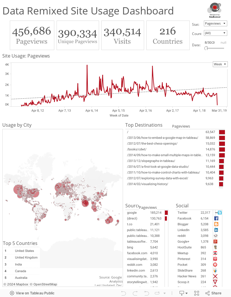
What are my key take-aways from this dashboard?
- Be Helpful. Look at the top 6 destinations. 4 start with the two simple words “How to”. It’s as simple as that.
- Think about SEO. Google is the #1 source of traffic for my website. What does it look like to a search engine?
- Data Viz is global. My site is a very small corner of the world wide web, but visitors from 155 countries stopped by. Incredible
Taking #1 above seriously, let me show you how I created this dashboard. Chances are you care about your website stats more than you care about mine, so the next section includes a detailed dashboard walk-through so you can do the same. You’ll need Tableau Desktop. If you don’t already have it, you can get a 14 day trial here. If you’re a student or a member of IRE, you can get it for free. You can also open and explore my workbook if you want by clicking on “Download” in the bottom right corner and opening the .twbx file in Tableau.
Here goes.
How did I make it?
This slideshare document walks you through the steps I took to build this interactive web traffic dashboard. Click to the right of the slides to advance them one by one:
I hope this was a helpful tutorial, and please let me know if anything was unclear, or if you have any suggestions to make this dashboard even better.
Thanks for stopping by,
Ben

Great post, and congrats! The only comment I have is that while this works for websites with smaller traffic when you have a ton of traffic to your site Google Analytics starts sampling your data which makes it difficult to analyze 🙁
Maybe in 8.1 we’ll see some improvements to the GA connector?!
Thanks Ben! I guess it’s somewhat unfortunately that I don’t have that problem. Yet, anyway.
Congrats Ben for the 2nd year of your blog. I usually enjoy a lot your posts.
This is particularly useful and it inspires me to replicate the method using Google Analytics data from my web site.
Great post, data visualization and tutorial.
Thanks for the comment, Ramon. I’d love to see you improve on it rather than replicate it. When it comes to designing data dashboards that contain a lot of info, few can do it better than you. See you in DC next month.
Hi, Ben. I love the layout of this and have been working on something similar for some of my daily stats. However, I keep running into an issue with the top stats callout boxes. I can create the boxes no problem, but I can’t get the correct value to display.
I have the user select a date range to view (i.e. current calendar month, last 7, 30, 60 days, etc). I then calculate the minimum value of the date range and the maximum value of the date range. I should then be able to sum my visitors or sales based on the date being within the range. However, the result returned is the total visitors or sales in the data source, not just for the specified range.
Working with dates in Tableau is making me crazy! Any tips on how to make this work??
TIA.