
I’m a big fan of small multiples in data viz, and I’m somewhat of a “Maphead” as well. Naturally, combining the two together results in a visualization that I’d vouch for almost any time. Kyle Kim of the LA Times just published a stunning series of 192 maps showing drought levels in California by week, going back to January 4, 2011. Small Multiple Maps can take up a lot of space, but they’re very effective at showing change over both time and geography. Judge for yourself.
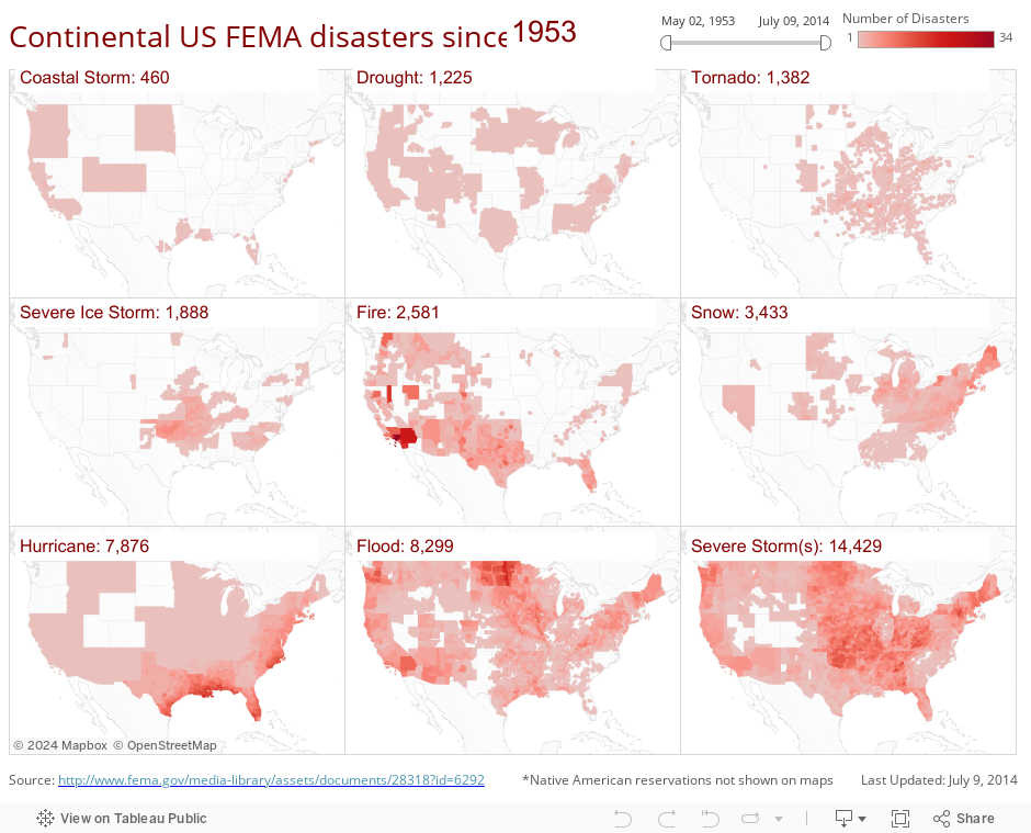
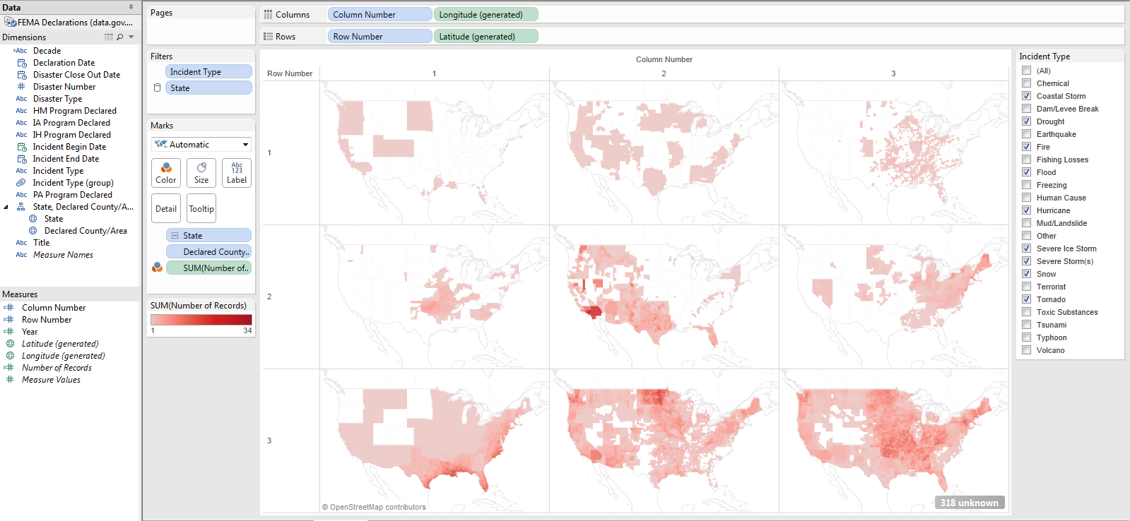
I look at a lot of Tableau Public visualizations, but I don’t see a lot of “small multiple maps” out there. It’s not that they don’t exist, they’re just rare. They’re actually pretty easy to make, so I thought I’d show you one and walk you through how to create one for yourself. Here’s a small multiples map showing FEMA declared disasters, by county, since 1953:
If you want to follow this brief tutorial, first download this Excel file of FEMA disasters.
How to Make a Small Multiples Map in Tableau
There are at least two different ways you can create small multiples maps in Tableau. One way is to create a bunch of individual maps as Sheets and drag and drop them all onto a single Dashboard. The other way is to create a single Sheet with a grid of small maps. This blog post covers the second method, which has the advantage that the “OpenStreetMaps” attribution only occurs once in the bottom left corner, instead of once for each multiple.
Step 1: Create a basic map
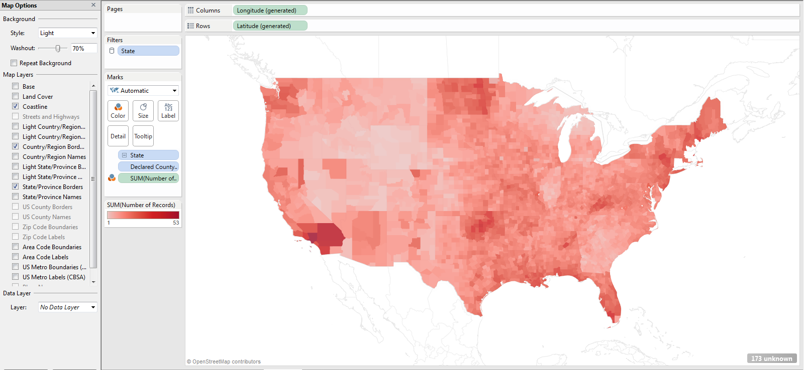
I started by creating a basic choropleth map of continental US counties. I double clicked on the county data field (Declared County/Area) and then dragged “Number of Records” to the Color Shelf. I filtered out the states and territories not in the “lower 48”, I changed the Color to red, set country shape borders to “None”, and edited the Map Options to only show the coastline and borders:
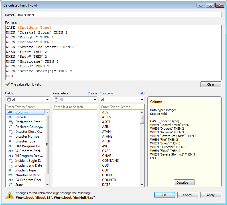
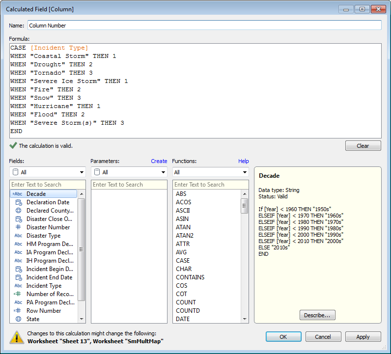
Step 2: Create a “Row Number” and “Column Number” Calculated Field
There are 22 different “Incident Types” (so, plenty of material for Hollywood), but for this project I wanted to create a 3X3 grid, so I needed to identify the top 9 Incident Types. From a simple bar chart showing counts of Incident Type over the full date range, I found that (in descending order of frequency) Severe Storm(s), Flood, Hurricane, Snow, Fire, Severe Ice Storm, Tornado, Drought and Coastal Storm were the ones to include.
I wanted to put each of the 9 top Incident Types in its own box on the 3X3 grid starting with the least frequent type of the 9 (Coastal Storm) in the top left and working my way down to the most frequent (Severe Storm) in the bottom right. Each of the nine then would have a Row Number (1-3) and a Column Number (1-3). I created two new Calculated Fields (right click in the Dimensions or Measures area and select “Create Calculated Field”) to place each in its proper location:
Step 3: Use “Row Number” and “Column Number” to create the grid
Now that the grid location fields are created, I just needed to drag “Row Number” to the Row Shelf and “Column Number” to the Column Shelf, and change both from SUM to a Dimension. When I used a Quick Filter to only include the 9 top fields, I had my small multiples view:
Step 4: Formatting
The rest is mostly clean-up, really. Hiding the Row and Column Headers, customizing the Tooltips, adding a date Quick Filter, and placing the small multiples map on a Dashboard. In the Dashboard, the titles for the 9 boxes are actually 9 very similar Sheets with Incident Type and Number of Records added as Text and filtered to just one of the nine incident types.
What do you think? Easy to make, right? Pretty effective as well, wouldn’t you say?
I’d love to hear your thoughts, and thanks for stopping by,
Ben
PS. Coastal Storms seems to be occurring in rather… non-coastal areas in the country. Not entirely sure why, but I’m guessing it’s a misclassification by FEMA. If anyone knows the story, I’d love to know.

Hi Ben,
Great article, as usual. I’m quite the fan of small multiples myself, but have never thought (or needed) to use them with maps. They do make for a very compelling pairing. 🙂
My inner sloth always looks for ways to avoid hard-coding anything, so I wondered if there could be a way to display the top 9 incidents without having to assign each one an explicit row and column number. I found that you can do this by leveraging the RANK_DENSE function. This also has the added benefit of allowing the incidents to remain ranked even when you change the time horizon.
Let me know what you think.
https://public.tableausoftware.com/views/SmallMultipleMaps/DisasterMap?:embed=y&:display_count=no
This is amazing Michael! Huge improvement – your version is a much better approach.
I agree that it is better to order the small multiples by rank using a formula.
You can simplify the formulas in his example a bit using modular arithmetic and as a bonus then can easily adjust the number of columns in your matrix (without changing the calculations)
num_cols = integer parameter
column_number = ([Rank] – 1) % [num_cols] + 1
row_number = int(([Rank] – 0.5) / [num_cols]) + 1
Nice tutorial, Ben. Thanks!
So glad we got the map credits in only one place in small multiples views. Small feature change, huge improvement in the output.
Hi Jeff, I totally agree. These kinds of small adjustments can make a big difference.
It’s awesome. It seems simple, but it exists a lot of hours of study and practice behind something like this. I’m one of your readers and I love this article. Thanks for your efforts. Yesterday I made an infographic with Tableau, something seemed to this small multiple maps graphic, although I didn’t use your method, I’ll test your advice, I promise.
https://public.tableausoftware.com/profile/juanfcia#!/vizhome/Mortalidadinfantilenelmundo/mortalidad_infantil
Pingback: Cifras de la esperanza de vida y mortalidad infantil en África
Pingback: Data Viz News [68] | Visual Loop
Utah and South Dakota seem like unlikely places for Coastal Storms…
The display has some appeal. I’ve done a few maps where you put a pie chart on a region to show a category breakdown. That has its uses, but it makes but comparing one of the categories geographically a little dicey. This would work much better, assuming a small number of categories, any how.
Ben,
This is incredibly creative and a great use of small multiples. The row and column assignment is turns out to be quite easy and I can see a lot of utility in this. Thanks for sharing!
Thank you Leigh!
Hi Ben,
Can we show aggregates on this map? like total cities effected etc
Thanks
Pingback: Data Viz News [68]
Pingback: Small multiples – learningtableaublog
Pingback: How to Make Trellis / Tile / Small Multiple Maps in Tableau | Ryan Sleeper
Pingback: Journalist’s Toolbox | A Society of Professional Journalists Blog – English4Media / اللغة الانكليزية للاعلام