
Note: This post is inspired by Cole Knaflic’s August 2018 #SWDChallenge to data visualization practitioners to create a dot plot.
When ancient humans first started coming up with systems to aid with counting and arithmetic prior to the invention of the numeral system, they chose to move wooden beads, beans or stones along a wire or a bamboo rod, or within sand channels. Archaeologists have found evidence of a form of abacus in Mesopotamia as early as 2,700 BC. It’s a testament to the effectiveness of this simple yet ingenious device that we all learned counting with a modern form of the abacus in our earliest school experiences, almost 5,000 years later.
Here’s a photo of one, called the Chinese abacus, or Suanpan, in which the 5 beads on each rod below the horizontal dividing beam are 1s, 10s, 100s, etc (from the right-most rod to the left), and the pairs of beads above the beam are 5s, 50s, 500s, etc, from right to left:
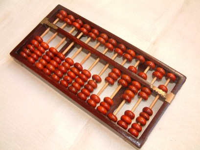
The abacus allows us to capture, count, add, subtract and multiply quantities by virtue of the fact that the position of each bead along its respective rod conveys an amount based on its position in the grid. Move one of the beads on the right-most rod toward the horizontal dividing beam, and you have just counted to 1. Move the next bead toward the beam, and you have just counted to 2. Move one of the two beads above the beam on the right-most rod toward the center and you’ve added 5 to your previous total of 2, for a new total of 7. We all know basically how it works, but here’s a helpful video playlist for a refresher if you need one like I did.
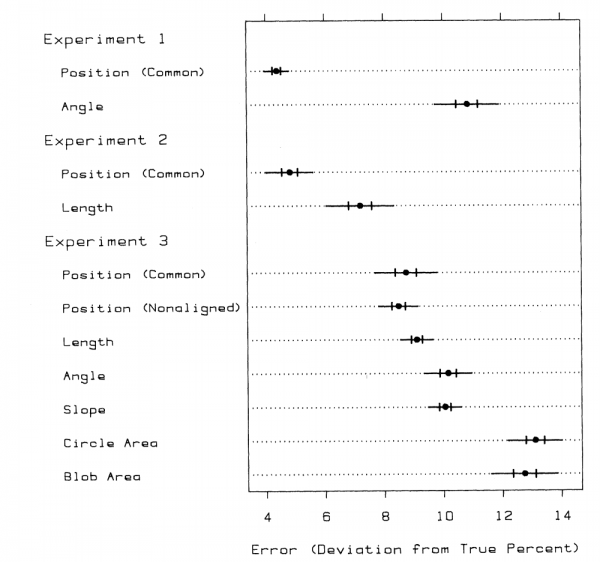
Our ancient ancestors found that position along an axis is a good way to keep track of quantitative information. Is it any wonder, then, that if you zoom forward to more recent times, Cleveland and McGill found in their 1985 study ‘Graphical Perception and Graphical Methods for Analyzing Scientific Data’ that subjects were able to judge values using position along a common scale with the least amount of error? They evidently learned from their experiment, as they chose to present their experimental results using a dot chart, with error bars:
Cleveland & McGill’s results have been replicated, including in 2010 by Jeff Heer & Mike Bostock, and we now have a pretty good idea how accurately people can judge proportions when they are presented with different encoding types. The following image is from Tamara Munzner’s book Visualization Analysis and Design, which is an absolute classic and I use this image as a starting point whenever I’m asked to present on the fundamentals of data visualization:
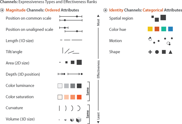
As you can see, position is at the very top (‘most effective’) of both the ordered as well as the categorical attribute lists. If you want to win in data visualization, you’re likely to succeed if you separate distinct categories in your data into marks that are in different spatial positions in the visual space and then move those marks to places where the distance from a common base is proportional to a characteristic value you’d like to compare. In other words, make a dot plot.
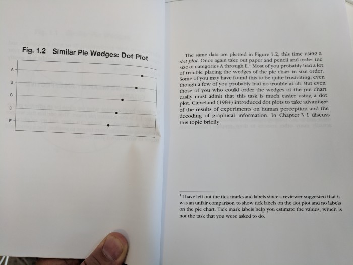
One of my favorite data visualization books is Creating More Effective Graphs by Naomi Robbins, and she opens her book by singing the praises of the dot plot, including on page 4 as shown here:
When I wrote my book Communicating Data With Tableau in 2014, I encouraged my readers to employ this visual technique, even though adding horizontal on-center lines isn’t currently a default in Tableau (if you’d like it to be, you can vote it up in the Tableau Ideas Forum here). It’s definitely doable in Tableau, though, as Andy Kriebel demonstrates in a helpful video tutorial here. Back in 2014 I employed a similar, albeit more simplistic approach by placing a static value of 1 on a dual axis and then fixing that secondary axis to go from 0 to 1 and then hiding it. The bars that go from 0 to 1 in each row can be made very thin using the Size shelf, effectively letting you mock-up an on-center gridline through the middle of the marks in each row, rather than the default “swim lane” configuration of horizontal lines separating rows between each dot. It’s a stylistic choice, but I think perhaps it can prove to be an important one.
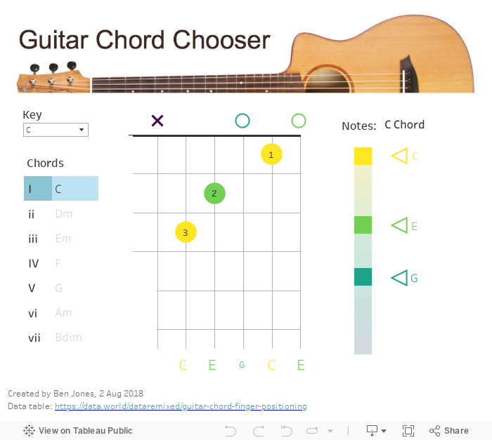
All of this brings me to my submission for Cole’s challenge. I’ve enjoyed playing acoustic guitar since my father bought me one for Christmas when I was 16, and it occurred to me as I was considering Cole’s latest challenge that the chord diagrams I’ve been looking at and memorizing since I was a teenager are a form of dot plot – dot plots where the position of the dot along each line isn’t abstract, it’s actually a quite physical representation of where to place your fingers along the six guitar strings to form a chord. You can find these chord diagrams on the internet and in learner booklets everywhere, most commonly in a small multiples form which I love, but I decided to create an interactive app to let users choose a key and a chord to display one diagram at a time. I’d also like to believe that I added one small visual innovation – I used the viridis color palette to color each dot by the musical note that its string makes when plucked – most chord diagrams are in black and white:
I hope you like it! Thanks for reading.
Ben
