Previous Post (1 of 3): Data Visualization: Clarity or Aesthetics?
Part 2 of 3: A Tale of Four Quadrants:
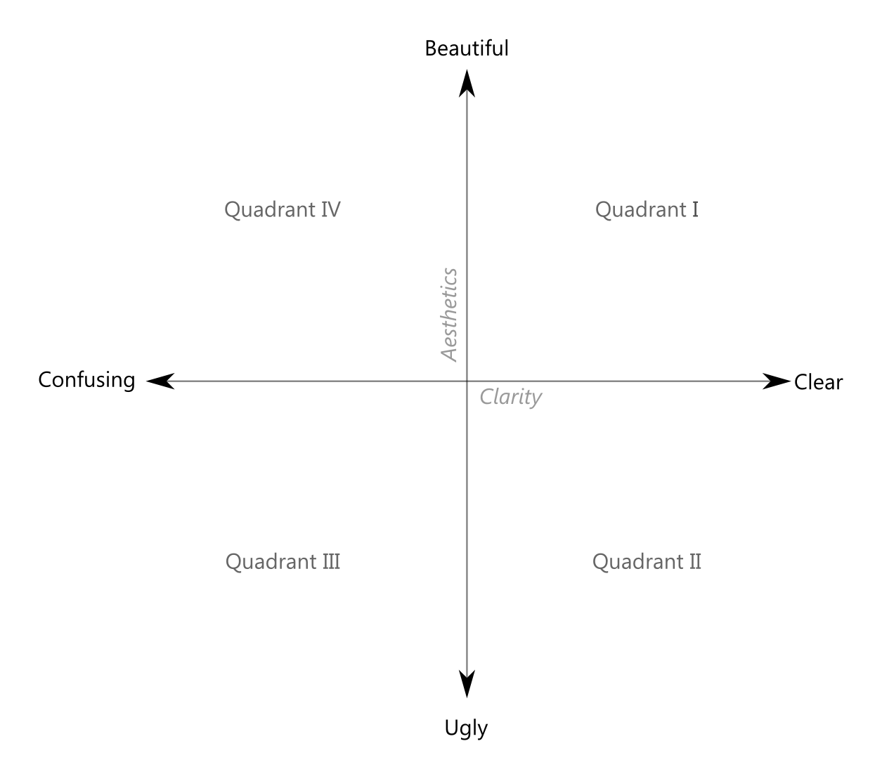
In Part 1, we introduced the notion of a two dimensional plane on which a data visualization can be mapped as a single point using the x,y coordinates [clarity, aesthetics], where clarity ranges from confusing to clear, and aesthetics ranges from ugly to beautiful. The single point can then be transformed into a circle with area proportional to the impact of the work. While not perfect, such a system just might be useful to determine how to assess and ultimately improve a given data visualization.
Four Quadrants
Such a plane would thus be divided by the two axes (x = clarity and y = aesthetics) into four regions, or quadrants:
- Quadrant I = [clear, beautiful]
- Quadrant II = [clear, ugly]
- Quadrant III = [confusing, ugly]
- Quadrant IV = [confusing, beautiful]
Here, again, is the basic grid:
Before moving on to a few basic tips in Part 3, I’d like to show a simple example of these four quadrants to more clearly illustrate the point. Creating this example was quite fun for me, by the way, as it afforded me the rare opportunity to make really bad stuff (on purpose, that is). Try it sometime, you’ll get a kick out of it.
Steve Jobs and Job Creation
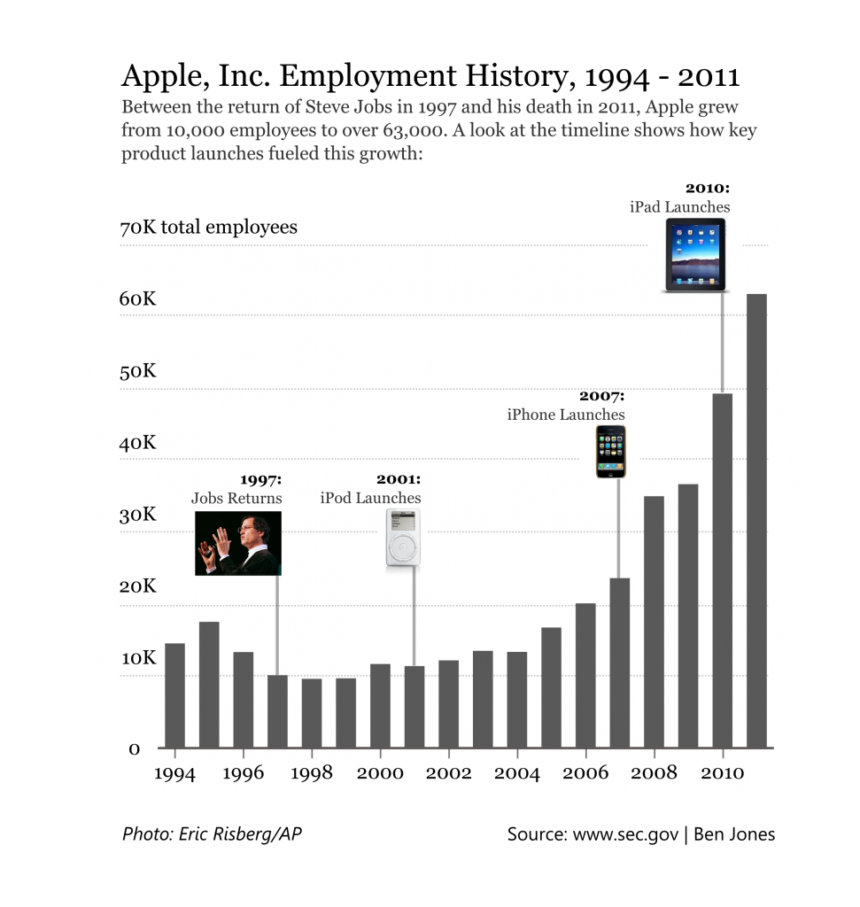
After the passing of Steve Jobs this past October, I was interested in finding out whether Apple had been continuing to hire in spite of the global recession, and whether, in Apple’s case, an innovative culture could be correlated with increasing employment. I had to dig into each of the annual SEC filings to mine the yearly employment figures, but what I found confirmed my suspicion – jobs at Apple had increased with, well, Jobs at Apple. What surprised me was that employment had increased over six fold since his return. But how to convey that insight in a data visualization? Luckily, this is a fairly simple data set to chart – comparison over time with relatively few periods calls for a column chart
Four Approaches
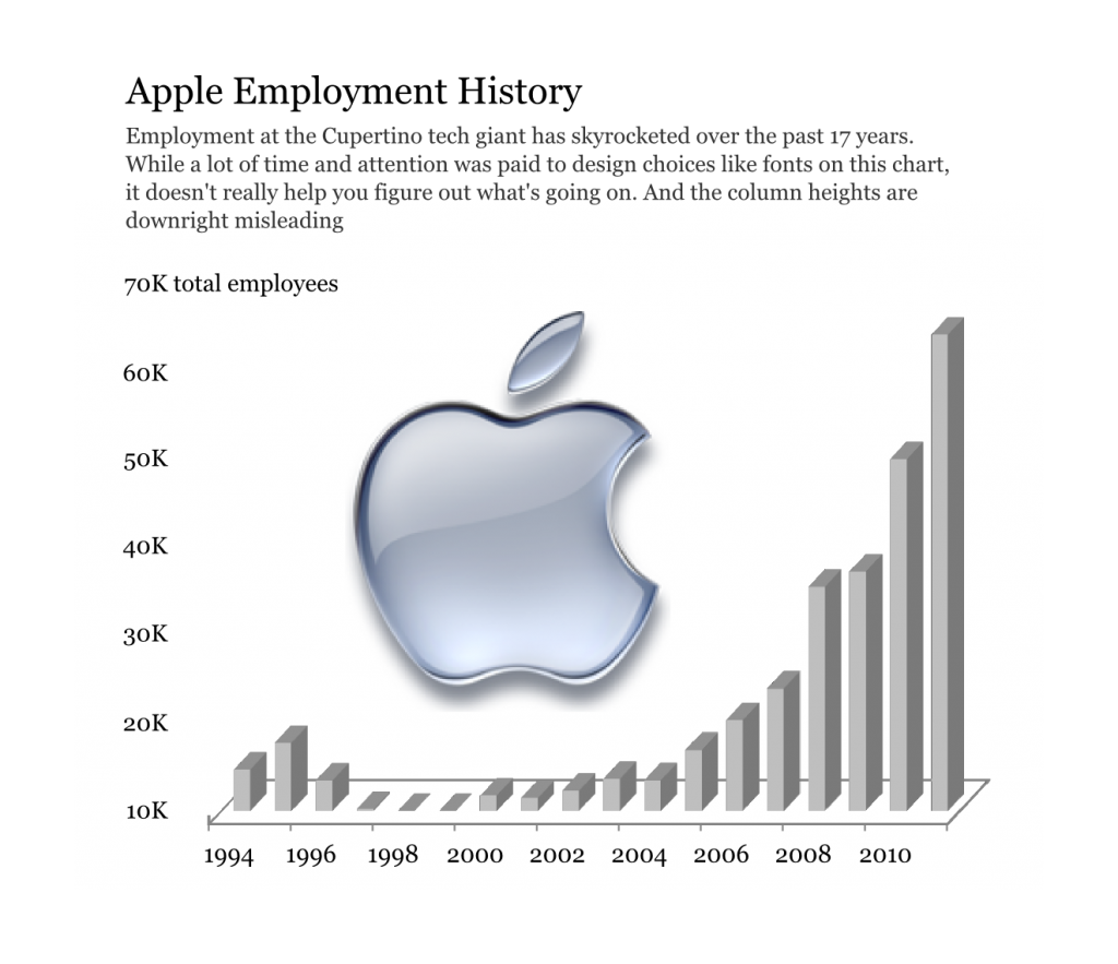
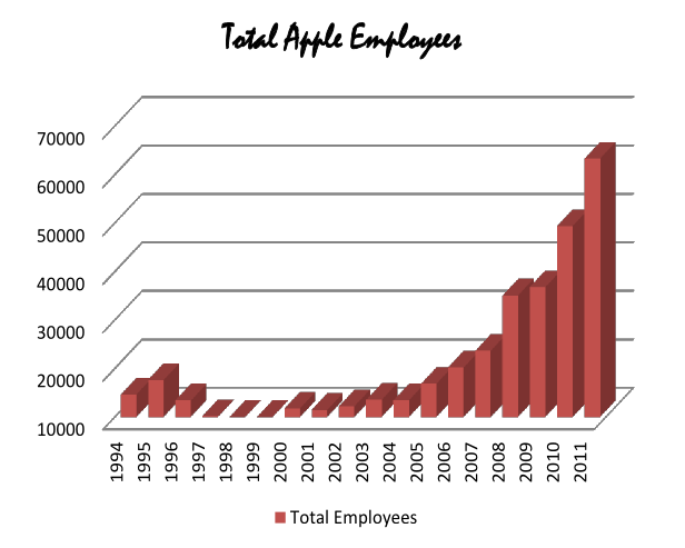
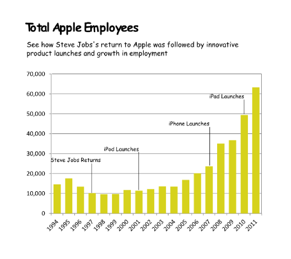
Here are all four attempts, shown in their respective quadrants, followed by a break-down starting with the insidious Quadrant IV and working our way counterclockwise to the commendable Quadrant I:

Quadrant IV – Confusing yet Beautiful
Quadrant IV is for pigs with lipstick. Before you cry foul about any 3D chart being called “beautiful”, let me explain:
- Well placed & aligned title & lead-in
- Attention to detail with font selection
- Inclusion of image
Why is it “confusing”?
- Y-axis starts at 10K (column height misleading)
- 3D effect makes it difficult to gage heights
- Title & lead-in aren’t helpful
The biggest problem with Quadrant IV is that it masquerades as something that can impart knowledge, but it either befuddles or beguiles. I agree that the 3D is an automatic turn-off and detracts from the overall beauty. Not everyone feels that way, or else we’d see less of them. Just take a look at the finalists of the “bad graph contest” by Naomi Robbins (with two or three advil in hand)
Quadrant III – Confusing and Ugly
This poor and sorry quadrant reminds me of the old high school joke, “She may be ugly, but she’s dumb.” The point is that there are no redeeming qualities about this chart.
- Horrible font & color choice
- Grid lines are too dark & distracting
- Format of axes (vertical x-axis labels, number format of y-axis)
Why is it “confusing”?
- Y-axis starts at 10K (column height misleading)
- 3D effect makes it difficult to gage heights
- No lead-in or call-outs to provide context
This is basically an out-of-the-box Excel 3D column chart with an unfortunate change to the font of the chart title. If you don’t think this type of graph would really be created by anyone, think again.
Quadrant II – Clear but Ugly
Quadrant II is our blue-collar classic. It shows up to work with a lunch pail, gets the job done, and goes home. No frills, no finesse. And yet it leaves something to be desired. A certain elegance of form.
- Poor color (puke yellow?) and font (Comic Sans?) choices
- Slightly pixelated – poor attention to image quality detail
- Chart details – axis orientation, grid lines, outline
Why is it “clear”?
- The y-axis starts at 0 and the 2D columns are easy to gage
- For the first time, we see call-outs of relevant events on the timeline
- This time the lead-in paragraph is actually informative
Again, in a time crunch, by all means crank out a Quadrant II chart rather than IV or III. It does the job. I learned something from this chart that the other two just didn’t teach me. “B for effort”.
Quadrant I – Clear and Beautiful
Saving the best for last, we arrive to the Northeast – Quadrant I. This is the zone of the homecoming queen who is also the valedictorian and captain of the softball team. As such, occupiers of this quadrant have many admirers, but also many jealous detractors. Let’s break it down:
- Good font & color choices throughout
- Soft gridlines don’t distract
- All elements well aligned and spaced
- High res images are “useful” chartjunk
Why is it “clear”?
- The y-axis starts at 0 and the 2D columns are easy to gage
- Call-outs with images aid cognition
- Improved title & lead-in verbiage provide further elucidation
- For the first time, a photo credit and data source are included
At the risk of calling my own baby beautiful, this graphic is what it could and should be. It took more time than the rest. A lot more time. And more time could be spent polishing it further. Suggestions & feedback are more than welcome!
For all the business folks out there – would you appreciate seeing your company data displayed in this way? We expect this from the NYTimes, and we’d even expect it from a high-paid consultant group. Why don’t we expect it from our own colleagues? Instead of twenty five slides with poorly designed and unclear charts, what if we captured the story in a single data visualization. And then handed it out. I think meetings would be a whole lot more productive.
“Mutual Improvement” Data Viz Support Groups
One of the things I love about the online data viz community is that there are great examples of people converting Quadrant IV and Quadrant III charts into Quadrant I charts. Here are some recent posts of blogs I like to follow that rescue charts in distress:
- Storytellingwithdata.com: Cole Nussbaumer converts IV to I for Google
- Vizwiz.blogspot.com: Andy Kriebel rescues a Nielsen infographic:
- Forbes.com: Naomi Robbins points out issues with scale
- The Why Axis: Bryan Connor sets free the Reuters Greek Election Poll Results
“Self-Help” Resources for Data Viz Entusiasts
All great examples of what to do and what not to do. I also should point out that much of what I have learned about designing charts and graphs properly from an aesthetic perspective comes from Nathan Yau’s recent book Visualize This. If you haven’t read it, you should. Other great resources are Stephen Few’s Show Me the Numbers and Edward Tufte’s The Visual Display of Quantitative Information. All three are absolute classics.
Next Post: Part 3 of 3 – Clarity or Aesthetics? Tips for Achieving Both
Thanks for stopping by!
Ben

Awesome post, Ben. Thanks for the mention!
Hi Cole – much thanks for the reason for the mention!
Pingback: Teaching data visualization: Recommended readings and resources