Part 1 of 3:
 It seems like every field has its version of the Hatfields and the McCoys – feuding families that just don’t see eye-to-eye. If this applies to Data Visualization, then surely the battle lines are drawn along the boundary separating clarity and aesthetics. A data visualization (hereafter “creation”) is simply an image conveying a quantitative truth (more complete definition here), and the focus is either to inform, to entertain, or both.
Disclaimer
For those solely seeking to entertain (“data artists“), this post won’t really apply to you. For the rest who want to impart some understanding about our world, I’d like to share my two cents about how I think about this debate, including a framework for evaluating creations from both angles – my hope is that it will be useful to you.
An Analogy from Engineering School
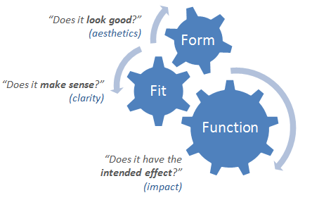
 In engineering school, we were taught that the way to characterize something in the physical world is to define its “form, fit and function”. Mechanical design requires properly specifying these three components. I’ve found that this approach translates into the world of Data Visualization – a creation’s “form” (how it looks – or, aesthetics) and “fit” (how it matches reality – or, clarity) combine to produce some “function” (an intended effect – or, impact).
“Start with the End in Mind”
For example, when I created my tribute to Wayne Gretzky last year, I wanted to convey the awe of a child growing up in Ontario, Canada in the 1980’s. The final creation includes aesthetic elements (slightly washed-out background image & Edmonton Oilers color scheme) as well as quantitative elements (scatterplot of goals & assists of the top 100 career points leaders – with Gretzky way in the lead). Both are included to deliver this intended effect. At the time, I felt strongly that the data by itself would have only gone part way and the overall impact on the audience would have been less. I could have been wrong, but I don’t think so.
Introducing a Chart for Charts
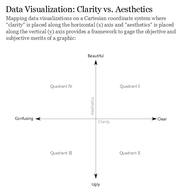
Let’s imagine for a moment we could somehow quantify a creation’s “clarity” and “aesthetics”, and that they are completely independent parameters (not true – more about this later). We could then create a Cartesian coordinate system with clarity mapped to the horizontal (x) axis and aesthetics mapped to the vertical (y) axis as shown below:
Clarity
We can come closest to objectively quantifying a creation’s clarity – or how quickly and effectively it imparts to the audience an accurate understanding of some fundamental truth about the real world. We can scientifically measure the time to arrive at some ah-hah moment, the percent of people who “get it” in a certain amount of time as determined by some follow-up test, and we can even track users’ eyes as they gaze upon the masterpiece to determine how much cognitive load is piled on. Fortunately, there are well established rules of thumb to guide which type of visualization to use to convey specific types of information so as to reduce this load. Let me be clear: being clear matters the most, and it’s not even close.
Aesthetics
Clarity may be easy to lock down, but alas, aesthetics will never be so cooperative. Of course the problem with aesthetics is that the over-used cliche – beauty is in the eye of the beholder – is very true. What looks beautiful to me here and now, is not what looks beautiful to you, and may not even look beautiful to me there and then. And so we have a problem when it comes to the y-axis. The universal standards of “beautiful” elude us, and always have. For some, clarity is beauty. For these data purists, the system reduces from a two dimensional plane to the one dimensional line, x=y. I suspect for others, these two aspects are indeed quite independent, and “creative” or “novel” approaches are valued over the tried-and-true. As for myself, I tend to recognize clarity as beauty and I often see adornment as ugly, but not always. I tend to feel that novel is often worse, but not always. There is such thing as useful chartjunk. There is also (more often) harmful chartjunk. Knowing the difference is the hard part. But more subtle than that, font and color choices can have a profound impact on aesthetics. Picking the right ones can increase the overall impact, which is ultimately what matters, right? The point is to force ourselves to evaluate the aesthetic qualities of a data visualization, articulating our opinion and comparing notes with others. We won’t always be within a stone’s throw of each other on the plane, but not throwing stones is also the point. And yes, aesthetics should only be discussed once clarity has been achieved.
The Four Quadrants
And so the result of mapping data visualizations in this way is a four quadrant grid:
- Starting in the northeast, Quadrant I is for the winning visualizations that are both clear AND beautiful.
- Heading south is Quadrant II, where those unfortunate clear but ugly visualizations live.
- Heading west from there is Quadrant III, the saddest plot of land reserved for those ugly AND confusing works that should never have been.
- And finally, to the northwest is Quadrant IV – the insidious land of the visualizations that stun you with their graphical beauty, but don’t impart a lick of understanding of the real world, at least not of the accurate sort. Even worse, they tend to mislead the reader, sometimes with malicious intent.
These last ones are the ones that started the bullets flying, after all.
Next Post (Part 2 of 3): An Example – Apple Employment (in Each Quadrant)
All the best!
Ben


please link your next article in this series at the end of this article and provide a link to this one at the beginning of the second and so on…it would make them easier to follow in the long run 🙂 thanks!
Got it, thanks for the tip! I added some hyperlinks to make navigation easier.
Pingback: The Week In Data » OWNI.eu, News, Augmented
Pingback: Recommended readings for the infographics and visualization course by Alberto Cairo | New Media and Non Profits
Love this series! Putting your thoughts on an axis helps instantly explain the idea. Thank you!
Thanks Matt! I think it’s a habit ingrained in me, for better or worse, as a result of attending business school. I’m glad it worked for you in this case, and thanks again for letting me know.
Pingback: Data Visualization: Clarity or Aesthetics? | Блогът на K&D