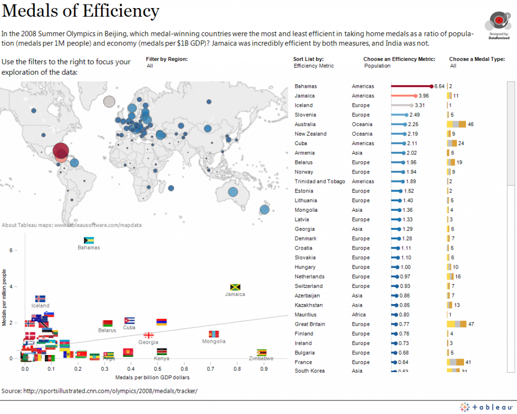
The opening ceremony of the Summer Olympics starts today in London, and I’m sure we’ll all be deluged with a flood of olympic [infographics]. At the risk of adding to the noise, here’s a link to an interactive dashboard created with Tableau Public that let’s you explore which countries were the most efficient in taking home medals last time, when Beijing held the games in 2008.
How to define “efficiency” in taking home medals? Two ways: 1) medals divided by population, and 2) medals divided by the size of the economy (GDP). 2008 figures were used for all ratios.
Here are some of my quick findings:
- I’d have to give Jamaica the nod as overall medal efficiency winner, ranking #2 in both categories.
- On the other side of the coin, India was the least efficient medal-winning country in both categories, but remember, many countries won no medals at all.
- Of the top 10 medal winning countries, Australia was the most efficient in terms of population, and Ukraine was most efficient in terms of economy.
- Even though the US won far more medals (110) than Canada (18), Canada was more efficient (0.54 per million ppl) than the US (0.37 per million people) in terms of population. (Did I mention I’m Canadian? I choose my moments.)
Thanks for stopping by, and thanks to Nick Harris of sportingintelligence.com for posting a version of this dashboard (here) at his great sports data site.
Ben
(This project was used as an entry in the Olympics Challenge at visualizing.org. In spite of the fact that judging hasn’t happened yet, please use the comments section to let me know what you think – the good, the bad and the ugly, as always. Criticism is just data, afterall.)


Well done Ben!