
I love chess. Lots of people say that to sound smart, but not me. A 6 year old and an 8 year old have both played me to stalemate, and not because I let them. Of course, the saving grace is that they are my sons, so my abject shame is replaced with a dad’s pride. Losing to your kids is kind of like winning.
In spite of this fortunate side effect, I put together this winning chess openings dataviz with Tableau to make sure neither budding wiz kid’s king slipped through my fingers again. At least not any time soon. It uses data from this website, which I was not able to substantiate with a second source, so take it with a grain of salt (thanks, internets).
How was it made?
1. The time-consuming part was converting each of the 20 openings in the viz from standard chess notation in the website to a spreadsheet structured as follows (each row corresponds to a specific piece on the board, e.g. wp1 = white’s first pawn, on square A2 to start the game):

2. Once all of this was converted to an Excel spreadsheet, the win/draw/loss stats were added to each row, and the Tableau reshaping tool was used to convert the spreadsheet to prepare for connection with Tableau.
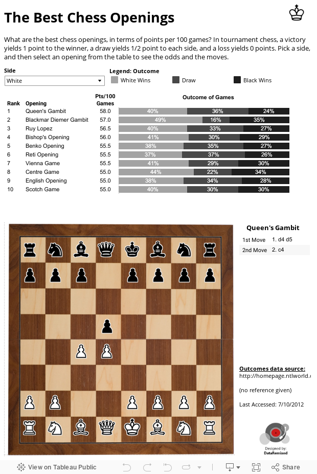
3. A chess board image and chess piece images were found using Google Image search.
4. I started with the chess board view, which looks as follows:

4a. I added the “x-pos” field to the column shelf and the “y-pos” field to the row shelf and converted each from a SUM to a dimension (32 small circle shapes appeared in the general positions of the pieces).
4b. I added the chess board background image by selecting Map > Background Images > Add Image, browsing to the chess board image file location, setting the coordinates to -0.35 and 9.35 for both the x-axis and the y-axis, and selecting “Always Show Entire Image” in the Options tab. Voilà.
4c. I dragged the “Piece” field to the Shape shelf, clicked the down arrow in the “Piece” legend that appeared in the bottom left and selected “Edit Shape…”. I had saved the chess piece images in .png format to the “My Tableau Repository” and “Shapes” folders in a new folder I created called “Chess”. Then it was a matter of choosing the “Chess” option from the “Select Shape Pallette:” drop down menu and assigning the right image to the right piece code (wk = white king, bk=black king, etc.).
4d. The Quick Filters were added to limit the board view to one and only one opening (instead of showing all of them overlaid on one another, which just jumbles all the openings into one view).
5. A stacked bar chart was created for the chess opening outcomes as shown below:

5a. This is basically just a stacked bar chart with some fancy formatting, but the starting point is a bar chart with the “Opening” field in the Rows shelf and the “Frequency” field in the Columns shelf, with the “Outcome” field in the Color shelf. Also added are the rank and the Pts/100 Games fields. The only trick was the sorting – I wanted to sort based on the Points per 100 Games, but had to do so manually. I’m pretty sure there was a better way to do that, but ran out of time.
6. After that, I just made a simple table for the move notation and a “Hover for Instructions” image, and dropped everything into a Dashboard.
In case you want to try it out, here is the Excel spreadsheet, and you can download the completed Tableau Public workbook by clicking “Download” in the bottom right corner of the workbook above. Good luck! If you have any questions or suggestions on how to make it better, I’d love to hear it.
Thanks for stopping by!
Ben

Nice – but you only show the best openings *for white*, it would be good to see the best ones for black too.
Hi Mikael! Thanks a lot for commenting. The black openings are actually already there. To see them, 1) click on the drop down list to change from “White” to “Black”, and then 2) click on the name of a black opening in the outcomes table (e.g. “Sicilian Defence”). The chess board view and moves notation column should adjust accordingly. I hope that helps – let me know if you can make it work!
Why does Blackmar Diemer Gambit have a much higher winning % (49%) vs. Queen’s Gambit (only 40%). Should a beginning player stay away from “Gambit” openings? (With black openings I feel the key is for black to control the black ‘diagonals’.. you can do that with an opening response of G7-G6 or G5).
Good question – this is all expert vs. expert data I believe, so it probably doesn’t apply very well to beginners. The strategy a beginner should use when playing another beginner would be a different question all together. I’d think avoiding gambits would be a smart idea.
Pingback: State of Data #116 « Dr Data's Blog
If you play chess online with “chess.com” or “gameknot.com” all of the opening databases are available to help you decide on the best move. It’s kind of cheating if you ask me but it does teach you some of the best standard openings and helps you weigh your options.
Cool, I’ll try it out. Thanks!
Blackmar Diemer Gambit has a good winning probability. but, Nowadays it is rarely played in the big Tournament even in small tournament I never saw people use it. But, I an in total agreement with Queen’s Gambit.
Hey, thanks for sharing the great piece of information on web. I hope it will be helpful for the beginners. Keep it up!