
At the Tableau Public blog, we’ve chosen to focus on political data visualizations during the month of October, since election day in the United States is right around the corner. We’re using the hashtag #VizTheVote to collect our posts and to encourage others to share their thoughts on an aspect of our world that is rich with data (or at least should be) and is also ripe for visualization.
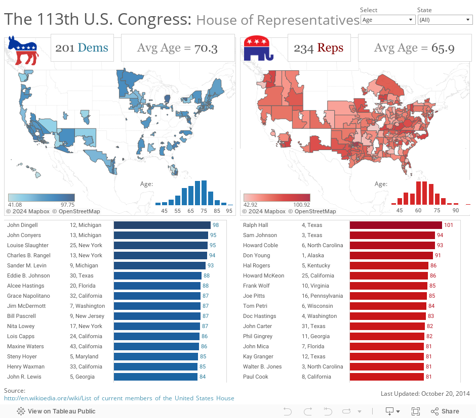
In this blog post, I’m going to show you how to take advantage of a seldom-used mapping feature in Tableau Public 8.2: built-in U.S. Congressional District shapes. First, let’s look at a viz showing the 113th House of Representatives by either age or tenure, then I’ll go into detail about how it was made:
Step 1: Get the Data
If you look at the Wikipedia page showing the “List of current members of the United States House of Representatives by age“, it looks like this:
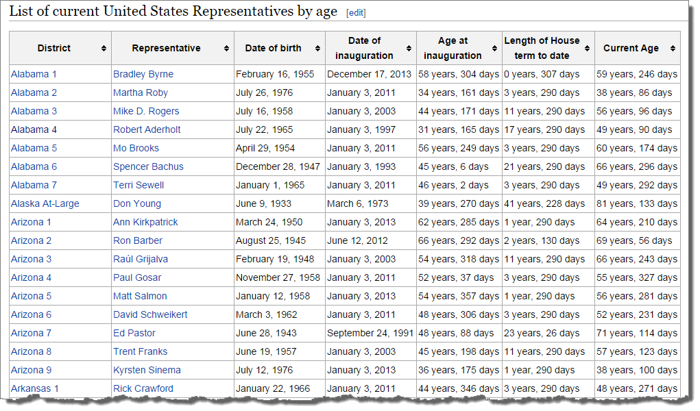
I copy and pasted this table into Excel and added a column indicating which party each politician belongs to. Step 1 done.
Step 2: Structure the Data
This table is great, but notice the first column – “District”. It combines the state and the congressional district number into one geographic field. In order for Tableau to recognize the congressional district and apply the correct shape, these two fields need to be separated into a “District” column and a “State” column. I did this in Excel using “Text to Columns”. Here’s an image of the final Excel spreadsheet I used to build the viz:

Just the number itself suffices to automatically draw congressional district shapes in Tableau, but there are a few other variations that will also work, as shown in the Geographic Role table below:

Step 3: Visualize the Data
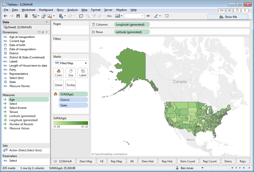
Connect a new Tableau workbook to this spreadsheet and make sure the geographic role for District is set to “Congressional District” (right click on the District pill). Then, do the following:
- Double click on “Latitude (generated)” (goes to Rows) and “Longitude (generated)” (goes to Columns)
- Drag both “District” and “State” to the Detail shelf
- Change the Marks type from Automatic to Filled Map
- Drag “Age” to the Color shelf (Age is a calculated field calculating the DATEDIFF between today and the age of birth)
Here’s an image of the map that shows the age of each member of the House of Representatives, with darker colors indicating older reps:
Step 4: Create the Dashboard
This last part is Tableau 101 and a maybe a little bit of 201. I won’t go into detail about how to create the additional Sheets and combine them on a single Dashboard, as I go into detail on how to do this in Chapters 13 and 14 of my book Communicating Data with Tableau.
Interesting to notice a few things: that congressional districts are split on a coastal vs land-locked basis, that some members of the House are quite old and have hung on to their seat upwards of 5 or 6 decades (John Dingell, Michigan 12). Mostly, though, I hope you notice that creating choropleths of congressional districts in Tableau is quite easy.
For more data at a Congressional District level, check out the U.S. Census Bureau “American Fact Finder” table, or use this CSV I downloaded from the Census site that is ready to import directly into Tableau.
Thanks for stopping by,
Ben

Do you know if there is a dataset that has all the zip codes that roll up into a congressional district?
Hi Orien, I believe this resource at census.gov may have what you’re looking for. Good luck!
Orien, try this. http://mcdc.missouri.edu/websas/geocorr12.html
Good luck!