
 Previous – “Part 1: Gaps Between Data and Reality“
I’m reading “Thinking, Fast and Slow” by Nobel Prize winner Daniel Kahneman – a frighteningly interesting book about cognitive biases and “heursitics” (rules of thumb) in decision making. If you deal with numbers at all and haven’t read it yet, you should. In it he refers to an article by Howard Wainer and Harris L. Zwerling called “Evidence That Smaller Schools Do Not Improve Student Achievement” that talks about kidney cancer rates, of all things.
Kidney cancer is a relatively rare form of cancer, accounting for only ~3% of all adult cancers. If you look at kidney cancer rates by county in the U.S. an interesting pattern emerges, as he describes on page 109 of his book:
The counties in which the incidence of kidney cancer is lowest are mostly rural, sparsely populated, and located in traditionally Republican states in the Midwest, the South, and the West. p.109
What do you make of this? He goes on to list some of the reasons people come up with in an attempt to rationalize this fact: residents of rural counties have access to fresh food, lack of air pollution, etc. Did these explanations come to your mind, too? He then points out the following:
“Now consider the counties in which the incidence of kidney cancer is highest. These ailing counties tend to be mostly rural, sparsely populated, and located in traditionally Republican states in the Midwest, the South, and the West.”
Again, people come up with various theories to explain this fact: rural counties have relatively high poverty rates, high fat diet, lack of access to medication, etc.
But wait – what’s going on here? Rural counties have both the highest and the lowest kidney cancer rates? What gives?
Insensitivity to Sample Size
This is a great example of a bias known as “insensitivity to sample size“. It goes like this: when we deal with data, we don’t take into account sample size when we think about probability. These rural counties have relatively few people, and as such, they are more likely to have either very high or very low incidence rates. Why? Because the variance of the mean is proportional to the sample size. The smaller the sample, the greater the variance (proof).
I found the 2007-2011 kidney cancer rate data and the 2010 population data for each U.S. county, and created this interactive graphic to illustrate the point that Kahneman, Wainer and Zwerlink are trying to make:
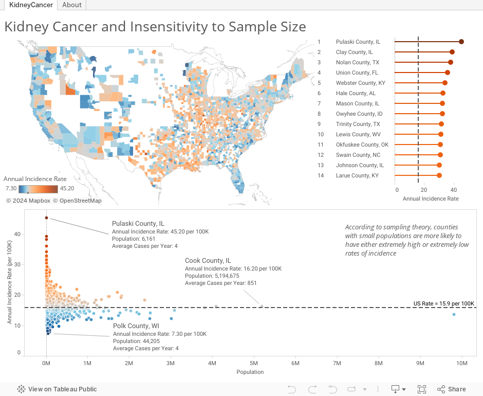
Notice a few things in the dashboard above:
- In the choropleth map, the darkest orange (high rates relative to the overall U.S. rate) and the darkest blue (low rates relative to the overall U.S. rate) counties are often right next to each other
- In the scatterplot below the map, the marks form a funnel shape, with less populous counties (to the left) more likely to deviate from the reference line (the overall US rate), and more populous counties like Chicago, L.A. and New York more likely to be close to the overall reference line
- If you hover over a county with a small population, you will notice that the average number of cases per year is extremely low – 4 cases or less sometimes. A small deviation – even just 1 or 2 cases – in a subsequent year will shoot a county from the bottom of the list to the top, or vice versa
Other Examples
Where else does “insensitivity to sample size” come up? My colleague Dash Davidson suggested “streaks” in sports, which can often be just a “clustering illusion“. We look at a brief sample of a player’s overall performance and notice temporary periods of greatness. We should expect to see such streaks for even mediocre players. Remember Linsanity? Similarly, small samples make some rich and others poor in the world of gambling. You may have a good day at the tables, but if you keep playing, eventually the house will win. And in investing, “diversification” is nothing more than a strategy to minimize exposure to extreme downside risks of individual securities (think Enron).
Kahneman and his long-time partner Amos Tversky even showed that 84 professional psychologists were subject to this very same bias, so experts are not immune.
Avoiding this Pitfall
So what do we do about it? How do we make sure we don’t fall into the pitfall known as “insensitivity to sample size”?
- Be aware of any sampling involved in the data we are analyzing
- Understand that the smaller the sample size, the more likely we will see a rate or statistic that deviates significantly from the population
- Before forming theories about why a particular sample deviates from the population in some way, first consider that it may just be noise and chance
- Visualize the rate or statistic associated with groups of varying size in a scatterplot. If you see the telltale funnel shape, then you know not to be fooled
In Conclusion
 The point of the original article by Wainer and Zwerling is that smaller schools are apt to yield extreme test scores by virtue of the fact that there aren’t enough students in small schools to “even out” the scores. A random cluster of extremely good (or bad) performers can sway a small school’s scores. At a very big school, yes a few bad results will still affect the overall mean, but not nearly as much.
Here’s another way to think of it: if Daniel Kahneman ever moved to Lost Springs, Wyoming, then half of the town’s population would be Nobel Prize winners. And if you think that moving there would increase your chances of winning the Nobel Prize, or that it’s “in the water” or some other such reason, then you’re suffering from a severe case of insensitivity to sample size.
Do any other examples of this pitfall come to mind? Ever fall into it yourself? Share by leaving a comment below.
Thanks for stopping by,
Ben

Great post, Ben. In the medical stats world the funnel plot (which unfortunately means two different things) has been around for a while and it could be useful for anyone interested in dataviz. The key papers are by David Spiegelhalter and can be tracked down easily on Google Scholar.
Would you care to comment about the pitfalls of the huge samples?
Those are more common now when majority of data analysts has access to a cheap data.
The problem with the huge samples is that one can find statistical significant correlation between anything if the analysis encompasses the huge data set. The issue here is that even events that have very low probability of happening will happen in the huge dataset. The same principle is used in particle physics with neutrino detectors. Those detectors are compensating for the tiny probability of the particle reactions with the huge reservoir of the particles.
Or to put it in the other way, if we have one in million chance to will lottery jackpot, we’ll surely win it if we buy over million lottery tickets.
Pingback: Erroneous Statistics and Ski Town Suicide – Data & Society Reflections