
I believe in the creative power of play in any discipline. Data visualization is no different. I’ve acquired new skills and grown in ways I would have never predicted, all because I spent a little bit of time playing with a data set I found intriguing. Here are a three recent side projects of mine, and a useful tip that comes from each.
1. Play specific YouTube video segments when users click on corresponding marks
I’m pretty sure most of you were aware that it was (the real) “Back to the Future Day” this past October 21st. To celebrate the occasion, as any data-loving 80s kid would want to do, I created a dashboard using what I call dimension line charts to show all 13 trips the DeLorean time machine took over the course of the trilogy.
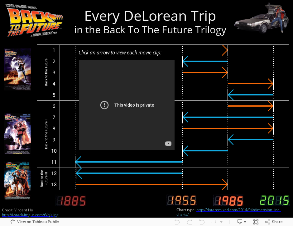
The dashboard gives the reader the ablity to watch the movie clip associated with each DeLorean trip by clicking on the corresponding arrows. To add this feature, I first had to find a video on YouTube that includes each time travel clip back-to-back. Then, I had to grab the embed URL for the video:
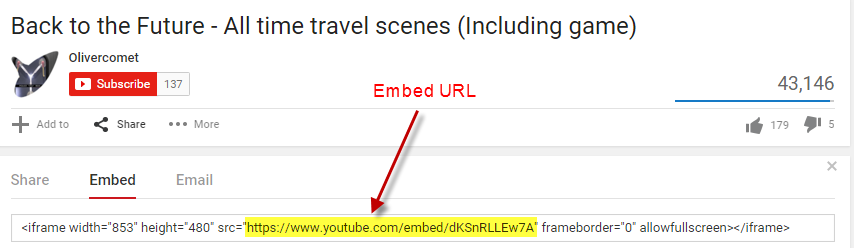
Finally, I had to add the embed URL with the following parameters to each row in the spreadsheet I created:
https://www.youtube.com/embed/dKSnRLLEw7A?start=XXX&end=YYY&autoplay=1
Where XXX and YYY are the start and stop times in seconds, respectively. The “&autoplay=1” parameter means the user doesn’t have to click the arrow and then click play. Clicking the arrow automatically starts the video clip.
Great Scott, that’s a cool tip!
2. Use the TODAY() function to have a countdown clock in your dashboard update every day
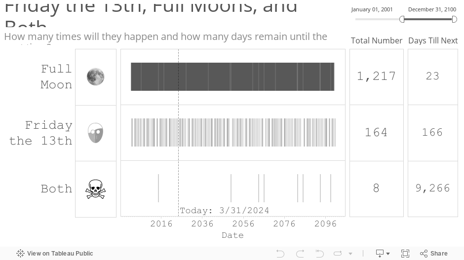
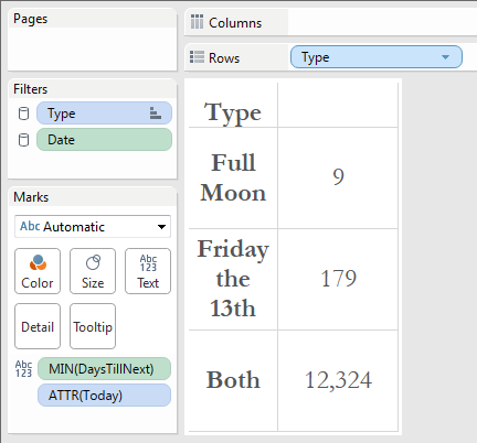
The genesis for this next project came from eyeo. I had the chance to present at the eyeo conference last year, and the day of my presentation happened to be both a Friday the 13th and a full moon. Spooky, right? I wondered how often these two events coincided, so I found a calendar listing of each one, and figured out all the instances in which they occurred or will occur on the exact same day:
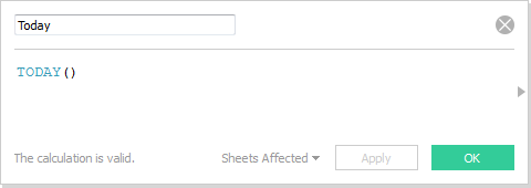
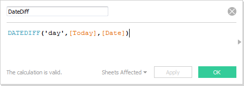
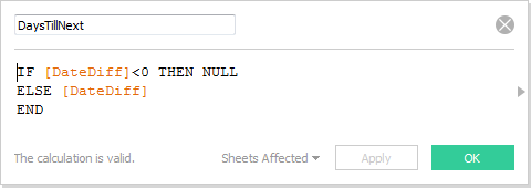
The helpful tip that comes from this side project is the use of the function TODAY(). To create the “Days Till Next” table on the far right hand side of the dashboard, I first created the following three calculated fields, the first to pull in the date value for “today”, the second to compute the number of days between today and each given event, and the third to null out events that have already happened in the past:
Next, I created a new Sheet and placed MIN(DaysTillNext) on the Text shelf, like so:
What’s great about this technique is that every day you load the dashboard, Tableau Public server will update all of these calculated fields, including the day that TODAY() maps to, and give you a brand new countdown. Who says Tableau Public dashboards don’t update automatically?
3. Invert the y-axis to stack marks downward — if you dare!
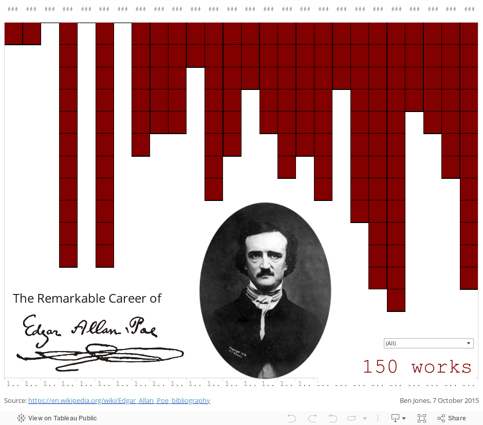
The third side-project was undertaken on the 166th anniversary of Edgar Allen Poe’s mysterious death. It was born out of a simple question: How many works of literature did the revered writer and poet produce over the course of his life? The following dashboard stacks 150 red boxes, one beneath the other, over the course of two and a half decades to visualize his prolific career:
WARNING: This is a dangerous technique! Just ask Christine Chan, who’s “Gun Deaths in Florida” viz, which used a similar technique, drew the widespread and harsh ire of the internet. People called her graphic “misleading” and “deceptive” for making something that was getting worse look to many like it was getting better.
Fair enough. I feel that in this case, the stacked boxes in the Poe viz isn’t as likely to be misinterpreted as a line chart which slopes “downward” from one value to a greater value. We’re just stacking boxes here, and it’s pretty clear that 1845 has “more” boxes than 1844, not less. By why do it at all? Why risk misleading with the inverted y-axis? It’s for dramatic effect – it makes it appear like blood is falling down onto Poe’s head. Dramatic effect is a double-edged sword, though, so tread with caution.
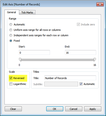
And to open the Pandora’s Box on this technique, simply right click on the axis you want to reverse (it can be the x-axis or the y-axis), and check the “Reversed” box:
Thanks, I hope you enjoy these side projects as much as I did. I hope you find the tips helpful (and that you don’t burn yourself on them!). What side projects have you learned from lately?
Ben
