
 I had the pleasure of reading Cole Nussbaumer Knaflic’s recently released book Storytelling with Data over the past week. I highly recommend it to anyone who uses charts and graphs to convey a data-driven message to an audience – that is to say, basically everyone.
In brief: Cole shows what clear and well-designed visualizations look like, and explains why they’re effective. She also gives sound advice on practices to avoid in most cases, such as pie charts, 3D views and dual axes. She stops a good exit short of Dogmaville, though, explaining that you should be able to give a good explanation why you’re using a challenging chart type if you decide to go that route.
Well beyond merely choosing chart types, the value of this book is that you will learn how to eliminate clutter, focus attention on what matters, and de-emphasize everything else. The pages are filled with high quality before and after images that bring the subject to full color and show you what “good” looks like.
She doesn’t deal with “How” from a tools perspective – her techniques and principles can be put into practice using pretty much any tool from Excel to Tableau to D3. And she doesn’t talk about “data dashboards” that are characterized by multiple charts and graphs placed side-by-side. The book deals entirely with individual visualizations and how they can be designed, annotated, and shown in sequence to tell a story and build to a coherent conclusion.
I especially enjoyed chapters 7 and 8, where Cole gleans lessons from theater, cinema and fiction and then shows how they can be applied to crafting a story with data, including determining flow and storyboarding. Chapter 8 concludes with a great example that I have attempted to recreate here using the Tableau Story Points feature. Note that this interactive graphic is entirely adapted from Cole’s work, not mine, and if you want to understand the principles behind this specific example, I encourage you to read the book:
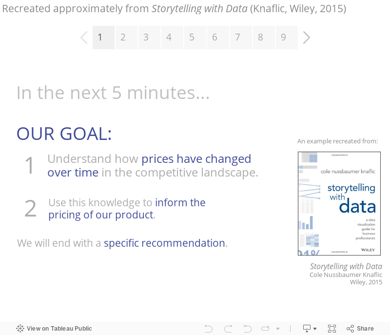
Excerpted with permission of the publisher, Wiley, from Storytelling with Data: A Data Visualization Guide for Business Professionals by Cole Nussbaumer Knaflic. Copyright © 2015 by Cole Nussbaumer Knaflic. All rights reserved. This book is available at all booksellers.
The book concludes with case studies that deal with special topics like survey data, animating visualizations, slopegraphs, alternatives to pies, and strategies to “avoid the spaghetti graph.” In each of these cases, what I really appreciated about the book is that Cole doesn’t merely provide platitudes, she shows with clear visuals what works well and what doesn’t work as well. The book reminded me of Naomi Robbin’s Creating More Effective Graphs in that regard.
If you’ve also read the book, leave a comment below and tell us what you think. I’ve added this book to my Recommended Books page. Note that Cole also has a blog that you can follow if you find her instruction helpful.
Thanks,
Ben

I read the book a couple of evenings ago and sacrificed a good nights sleep over it. A great read from stem to stern. The book reinforced my thinking gained from experiences and made me feel that simple data visualizations that are story driven is what will differentiate my presentations from the rest. This is important to me as a small business owner.
Thanks Cole, and I look forward your next installment.
Excel tutorial : Jon Schwabish of PolicyViz recreated Figure 5.13 using Excel and documents his process here. (You can also hear me and Jon discuss my book, color, and storytelling on this podcast .) Tableau Story Points example : Ben Jones of DataRemixed recreated the example in Chapter 8 using Tableau’s Story Points feature, which you can view here. (See Ben’s full review of the book here .)