
Have you noticed it as well? The tide is turning against dogmatism in data visualization, as witnessed by the increasing number of voices speaking out against a rigid approach and closed-mindedness regarding practices that are often ridiculed in knee-jerk fashion. It’s about time.
To which voices am I referring, and which data visualization practices are they defending?
1. Charts with non-zero y-axes
Can you tell Vox’s Johnny Harris and Matthew Yglesias have had it with readers taking pot shots about their choice of y-axis starting points? Their well-reasoned video entitled “Shut up about the y-axis. It shouldn’t always start at zero” says it all:
Harris and Yglesias show that the choice of axis starting point depends on the context, the unit of measure, and on the comparison being made.
2. Artistic approaches to data visualization
In Andy Cotgreave’s recent ComputerWorld article “Why Do We Visualise Data?“, Andy argues that not all data visualizations need to be burdened with the requirement of imparting ultimate precision of comparison. It depends on the purpose.
“The purpose of a visualization will also determine the extent to which you should inform effectively…Sometimes it’s more important to make someone engage with the overall message rather than the minutiae.”
Andy uses the example of Stephanie Prosavec’s “Air Transformed“: a wearable data visualization necklace showing air quality in Sheffield, UK:

Should this project really be ridiculed as “ineffective” and horribly contrary to “best practices”, with no place for it at all in the field of data visualization? Or could it be that this form of expression engages human beings in a way that a rigorous report complete with bar charts and compliant zero y-axis timelines of air quality in Sheffield could hardly do? Maybe both the report and the necklace are valid, each in their own way.
Which should you create? It depends on your purpose and your audience.
3. Pie charts
Oh, the poor, maligned pie chart. The chart type that gets pushed around and bullied on the data viz playground more than any other. Randal Olsen of /r/dataisbeautiful ran a twitter poll asking “Do you think pie charts should be banned from #dataviz?”. Scientific or not, nearly 2 in 5 responded affirmatively:
Another Twitter poll: Do you think pie charts should be banned from #dataviz?
— Randy Olson (@randal_olson) October 29, 2015
That’s amazing if you stop and think about it. Almost 40% of respondents, likely mostly data viz enthusiasts who follow Olsen, think that pie charts should never, ever, ever be used. Hilariously, Andy Kirk of Visualising Data asked whether we should also run a poll about whether those people should be banned, and Irvin Almonte’s response was sheer genius:
.@inivri Exactly, thank you! Pie charts are useful for showing simple proportions like this. pic.twitter.com/Rsg7e6ilBR
— Randy Olson (@randal_olson) November 5, 2015
Again: It depends. Say it with me: IT DEPENDS.
Pie charts, in certain instances, can actually be more effective than bar charts at showing specific part-to-whole comparisons. And if the part-to-whole relationship is far more important to your message than comparing uber-accurately between categories, and if there are a very small number of slices, go ahead, give thought to using a pie chart. Don’t be intimidated by pie chart haters. There, I said it.
4. Word Clouds
I entered the fray last week with my blog post “My 3 Basic Tenets of Data Visualization” in which I argued that rules of thumb, not black-and-white rules, should prevail, along with a spirit of humility and openness to exploration and innovation in data viz.
I also did the unthinkable: I defended the Word Cloud. The poor, lowly pal of the pie chart, united on the playground in mutual fear of the roving data-dogma bully. My point is that if you only had a very short amount of time to impress upon a large room of people the most commonly used passwords, which of these four visualization types would you choose?
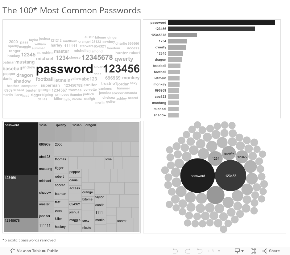
The word cloud sacrifices precision for completeness (all of the passwords actually appear on the screen in only the word cloud) and readability (the most commonly used passwords almost shout out at the reader). Is that a reasonable trade-off to make? Maybe. It depends.
Since that blog post, “What are your most used words on Facebook” has gone viral, and we’ve been inundated with over 16 million word clouds as of the writing of this blog post. Of course one can only hope this app is not a gigantic phishing scam, but do you think a bar chart version of your most commonly used words, or a concise and thorough text analytics report would have also gone viral? Maybe, but probably not. And I’m not saying “going viral” is a end that justifies all means, but in this case, ultimate precision of comparison is probably not needed anyway. It actually worked a little too well.
Let’s not let the pendulum swing too far, though.
This casting-off of suffocating restraint and a fearful spirit of ridicule is a REALLY GOOD THING in data visualization, but let’s not let the pendulum swing too far the other way. It’s true that pie charts are very often the wrong choice, and the majority of the time a y-axis that starts at zero is a really good choice.
I’m not a big fan of the word “best” in “best practices”, which seems to promise some optimal solution, but I do like the sentiment in this response by Vance Fitzgerald to my question on twitter about rules of thumb in data visualization:
@DataRemixed @UW Leverage the best practices of the dogmatic experts, but don't be dogmatic.
— Vance Fitzgerald (@vancefitzgerald) November 11, 2015
I’m hopeful that the next phase of data visualization is one that embraces the gray of “it depends” and encourages open dialogue and constructive criticism. In order to get there, we’ll definitely have to shed dogma. Let’s absolutely do so, but let’s also carry forward the principles and rules of thumb that just make good sense, while being open to the possibility that breaking those rules might be a great idea in specific situations.
Wouldn’t this be a more mature approach? Wouldn’t it also be more welcoming, and more enjoyable?
Thanks for reading,
Ben

Yes! Another reason to use less perceptually accurate vis (word clouds, pies, bubbles) is for uncertainty. If the data isn’t accurate down to the penny, I don’t want my readers percieving it as such and I can use less precise encodings like color, area, etc . to convey that. Bar charts are too precise for crappy data.
I absolutely agree with the y axis video, however the pie chart example is misleading. Which is bigger, C or D, and of how much? I can’t tell for sure.
If you plot the barchart with *proportions* rather than counts, it’s clear that category A is 50% (you just read on the y axis) and you also precisely see the relations with the other categories.
Sure, there are a restricted number of situations in which a pie chart is OK, just like there are situations when any generally bad practice is OK to use.
However, pointing out that one situation over the thousands of other situations in which it is not OK to use is it, is called cherry-picking…
Thanks for commenting, Nico. You’re absolutely right – if the difference between C and D really matters to you or your audience, then don’t use the pie chart. But in this post I’m agreeing with others that if such a comparison doesn’t matter at all, and if you only want to show visually, not with labels, that A is half of the total, then the pie chart is fine. There are many out there, as evidenced by Randal’s informal poll, that don’t agree that exceptions to the rules of thumb exist at all. Why else would they want to permanently ban pie charts? So I’m absolutely cherry-picking the exceptions to push back against the knee-jerk reactions of dogmatists that want to apply the rules universally.
Nico, showing an example of a pie chart that works for specific data is not cherry-picking. It’s called using the best suited visualization for the data in hand. I think this is the gist of the entire article and the way most visualization practitioners work. “With the data in hand, what is the most suitable visualization?”
This is such a great post! I have been thinking about the same idea since Vox posted the Y-axis video. I too, am hopeful for dogma shedding and the gray area being embraced in the future. I’m looking forward to this week’s data stories podcast, as they will be featuring the non-scientific “Dear Data” artists– just another example to your point #2. https://twitter.com/datastories/status/668575581022396416
Hi Catherine, thanks for commenting. Glad you agree with the sentiment here.
Also, I just signed up for your Skillshare course on drawing data – looks like a lot of fun. I’m actually going to try to take the course using Autodesk SketchBook on my iPhone. I loved your sketches of the 2015 Tapestry talks, and hope you’re able to join us for Tapestry 2016 in Colorado next year!
I strongly disagree with the video, and in addition they contradict themselves with the employment chart.
They seem to say context does matter in some regards, but not when they want to use it. I understand that with bar charts our eye is perceiving the whole vertical size, but wouldn’t it still be bad if Faux News used a line instead of a bar with no zero?
Their unemployment (or actually employment chart) is held up as “a really big deal, but if you chart this with zero you can hardly see the change at all”. Well perhaps that’s because the change in actuality is quite small and actually not a big deal. They then go back to the Fox News report, implying it is bad because it lacks some temporal context.
If we look at the % employment history linked below & w/o a zero line, we will see that the US went through decades with lower employment. Using their own methods I cannot agree with their employment assertions that it’s a “really big deal”
https://research.stlouisfed.org/fred2/series/LREM25TTUSA156S
Hi Kris, thanks for commenting. I’m hearing that you don’t like the unemployment example used in the Vox video, but what do you think about the overall point I’m trying to make in this blog post – that while including a zero anchor is often a really good idea, it might not be the best idea in all cases? That you might want to deviate from this rule of thumb to make a specific point to a specific group of people. Would you agree with that notion, or are you asserting that 100% of bar charts and line charts should include axes that start at zero?
An anchor of some sort needs to be required. Zero should be default, even for lines. One or 100 is the anchor if values are indexed or growth rates are compared. The only other alternative (say for relative scales) is a cohort of peers or past extremes, in which case the visualization is self-anchoring.
I disagree with your statement that “you might want to deviate from this rule of thumb to make a specific point to a specific group of people.” When you take a bar chart with two values A at 21 and B at 27 and you cut off 20 from the axis, then the mind pre-processes the image and loads into your head as B is 7x bigger than A rather than ~29%. Similarly with un-anchored line charts your eye is following the line, and overall up/down direction + variability are quickly perceived by your brain. By not anchoring, then you are pre-loading your own bias into the visualization. At the very LEAST you should give the user an option to anchor or provide other anchors.
The people in that video stated a ~2.5% drop in employment rate is “a big deal” and loaded their line visualization with that bias. but it isn’t. Data visualization should provide illumination to the viewer and let them discover what the data says rather than what the builder wants them to say. Now are deviations fine for data journalism? or infographics? data art? Sure! But I think data visualization should separated from those.
Hey Kris. Yeah, I think we pretty much agree. Regarding whether changes are a “big deal” or not, though, let me step away from the unemployment example for a moment if you don’t mind. I’ve worked in manufacturing environments where a very small change in the dimension of a raw material, say an inner diameter of a o-ring, would have disastrous consequences on overall yield rate. Now, if quality control were to plot the inner diameters of all inspected parts with 0 as an anchor point of the chart, you’d never notice a change that is small relative to the overall ID, but very large in significance. In those cases we used Control Charts (aka Process Behavior Charts), and there was absolutely no discussion of y-axis starting points. If anyone were to come in to the production area and say, “Oh, geez you guys, that y-axis is totally wrong – it’s misleading as hell and needs to start at zero”, we’d have looked at that person like he or she were absolutely crazy. The anchoring point for the context of manufacturing line was the control limits themselves, and the specification limits, not zero. Does that make sense? The knee-jerk “zero critique” doesn’t apply, because of context and frankly, money. Not throwing away expensive parts is more important to a company than adhering to a data viz rule of thumb that just doesn’t apply.
Kris, it seems to me that you’re disagreeing with specific examples in their video (the unemployment rate time series) while agreeing with their basic premise (that sometimes the y-axis should start at something other than zero). You’re actually providing a whole bunch of examples of other non-zero anchors, which I think is great. You’re even providing a revised rule of thumb – that charts should have axes with a meaningful anchor. That’s a better rule than “it should always be zero” in my opinion. I think that’s all anyone is trying to say here. It’s the knee-jerk “you’re lying if the y-axis doesn’t start at zero” reaction that we’re pushing back against. Make sense?
Sure, I see that I am fixating on the example and not the premise. Biology is the best example I have at the moment of not needing zero (and it was mentioned in the video with fever). I’m not getting back to my infant, child, or even teenage weight as I was still growing into an adult.
I’ll have to think about a few different (but common) classes of data and see if I can find some reasonable anchors.
Thanks.
Yeah, I’m pretty sure an axis anchor guidelines or cheat sheet reference would be HUGE!
Great post. Couldn’t agree more. I would like to see more people take a step back and consider the purpose of a data visualization and evaluate it on that basis, rather than on its objective form.
Another one I would add to the list is the “it’s basically a population map” criticism: https://xkcd.com/1138/ Gets thrown around far too often.
Thanks for commenting, Max. And that’s funny, I just taught the “basically a population map” xkcd concept to my data visualization theory class last Tuesday. That particular critique hasn’t struck me as over-done – is there an example you can think of where people piled on that criticism when the map was basically valid?