
I had a chance to visit the CUNY School of Journalism in New York City this past week to present some thoughts on data visualization to a group of business writers at the SABEW conference.

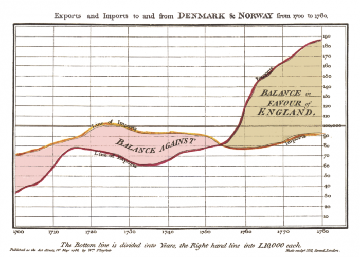
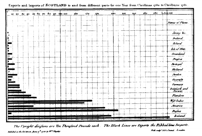
It occurred to me in preparing for the presentation that data visualization enthusiasts like me have a debt of gratitude to pay to the world of business writing. Why? Because it produced some of the earliest forms of visual encodings like the timeline and the bar chart, courtesy of Mr. William Playfair, who back in 1786 was visualizing England’s balance of trade with other nations:
I was in Washington DC earlier in the week, and as I was leaving my hotel, I picked up the business publication that was lying in front of my door, Emerging Markets. I opened the magazine and read through some of the articles on my taxi ride to the airport, and I noticed one on the very same topic that Playfair was dealing with all those years ago – namely, British exports, brought back to the forefront of the business news world thanks to Brexit and Article 50:
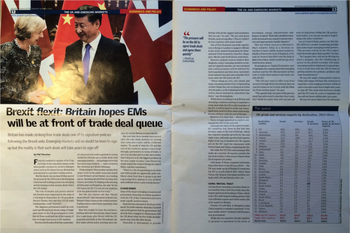
Notice the table in the bottom right corner? That’s UK exports in goods and services in 2013 to the top 30 countries, and a row for all others. I went ahead and copied the table over to Google Sheets and connected to the data using Tableau 10, and set about creating 10 different visualizations that I thought did a decent job of communicating the data to the writers at the conference. I put these 10 into a Story Points workbook and saved it to Tableau Public. Here you go!
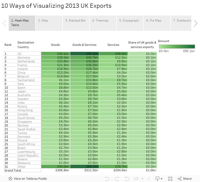
Each of the ten has its own strength and weakness. Emily Kund and I chatted about a particular challenge with the slopegraph version on Twitter earlier in the week:
What do you think? Do you have a favorite of the 10? Would you add an 11th? A 12th? As MakeoverMonday has so effectively shown us, there are many ways to look at even a simple data set like this. I see that as a good thing. It makes the field much more interesting to me.
Thanks for reading,
Ben
