
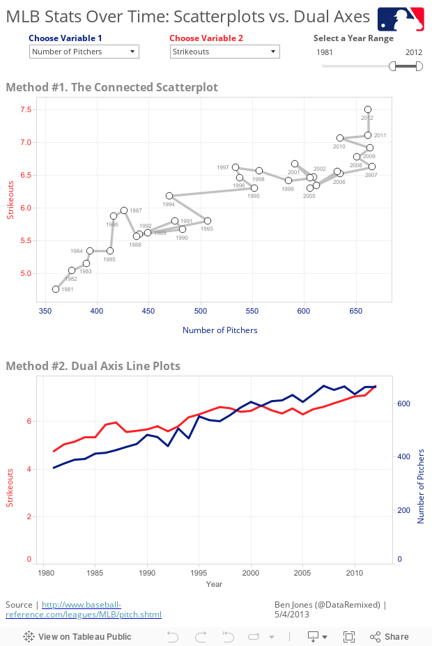
Shan Carter, Kevin Quealy and Joe Ward of The New York Times recently published a thorough analysis of the rise of strikeouts in Major League Baseball. In it, they showed how the number of strikeouts per game has risen along with the number of pitchers per game using two line plots, one for each variable. It’s good stuff, you should read it. I especially like the grayed out dots for each team, which give a sense of the team-by-team variation without overwhelming the reader.
I found the summary table for average MLB game stats since 1871 here, and I wondered what this correlation, and other pairings of MLB stats, would look like if they were plotted as connected scatterplots. Connected scatterplots are a visualization form that have have been featured at NYT recently (more about this form of visualization, including a number of examples, in Alberto Cairo‘s blog post “In praise of connected scatterplots“).
Here’s what it looks like, along with a second method show below it, the dual axis line plot:
Effort and Reward
I struggled with connected scatterplots at first. Maybe the engineer in me stubbornly resisted the notion of including time on anything other than the x-axis. But I found that after investing a small but not insignificant amount of time in orienting myself to the axes, the connected scatterplot actually became a fun chart to explore. To quote Andy Kirk, my effort was “ultimately rewarded with a worthy amount of insight gained.” (Kirk, Data Visualization – a successful design process, p26).
The connected scatterplot imparts a sense of travelling a pathway through a terrain that has twists and turns, loops and sudden rises and falls that encode how the two different variables changed together. It’s a roller coaster ride of sorts, and once you’ve on-boarded the cipher of the code, you’re out of the turnstiles and on your way.
The Other Method: Dual Axes
You have to admit, though, the dual axis line plots below the connected scatterplot do a fine job as well. In fact, they probably require the reader to invest less time upfront to begin to glean some insight (sorry, no experimental data on that claim). If my feeling is right, it probably has something to do with the fact that we’re more used to seeing changes over time shown from left-to-right. It’s still an abstract way to represent time, it’s just one we’re more familiar with.
Virtues and Vices
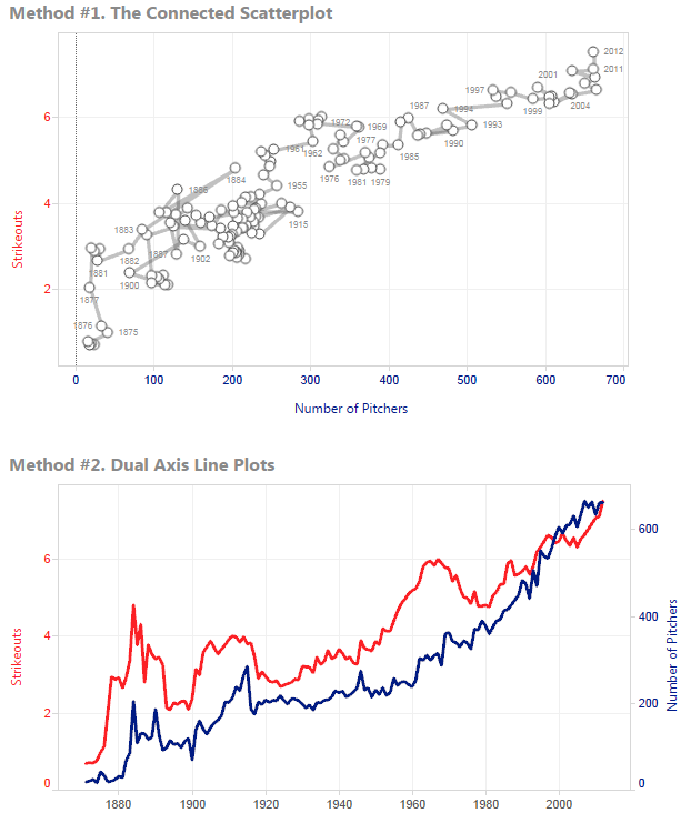
The dual axis method has some distinct advantages: if you open up the year slider to show the entire range from 1871 to 2012, you will see what I mean. The connected scatterplot becomes much more difficult to read, but the dual axis line plot does not require any additional effort. You can adjust the slide in the interactive version above, or here’s a screen shot:
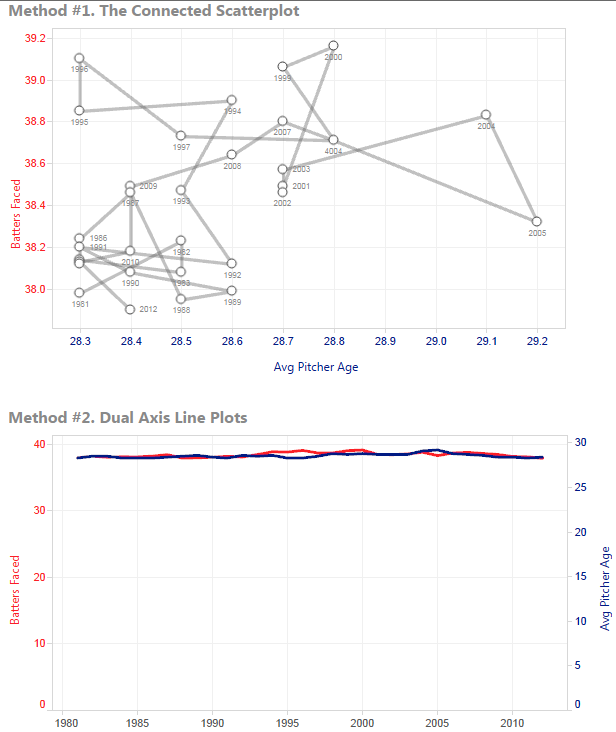
Additionally, not all pairs of variables render well in the connected scatterplot format, even with the shorter time window of 1981-2012. If one variable basically contains a bunch of random noise, or doesn’t change much at all, the connected scatterplot will look very jumbled, and will be hard to read since all the points will just form clumps. For example, change variable 1 to “Avg Pitcher Age” and change variable 2 to “Batters Faced”. What you get isn’t an exciting journey, it’s a wild goose chase, and you can see why if you take a look at the dual axis plot, which immediately tells the story – two flat lines:
In conclusion, my opinion at this point is that the connected scatterplot is a special case visualization type for showing how two variables change together over time – if it works well, it really works well. If it doesn’t, ditch it for the more all-purpose (and admittedly more utilitarian) dual axis line plot. I guess to go along with the baseball theme, my advice would be to swing for the fences if the pitch is right, otherwise just make contact and get on base.
How I made the connected scatterplot in Tableau
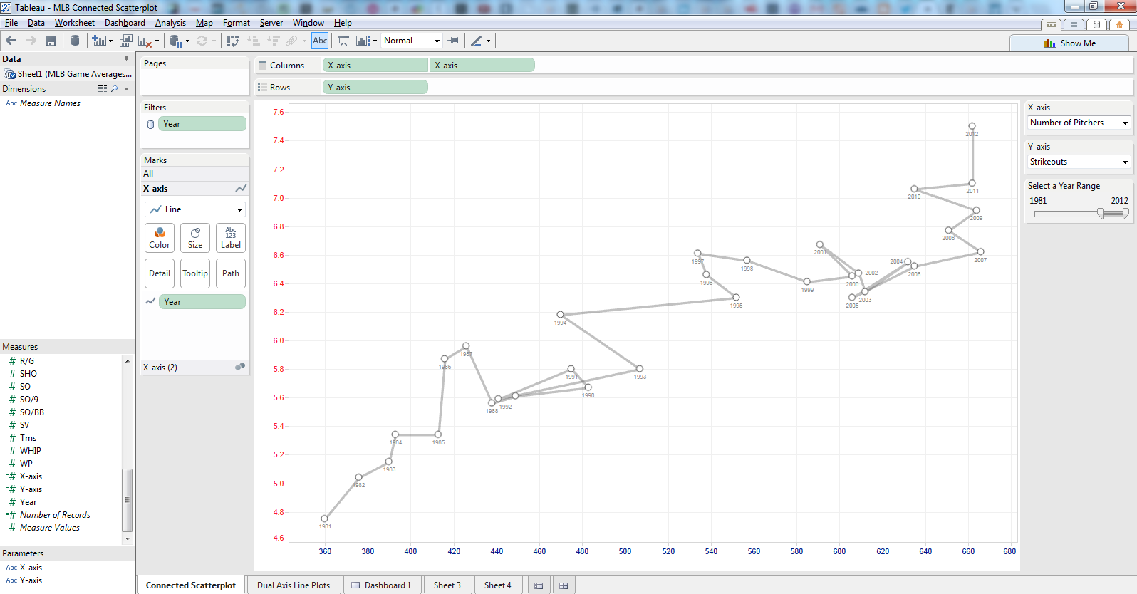
This section will serve as a very brief how-to for making a connected scatterplot in Tableau Public. The key is dragging “Year” to the “Path” mark landing pad.
Here are the steps:
- Drag the first measure you want to use to the “Columns” shelf and the second to the “Rows” shelf
- Convert both from SUMs to Dimensions by clicking in the down arrow of the pills and selecting “Dimension” (now you have a basic scatterplot)
- Change the Marks type from “Automatic” to “Line” and drag “Year” to the Path landing pad
- Also drag Year to Label
Of course I used Parameters to allow the reader to control the two variable types, and I also used a dual axis to format the data points but the above steps do the trick.
Here’s a screen shot of the final connected scatterplot sheet that I used:
Thanks for stopping by, and I’d love to know your thoughts on the virtures and/or vices of connected scatterplots,
Ben

Very interesting and nice blog post Ben.
I appreciate the comparison analysis of both visuals, connected scatterplot and dual axis line plots, and the nice data visualization you have done and shared in this blog post.
Thanks a lot Ramon. Much appreciated.
Hi Ben, if you sync the vertical axes of the time series to their respective scatter plot equivalents (same max & min), it may become evident that there is nothing really special about what the scatter plot tells or makes hard to tell versus the dual-axes. Your last zoomed-in example magnifies the scatter without doing likewise of the same magnitude in the dual axes. The noise will be more evident in the latter if done this way.
Worth mentioning that the biggest benefit of trialling a connected scatter plot is being able to overlay measures of scatter (e.g. trends, confidence bands, highlighting clusters) and visualise if & how time is a factor. But you need colour for this. Imagine in the last zoomed-in example if there was a single small step-up change in the middle of the dual-axes. The noise elongates but by adding Year to colour, we can highlight 2 possible clusters or trends. Of course, nothing that dual-axes can’t show but emphasising more the relationship between the 2 measures.
Pingback: Data Viz News [6] | Visual Loop
Ben,
I enjoyed this post a lot. Thank you.
I’m a sports journalist trying to learn Tableau Public to help add to my organization’s interactive/digital development.
I was inspired by this blog post — and I love what the NY Times graphics department does and I’m inspired by them as well — to see if I could recreate what the Times did with their main interactive graphic on strikeouts using Tableau Public.
I feel either my Tableau skills are either too rudimentary or Tableau Public just doesn’t afford all the tools I need to make it work. I can’t seem to fix a line chart of the MLB average over time on top of the teams’ year-by-year. Is there a way to do this like in the NY Times graphic. Do I just need to develop by skills further before attempting this.
http://public.tableausoftware.com/views/Strikeouts/Sheet1?:embed=y&:display_count=no
Hi Ian – thanks a lot for commenting. Sorry it took me a few days to get back to you! The trick to adding the MLB average is to use a feature called the “Dual Axis” plot – see this online help page. I went ahead and made a version with the MLB average included, which you can see and download here. I hope this helps!
Ben,
Thanks for the comparison of methods and the good links, I enjoy your thoughtful comments.
An additional con for the connected scatterplot method is the difficulty annotating date related events when dates don’t progress in an ordinal fashion. The NY Times original had several annotations which I found informative but difficult to add to the scatterplot. This is actually just a specific example of why connected scatterplots only work in special cases.
Normalizing the data is a third method for making these comparisons. I used your MBL data and setup (thanks) in this VIZ.
http://public.tableausoftware.com/views/MLBCorrelationsTotal/Totalcomparisons?:embed=y&:display_count=no
It calculates % Total to put all measures on the same scale. I think it is a cleaner method for comparing profiles than the dual axis and it has the additional advantage of allowing more than two comparisons on a chart.
Thanks again,
Dick
Pingback: Data Viz News [6] | Visual Loop
Pingback: Houses Keep Getting Bigger: A Data Visualization Rethinking | PolicyViz
Pingback: Connected scatterplots – learningtableaublog