
{Update, Feb 6th, 2014: I’ll be showing how to make the U.S. president dashboard below in a brief webinar on Friday, Feb 7th at 9:30am PT. Register for free here}
When studying history, we ask questions of the past, seeking to understand what happened in the lives of the people who have gone before us, and why. A data visualization of history suggests and answers a thousand questions. Sometimes, the value in a chart or graph of history is that it proposes new questions to ask of the past, questions that we wouldn’t have thought to ask unless the information were presented to us in a visual way.
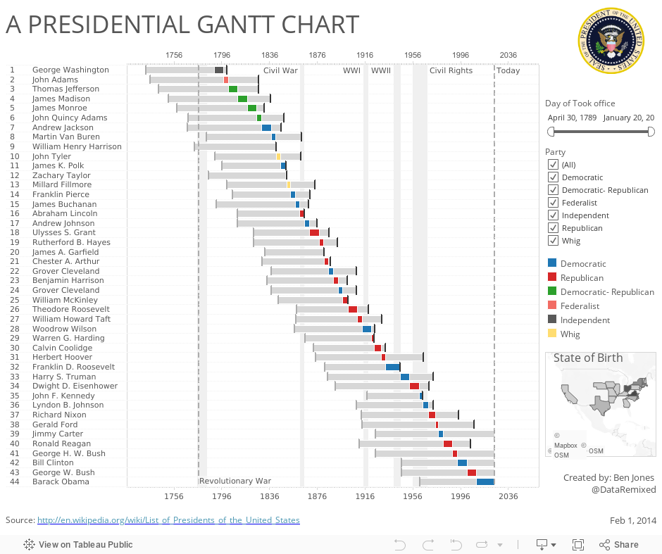
Visualizing Presidential History
Take the history of the United States presidency. Every high school student in the U.S. learns the names of a growing list of former presidents. They learn about the founding fathers, and the various wars and movements that occurred over the course of time. They memorize the names and dates, at least until the exam is over. Wikipedia provides a lot of information about U.S. presidents in table form.
But what if the string of U.S. presidents were presented as a gantt bar chart, as shown below:
Update, Feb 18th 2014: Pretty awesome to see versions showing Denmark’s presidents (by Kasper Ulvedal) as well as Sweden’s prime ministers (by Martin Lagnerö) and now India’s Prime Ministers (by Rachana Parmar) showing up since this was published. I’m thinking of crowd-sourcing a global version…
Observations from Data
Looking at the information in this way, rather than in table format, we can very easily see a number of interesting facts and patters, such as:
- Barak Obama is the first president who was born during the Civil Rights Movement
- No presidents were born during the Civil War, but two died during the internal conflict (Martin Van Buren and John Tyler)
- The first 9 presidents represented 5 different political parties
- Ever since Franlin Pierce took office in 1853, the presidency has been occupied by either a Republican or Democrat
- It’s pretty easy to spot the eight presidents that died while in office
- No president has lived longer after leaving office than Jimmy Carter (33 years and counting)
A whole host of observations can be made by looking at how the bars line up and overlap with each other.
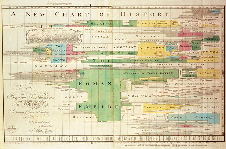
Visualizing the History of Civilizations
The gantt was the format used by 18th century theologian and chemist Joseph Priestley, one of the founding fathers of data visualization, in order to visualize the past. Priestley felt that an appreciation of human history would lead to human advancement and progress, and so he sought to educate the public about the civilizations that had existed prior to his day using this type of gantt chart:
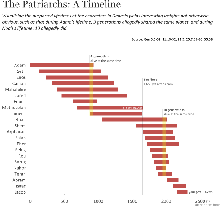
Visualizing Biblical History
One remarkable (or fantastical, as some would say) aspect of the Old Testament is that prior to the account of the flood, the characters in the pages of Genesis are purported to have lived hundreds and hundreds of years – over 900 in fact. According to the Biblical account, these patriarchs lived the vast majority of their lifetimes after having children. After the flood, the lifespans of successive generations of people in the lineage of Noah get shorter and shorter.
If true, this would have resulted in a situation far different from the one we experience. Today, 3 or at most 4 generations occupy the globe at the same time. If the record is true, Old Testament figures were acquainted with their family tree going back as many as ten generations. This observation is never directly mentioned in the pages of the Bible, but it suggests itself rather readily from a simple visualization of the lifespans using the gantt chart:
Visualizing Scandalous Political History
Last year, the team at La Nacion in Buenos Aires, Argentina, won the GEN Data Journalism Award for a series of reports outlining the suspicious expenses of Argentina’s Vice President Boudou. A “smoking gun” moment was when they presented Boudou’s expenses over time using a gantt chart. What became immediately obvious was that somehow he managed to incur reimbursable expenses in 6 different cities on the same day, as evidenced by the overlapping bars in the chart below:

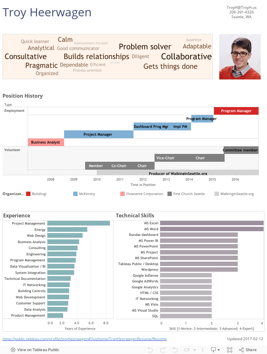
Visualizing Personal History
This last week, I had the pleasure of having lunch with a fellow Seattleite and Tableau Public blogger Troy Heerwagen of walkinginseattle.org. Troy created a visual resume in which his various professional roles are presented as a gantt bar, something that I’ve done in the past, as well as another Tableau Public author, Anya A’Hearn. Here is Troy’s version:
In Conclusion
It’s pretty simple: visualizing history using a gantt bar chart is a useful way to spot overlap in time – overlap of people with events, people with key dates, and people with other people. It’s also a useful way to spot patterns and identify impossibilities in a list of dates.
Update, Feb 6th, 2014: I saw this tweet today, and since it fits the theme of this post perfectly, I just had to add it:
Via @hoverbird, a bodacious example of history shown in a Gantt chart pic.twitter.com/vV1HRAVjxq
— Ben Jones (@DataRemixed) February 7, 2014
Thanks for stopping by,
Ben

Hi Ben
This is great! I LOVE Gantt bar charts. They’re one of my favourite views. I’ve created many for project management teams to manage their project portfolios. Seems to be very effective.
We also use them to keep track of upcoming audit check points in our IT environment.
Good to see the love
Cheers
@paulbanoub
http://www.vizninja.com
Hey Paul! Thanks for the comment, and glad to hear there’s another Gantt fan out there.
Hi!
Very interesting and well executed! You actually inspired me to have a go myself at creating a similar chart for Sweden. As we don’t have presidents, I had to make do with our Prime Ministers. I didn’t have much experience with Gantt charts before this, but I really learned a lot.
http://diagrammofon.blogspot.se/2014/02/svenska-statsministrar.html
Regards,
Martin
Very cool, thanks for sharing your version Martin, and glad the exercise helped you learn. I like how you added the images to your version. It adds a whole new dimension.
Terrific post, Ben! Really engaging visualizations and a very clever and clean application of Gantt Charts. The Patriarchs viz was enlightening for me (no pun intended), and the Presidential viz really encourages study and exploration. On the Prez viz, I especially liked the inclusion of the historical periods and the potent, limited use of color. Really a great looking, tight viz. Congrats!
I can’t wait to steal . . .er. . appropriate your methodology for some vizzes I’m working on!
Kyle
Thanks Kyle! Steal away 🙂 Let me know when you publish, and see you in a few weeks at Tapestry
Hello Ben,
Thanks for taking the time to seek into the biblical accounts. Sincerely, the Gantt’s charts are something that I dreamed to see, maybe, construct them. Inspired me to build the King’s lifespans Viz.
Thanks for the challenge!
Holanda.
Hi Holanda – very cool, I’m glad this project was inspiring for you. Be sure to leave a link in the comment thread when you finish your viz.
Pingback: Data Viz News [43] | Visual Loop
Pingback: PMs Visualized | yet another data blog
Hi Ben, just want to thank you for the amazing work and unique thoughts! I found this site via your dashboard template on chandoo.org and liked it immediately!
Really like the way you visualize data.
Thanks a lot Samantha! I appreciate it.
Pingback: Visualising Leadership: What Can Charts and Graphs Tell Us About Leaders? | Measuring Leadership
Amazing work! Was reading a paper by Dawson (2013) about using Gantt charts to display history (University of Alberta), and I did a search to find more examples. Your site is fabulous! So glad I found it! Dawson also writes about using filters on Gantt charts to display dynamics that might otherwise be overlooked. Great stuff. Thanks for posting your work! 🙂