
The following comments are in response to Stephen Few’s recent newsletter entitled “Information Visualization Research as Pseudo-Science” in which he critiqued an academic paper by Borkin et al entitled “Beyond Memorability: Visualization Recognition and Recall“. I’m not an academic researcher, so I will leave it to others in the field to respond to Few’s specific criticisms of the paper’s methods. My goal in this article is to respond to opinions Few voiced about memorability in data visualization.
I’d like to start by asking a few questions:
- Does it matter whether a data visualization is memorable or not?
- Should we, as data visualization practitioners, care about memorability?
- Should we design our visualizations so that those who view them are more likely to remember them at a later point in time?
- Is memorability a worthwhile area of study for those studying data visualization in academia?
In my opinion, and in my experience, the answer to each of these questions is ‘Yes’.
In Stephen Few’s recent newsletter entitled “Information Visualization Research as Pseudo-Science”, though, he put forward a differing opinion:
“Visualizations don’t need to be designed for memorability— they need to be designed for comprehension. For most visualizations, the comprehension that they provide need only last until the decision that it informs is made. Usually, that is only a matter of seconds.” – Stephen Few (emphasis his)
This statement helped me understand why Few and I disagree about memorability: we disagree about how data visualizations are used by groups of people. Simply put, I don’t believe data visualizations are “usually” followed by decisions “only a matter of seconds” later. That may be how a robot or a computer algorithm would approach decision-making, but it’s just not how groups of humans in organizations go about it.
How do groups of humans usually work with data visualizations, then? Well, analysts prepare dense packets for pre-reading materials, directors and VPs attend review meetings where they look at lots and LOTS of data and charts, sometimes they take copious notes, sometimes they zone out and check their smart phones, then they break for lunch, check their email, reconvene and consider different topics, only to have the final decision made at a totally different planning meeting or off-site weeks later.
Sound familiar? That’s a whole lot messier than question -> visualization -> decision in seconds. And that’s only one reason why memorability matters.
In my experience, the memorability of the overall message (of which the visualizations are a critical element) matters most when:
- Decisions won’t be made immediately
- The audience doesn’t care deeply about the topic
- The environment is already saturated in data and visualizations
To illustrate these three conditions, let me relate a personal story from my experience working with data and groups of decision makers. The specific details of the account have been altered to protect the innocent.
A Practitioner Wins Thanks to Memorability
One time I had the unenviable task of presenting the results of the launch of a product that was, shall we say, less than “top-of-mind” to the executives at a Fortune 500 company. Think “razor” of the razor – razor blade model. Sales should just be a pull-through, so they didn’t pay much attention to it at all.
But what we were finding was that the relative neglect of this high-touch product was causing a lot of dissatisfaction, and our lack of attention to the details of the product offering was causing us to lose customers.
In preparing for the presentation, I created plenty of nice, Tufte-compliant charts and graphs, like this one (a generalized mock up), to show how the recently-launched product was doing in the marketplace:
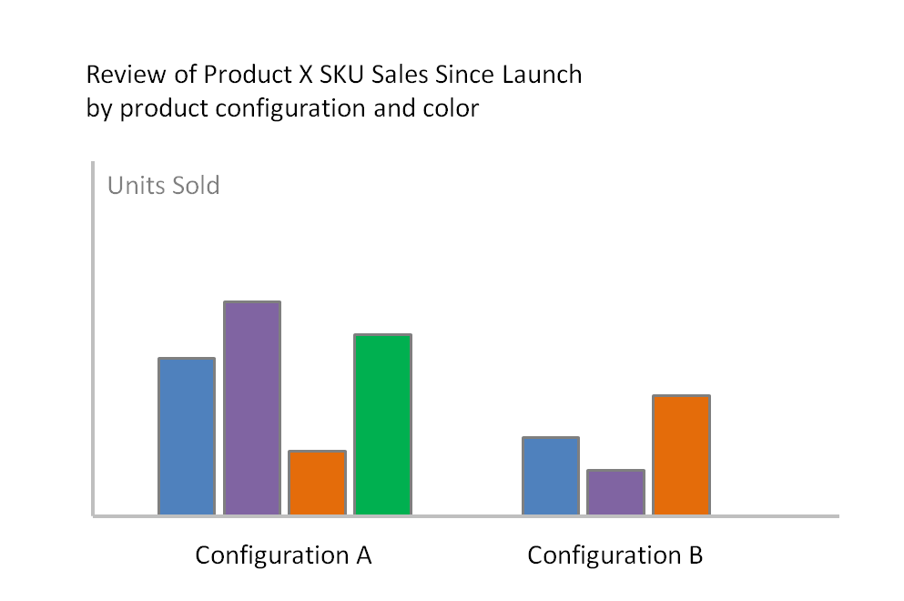
A comprehensible but not particularly memorable chart
Do you notice the problem in the chart? That’s right, we didn’t launch a green SKU in Configuration B.
Why not? Tooling investment.
Who cares? Customers did. A lot of them. The nature of the product was such that customers couldn’t select between A & B. There were factors that pre-determined that for them.
Now I was scheduled to be the fifth presenter in a very long review meeting where many other topics would be discussed, and as I mentioned, this product just didn’t matter to the executives. My charts were going to get glossed over. If the executives gave me 10 seconds of attention on each chart, I’d have considered myself lucky. The way the situation was shaping up, I felt pretty sure that this product line’s issues weren’t going to be addressed as a result of my presentation.
So instead, I showed charts like this, with actual photographs of actual customers and their actual quotes:
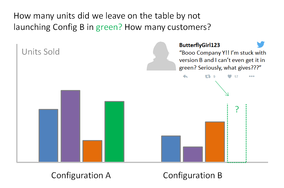
The same chart made more memorable by the addition of a human’s face and their own words
The result was palpable.
They leaned in. They looked at the faces in the pictures. Actual customers. People that looked like their sons, their daughters, their mothers. They chuckled at the funny social media handles. They cared. For the first time in a long time, they actually cared about the razor. And they cared about the fact that customers just weren’t loving it.
A few weeks later, I received an email that the go-ahead had been given to resolve a number of problems with this product line, including the missing green SKU in Configuration B. The VP thanked me for showing the “human side” of the data in my presentation.
When the time came to make the decision, they opted to fund a product they didn’t used to care about, thanks to charts they couldn’t forget.
Memorable or Comprehensible, or Both?
Stephen Few made the statement that comprehensibility matters, but memorability doesn’t when it comes to designing data visualizations. Well the original charts in my real-life example above were definitely comprehensible. I changed them because they weren’t particularly memorable.
My original charts were in the bottom right quadrant of the 4-blocker below, and all I did was push them up to the top-right. Sure, sometimes, it’s not necessary to do so. Sometimes, though, it’s make-or-break:
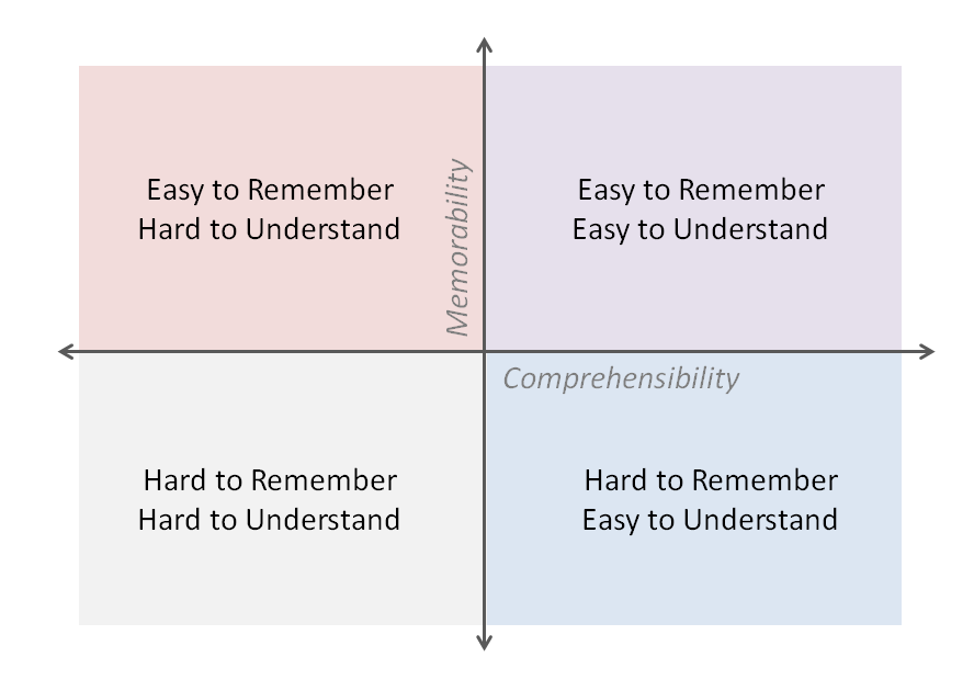
Note that for scenarios where the audience members already deeply care about the data, comprehensibility itself will result in memorability. Adding photos of beautiful, smiling faces just isn’t necessary.
But let’s be honest. Having an audience of 100% of the key decision makers that wait with bated breath for our next bland chart that results in a blank check being given right there on the spot just isn’t normal. It would be nice, sure, but how many times have you actually been in that situation? So many times you absolutely need them to remember your message. Having charts that draw them in and stay in their brains just isn’t a bad idea.
Sometimes There’s Just No Decision
So far I’ve written about data visualizations in the context of human decision-making. But many data visualizations don’t inform decisions at all. Decision support is but one of many possible purposes. Data visualizations can be created to merely inform, to educate, and yes, even to entertain. In those cases, design for memorability can be the difference between having someone share your work with others, and having them forget they ever saw it.
Few made the following comment about adding images to visualizations:
If I incorporate an image of a kitten into a data visualization, I can guarantee that a test subject would remember seeing that kitten if it is shown to her again a few minutes later. But how is that useful? Unless the visualization’s message is that kittens are cute and fun, nothing of consequence has been achieved. – Stephen Few
He answers the question himself quite well: images are useful if the visualization’s message is enhanced by the presence of the images.
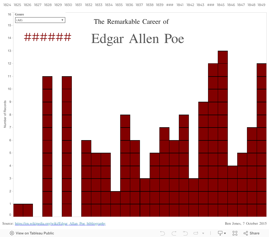
Take my Edgar Allen Poe timeline for example:
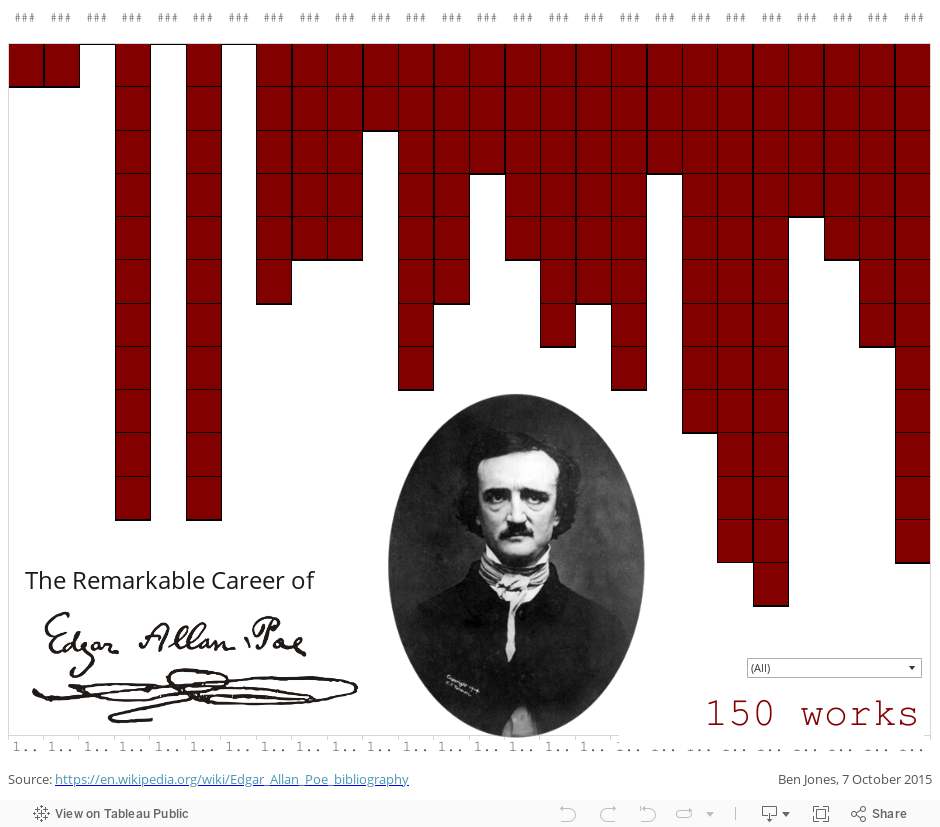
Does the image of Poe add any value at all? How about the image of his signature? Are these components nothing more than “chartjunk” (Few mentioned to me in an email that he would not call the image of Poe “chartjunk” based on his 2011 writings on the subject), or do they actually perform a function?
I submit that they perform a vital function. The visualization shows the life works of one man as blocks stacked together in the years they were written. Works that were written on ink and paper by his own hand.
There’s no decision here. The visualization is simply intended to educate you. And it’s my opinion that your education takes on a whole different meaning – a whole different feeling – when you see Poe’s face and an artifact of his own penmanship.
And let’s be honest, the following version is pretty damn boring, you’d probable ignore it if you saw it in your twitter feed, and it’s not nearly as memorable, is it?
I’d like to conclude by quoting from Stephen Few’s critique one final time:
The greatest tragedy of this research is that what makes a visualization memorable is actually of no consequence. – Stephen Few
I hope I’ve made it clear in this blog post why I think that memorability can actually be of great consequence in data visualization. But did you notice that in my comments above I used phrases like “in my experience” quite often, and that all I really did was relate an anecdote and state my opinion? My opinion does not amount to codified knowledge, and my experiences do not amount to rigorous research.
And that’s exactly why I would appreciate further attempts by academics to study what makes charts more or less memorable. I’m sure this task isn’t easy. Visualizations are but one piece of an overall message that can be delivered in myriad ways to a variety of audiences. For those who are studying this topic, do know that there are practitioners out there who are hoping that the insight you glean into this topic can help us all.
Thanks,
Ben

Hi, Ben. This is an interesting take. Here’s a question: If the audience doesn’t care about the topic, does anything else matter?
In your presentation about the ungreening of configuration B you got your audience to care about something it didn’t care about before. That’s a sign of an effective presentation. However, what you recount in this anecdote feels a little different than the Borkin study, which focused on a narrower definition of memorability that had nothing to do with the context of the communication.
Isn’t it possible that the thing that stayed with the executives was the insight that transformed apathy to engagement, rather than the more technical definition of memorability (as Borkin defines it) of the visualization? Did the eventual funding decision come down to their ability to pick the chart out of a lineup later on? In situations like yours I wonder whether the memorability of a chart might correlate with persuasion without being the cause of it.
Hey Jeff, thanks for commenting.
Academics need to define things very specifically for their studies, and I’m not intending to defend any one study or method, but rather the value of designing for memorability, and studying it. In his critique, as shown in the quotes, Few not only attacked one particular study, he attacked the value of memorability itself.
I do think the execs would have been able to pick the visualizations I showed them out of a lineup, and I do think that had a lot to do with why they remembered my message, and their conviction upon hearing it. That’s why I’d love to know what other methods and techniques also make it more likely for people to remember what I show them.
In short: it can matter a lot if people remember your message. A big part of your message is the visualizations themselves. Ergo, I’d like to know what makes the visualizations more memorable, for the same reason that I’d like to know what makes my delivery more memorable. I think of these different elements of the message like players on a sports team. The combined effect is what matters, sure, but each has their own contribution. Memorability of the visualizations sometimes (not always) can mean the difference between winning and losing.
Does this explanation make sense? If not, I’d like to hear more why you feel the visualizations should be thought of separately from the overall message.
Thanks again Jeff.
Thanks for the response, Ben. I agree that you’ll want people to remember your message. Your story is a good example of a decision that wasn’t made in seconds—in your situation, it was vital that those executives remembered your message for more than a few minutes.
Language is malleable enough that you can say that a visualization is a big part of a message, and there’s a sense in which that’s true. However, there’s also a distinction that can be drawn between a message and the way that message is communicated, and that seems like an important one here.
There are at least a couple of ways that a visualization will end up being memorable. The first involves attributes that are intrinsic to it: colors, pictures, typography, composition, decoration, etc. These are the things that are easier to measure using a group of random participants. People will recall seeing it because it’s visually distinctive.
You allude a few times to the second way a visualization can be memorable: relevance to the audience. Does it address a topic that they care about? Does it change their perspective, explain something well, or answer a burning question? In this case, people will remember it because the message it carries triggers an emotional response of some sort: an “aha” moment, or a surge of validation (or anger, if it presents an opposing viewpoint).
The quotes from real customers in your presentation were very relevant to your audience and got them thinking about product decisions in a new way. Maybe the presentation was also visually recognizable, but I suspect that it when it came time to make funding decisions it was the insight, not the appearance, that made the difference.
Brilliant thoughts, Jeff. The question you raise at the end of your comment deals with the famous distinction of the medium and the message. Which is more important, the visuals or the understanding imparted by the visuals? I wish we could ask Marshall McLuhan himself, who argued that “the medium is the message“, or the form of a medium embeds itself in a message. It seems obvious to say that the understanding itself matters more than the visuals, but wasn’t it the visuals that shaped and controlled the environment itself? We’ve stumbled on a classic philosophical puzzle. Thanks for commenting.
The filter makes the bar size and the date axis variable, which I feel that they look better when fixed. So here is a tiny effort to keep the empty column.
https://public.tableau.com/views/EdgarAllanPoeViz_0/EdgarAllanPoeViz?:embed=y&:display_count=yes&:showTabs=y
What do you think?
I love it. It’s a great improvement. Can you share how you did it?
Thanks a lot Ben for your thoughtful post! Very very interesting!
When I look at your first example however I am not sure memorability is the interesting or even important part. This looks to me more of a secondary effect.
When you add a marker and a note to your chart my sense is that you are not designing for memorability, you are rather designing for engagement and comprehension.
The graphical elements you added have the powerful function of directing (or re-directing) the reader to what matters the most in the graphic. It’s a guidance mechanism, not a memorability one.
Also, relevance plays a major role here. Your executives, I guess, remember the chart and the message because it matters to their business, not because the image itself is memorable.
What do you think? Does it make sense what I am saying?
Hi Enrico, thanks for commenting. What you say makes sense, yes, but I guess I’d say I have a hard time separating out three cognitive processes: 1) drawing someone’s attention, 2) helping them grasp what’s important, and 3) giving them something they’ll remember. It seems to me these three mental processes are inextricably connected.
Take the inclusion of customer faces for example. They simultaneously drew the execs in to the visuals, made them care, led to an “ah hah moment”, and helped them recall how they felt when they talked about the topic a few weeks later. By including the photos, was I designing for engagement, comprehension, or memorability? Yes, all three. So to me, they were not only a guidance mechanism, they were also a memorability one. So was the inclusion of the quotes (“omg we got booed!”)
I’d love to know more about how different visual mechanisms affect these different communication goals, as well as others, hence my defense of memorability as a valid end point of academic inquiry.
Does that make sense to you?
Interesting article Ben.
I think memorability and comprehensibility go hand in hand (to a good extent). When we comprehend something, do we also not memorize it? Can a manager not recall what information she used to make a decision at a later date? To me the answer seems YES. Of course, we may not remember everything about the chart, but we can recollect the key pieces.
If the chart was lousy (neither memorable, nor comprehensible), it doesn’t matter any way.
I define a good chart as something that fulfills its purpose. So if the chart should help in decision making, it should nudge users in that direction (your first chart encourages me to investigate more about GREEN in category B). If the chart is to just provide info / status, it should be easy to read. So adding additional bells & whistles may not be a good idea, even if they make the chart long lasting in memory.
Hi Chandoo, thanks for commenting! The problem is that often comprehensibility and memorability don’t go hand in hand. We can get it and then promptly forget it. Or the information may stay with us, just deep in the recesses of our minds due to lack of anything memorable to anchor on. I really wish we memorized everything we comprehend, but in my experience it’s just not like that. You’re right, a manager may recall the salient pieces of information she used to make a particular decision, but the problem is often with the information she didn’t use, because she didn’t remember it when it mattered.
Re: lousy charts (neither memorable nor comprehensible) – you said “it doesn’t matter anyway”, but it could definitely matter if the information were critical to the task at hand. In that case, the person who made the chart and delivered the message failed in a big way. They buried a signal in the noise.
Re: bells and whistles – I’m with you here. Elements we add to enhance memorability shouldn’t make the chart more difficult to read, and images aren’t always helpful. Design for Memorability shouldn’t be reduced to adding fancy images.
Is memorability just more of a meta-issue related to communication in general? I can see the need for memorability of the presentation and the whole picture, but I can also see how Stephen Few could want the charts to be precisely crafted to display information quickly and accurately.
You stated early that the three points of “1) drawing someone’s attention, 2) helping them grasp what’s important, and 3) giving them something they’ll remember. “are “inextricably connected”.
However, I have a few operational reports that I check occasionally when we get alerted. There is nothing memorable about them but the memorability comes from repeated viewing. Since this process involves server 1 moving data to server 2, we just give it a quick glance to make certain the computers are working as expected. “…the comprehension that they provide need only last until the decision that it informs is made. Usually, that is only a matter of seconds…” We look at the report and say “Yup it’s working” or email IT and escalate the issue within a few seconds.
Hi Kris. I don’t think “quickly and accurately” need be in conflict with “memorable” at all. In fact, sometimes judicious embellishment of charts can be a shortcut to cognition, as in the Poe example. You know it’s about him right away when you see the photo, and you’re more likely to remember seeing than it’s more basic alternative.
As for your operational dashboard example, you gave a use-case that aligns with Few’s statement that most visualizations need only support comprehension until a decision is made, which, according to Few, is usually only a matter of seconds later. I agree that this use-case doesn’t require design for memorability, I only doubt that it represents the bulk of all cases, or that other cases where decision is delayed aren’t important enough to also study.
Great post as always Ben.
Sometimes I wonder if Stephen Few is seating on the same type of meetings and presentations as the rest of us.
Let me start by using a different example, I’m assuming you are of roughly same age as me in your 30’s. Most people in that age bracket will remember Nirvana’s “Nevermind” album cover, where the baby is in a pool and there’s a note in front of him. It’s probably one of the most iconic album covers of all time. Same goes for Beatles “Abbey Road”. Both albums had great tracks but their covers are very memorable.
The same principle applies to dashboards, we can all design by the rule but if we want to grab the attention of our stakeholders we need to create something that’s memorable. In the fight to grab 10 minutes of our exec’s time it’s not enough to just put the information out there, it needs to be engaging and it needs to capture. Your example of humanizing the chart is proof and same goes for Edgar Alan Poe, in a few weeks I might not remember the data, but I’ll remember the dashboard with the picture of E.A.P. and that will be enough to search for it.
Great and thought-provoking post, Ben.
One aspect of memorability that I need to consider pretty regularly is novelty. Even if I put together an effective and memorable dashboard or analysis, at some point it will become wallpaper, especially if it used every week in meetings. So I suppose how you approach the idea of memorability depends somewhat on the cadence of the analysis you’re preparing. If (as in your examples), you are preparing a visualization to address a specific question or topic, you want your viz to be memorable upon first viewing, both so it gets your audience’s initial attention, but also so that it lingers in their minds long enough to achieve your desired goal (i.e. a business decision, social media sharing, etc.).
But if you have a report or dashboard that’s been in regular rotation, you sometimes need to revise the same metrics in order to *keep* your audience’s attention. This doesn’t mean you totally shake things up and move things around willy-nilly (although that would certainly get their attention!), but rather find novel ways to present the same information while still communicating what the users need to comprehend. I’ve witnessed this numerous times, where standard performance metrics are displayed in a novel way and it gets the conversation animated again.
-Mike
Interesting thoughts, Michael, thanks for commenting. Familiarity can be a good thing – instant cognition – but you’re right in that sometimes it can lead to complacence and neglect. We don’t notice the tip of our nose, which has been right there in our field of view since we were born. Ignoring the familiar in a BI context can be a major human flaw, so I agree, sometimes it can be helpful to look at the same information a different way, just to get a new perspective.
Is memorability something that needs to be designed in, or is it rather an effect of the design? If a visualization is designed to be meaningful and provides the information it needs, won’t it be memorable? Should memorability even be a goal in the design process? These are questions I feel like you’re missing in this article – you’re trying to answer them, but I’m still unconvinced.
So your example of adding a customer’s tweet and picture to a chart was brilliant. It’s good design, relevant information, not distracting embellishment or chartjunk. And you did it to connect execs to customers. That’s not the same as just trying to make your chart more memorable. So wouldn’t you say that the memorability came from good design, not the other way around?
Thanks for weighing in, Andrew. I suppose all I can say is that when I created the 2nd version of the charts that included the customer faces and quotes, I was striving to design something that the executives would be more likely to remember. I wanted to give them an image that would remain in their minds until the point of decision had arrived. So yes, memorability was a specific goal of mine in the visualization design process.
Re-reading your article with that in mind, I suppose all I can say is that… given your situation that makes complete sense. I understood the problem to only be execs that weren’t connecting with their customers (still part of the problem), but it’s clearer to me now that your specific problem was execs who weren’t generally interested in what you were presenting and expected to forget it all moments later.
I still believe that the memorability here was a result of exceptional design on your part and not “what makes a chart memorable” in the sense of the research papers Few was criticizing. It seems to me that your audience didn’t just look at a screen for 10 seconds – they interacted with your visualization, and that’s why they remembered it.
However, I can certainly agree now that a requirement in your solution definitely had to be to make a chart that was memorable – something easy to digest for quick decision-making wouldn’t have been enough.
Ben
Whilst your rationale makes sense in the context you give – that of “groups of people” such as when “… directors and VPs attend review meetings where they look at lots and LOTS of data and charts… ” – this is only one use case for visualizations. Many, many visualizations are used by individuals, in isolation, as part of their day job; there are probably thousands of such instances for every board meeting / VP review etc. – at least in some of the clients that I work with.
In such cases, comprehension must trump memorability; decisions usually do follow within minutes, often seconds (as an aside, my read of Stephen Few’s content in this area suggests that he is highlighting the subconscious nature of System 1 thinking – i.e. that we decide quickly, and then rationalize and self-explain at leisure – rather than expressing a belief that people only view visualizations for a few seconds and come to fully-reasoned System 2 decisions). If decision-makers, working beneath the board, need to make hundreds of small decisions each day – and many do, using visualizations to guide them – then I suggest comprehension is king, and memorability of little or no value (particularly where content changes rapidly).
So this practitioner’s answers to your opening 4 questions are:
* Does it matter whether a data visualization is memorable or not?
* Generally not, unless you need to refer to it days / weeks later
* Should we, as data visualization practitioners, care about memorability?
* Yes, but only for a relatively small set of use cases
* Should we design our visualizations so that those who view them are more likely to remember them at a later point in time?
* Maybe – but I’m not sure whether you mean that viewers should remember the visualization’s style (i.e. a broad recollection of its appearance) or its content (i.e. detailed recall of its content, including values and proportions etc.)
* Is memorability a worthwhile area of study for those studying data visualization in academia?
* Perhaps, but of relatively low priority… unless there is a strong belief that truly memorable visualizations would enable strong recall of both style and content
The specific example you use to illustrate memorability is interesting; it seems to me that the memorable aspect of this is not any of the content presented in the first image. Specifically, it is the element absent in the first image that you are highlighting in the second image… and then adding to this with the human element. I fully accept that this “human side” of the data caused the visualization to be memorable… but it would be interesting to know what the audience recalled afterwards; was it various faces, twitter handles etc. or was it the absence of the green product? In other words, are we aiming for memorable style or memorable content?
If the former, then I would suggest the memorability achieved was for the style – amusing, novel, interesting, human etc. – but not for the content. If, however, the majority remembered that they needed to produce a green razor to meet customer needs, then mission achieved; after all, this was (I think) the key message you were delivering in the example given?
Do you recall which type of memorability you achieved?
I suggest that the same is true of the Edgar Allan Poe visualization; yes, the style of the original is more memorable than the latter, but the content is no more memorable – it’s identical.
Perhaps this suggests a different question for the research: “What is the value in remembering that you have seen a particular visualization, and recall it’s style, if you can’t recall much of it’s content?”. I appreciate its value as a mnemonic if it helps a viewer locate the visualization in question, to review its content and re-comprehend the message within, but I’m struggling to think of any other reason?
This is a great comment Guy, thanks for taking the time to write it! I think we agree on everything except the relative importance of visualizations that don’t result in immediate decisions. I still feel that critical decisions in a business, ones that require broad consensus and usually involve major budget outlay, often involve multiple perspectives. Each perspective can be embodied my multiple visualizations, each of which vies for the share of mind of the decision makers over a matter of at least hours, often weeks or even months. These types of situations are important enough to warrant further study of memorability, in my view.
Re: System 1 vs System 2 thinking, Kahneman states on p.416 of Thinking Fast and Slow that System 1 is subject to “cognitive illusions such as anchoring, nonregressive predictions, overconfidence and numerous others,” which is why skillful thinkers need to “slow down and ask for reinforcement from System 2.” He further states on p.418 that ““organizations are better than individuals when it comes to avoiding errors, because they naturally think more slowly and have the power to impose orderly procedures”. Slowing down and taking time to fully understand the data is exactly what Stephen Few advocated for in his recent blog post Data Sensemaking Requires Time and Attention. Slow, purposeful analysis requires looking at the problem from multiple perspectives. Making a final call requires us to remember what we saw and learned.
Re: style vs content, I’m of the opinion that adding photographs of customers in the first case, or Edgar Allan Poe in the second case, isn’t purely stylistic, like choosing a font or font color, but also informative enough to amount to actual content. I also think we’re heading down a notoriously tricky road if we try to separate the memorability of the medium from the memorability of the message. Did my audience remember only the key take-aways, what the people in the photos looked like, the ghost-like green column, or some combination of the three? THAT would be an interesting thing to study, and I hope academics do.
Thanks again Guy, I really appreciate your comment. Yours is a very valid perspective, and you raise some really interesting questions.
Pingback: Alice in Wonderland: A Linguistics Approach to Data Visualization – TableauFit
Pingback: Looking Back to 2015 and Looking Forward to 2016 | PolicyViz