Previous Post (Part 2 of 3): A Tale of Four Quadrants
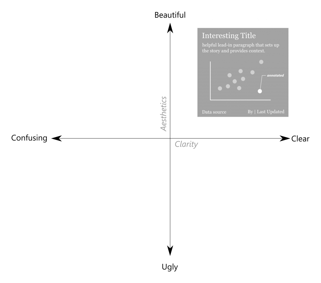
We started this series by introducing the notion of a two dimensional plane on which to assess all data graphics, and then followed it up with an example of visualizations in four different quadrants on the plane to illustrate the differences between the two axes, clarity and aesthetics, that define the plane.
Now, let’s review some of the basic principles & tips that you will find in the data visualization resources out there. All I have done here is I have applied these well-known best practices to the four quadrant system. Those of my readers who are familiar with the field of data visualization will recognize these tips – they are not new. Those who aren’t: please take careful notes, for the good of us all!
Before showing the three tips, I want to make one thing very clear: as the designer of a data graphic, you are not the audience. Your audience is the audience. As obvious as that may sound, I often have to remind myself of this fact. After working for hours on end with a data set, you have certain truths about that data set in the front of your mind that your audience likely will not. Before publishing anything, it always helps to ask different potential audience members (1) what they notice, (2) what they like and don’t like, and then pay attention to (3) what they don’t notice. This isn’t a compliment fishing session – truthful friends are the best kind.
Without further ado:
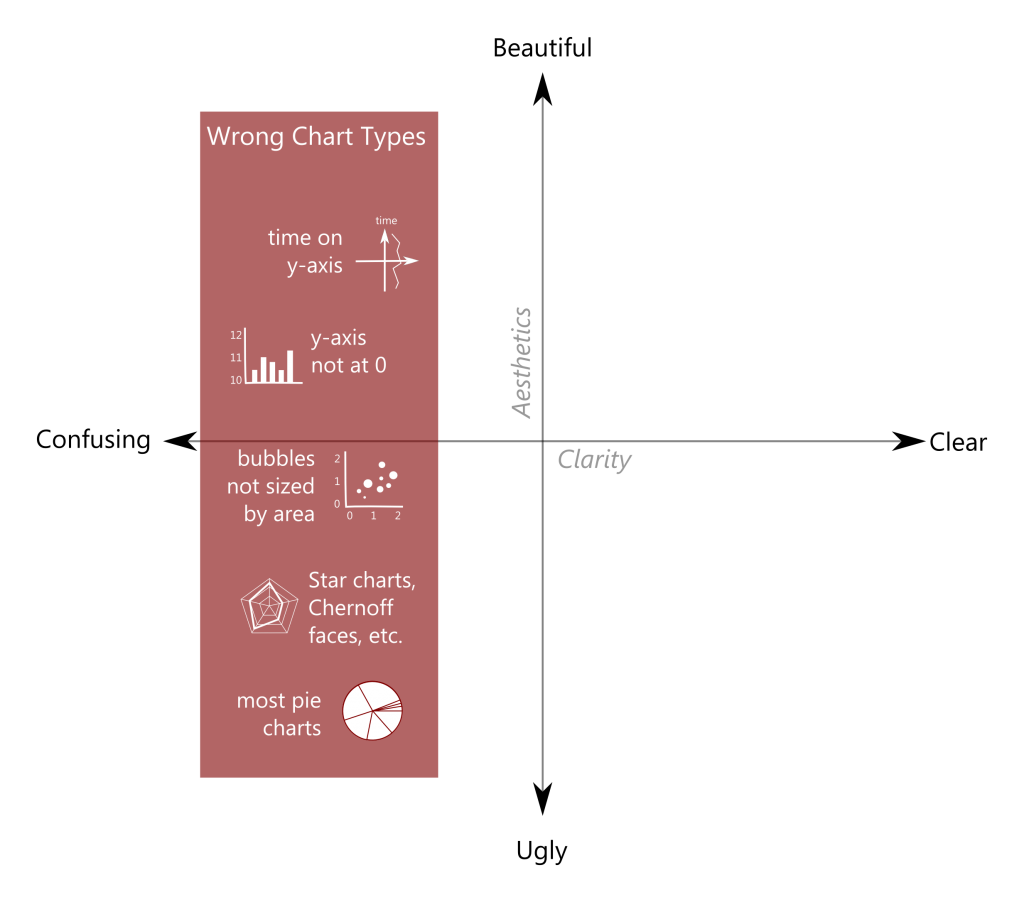
Tip #1 – First, avoid confusing your audience with the wrong chart type. Clarity is the cake.
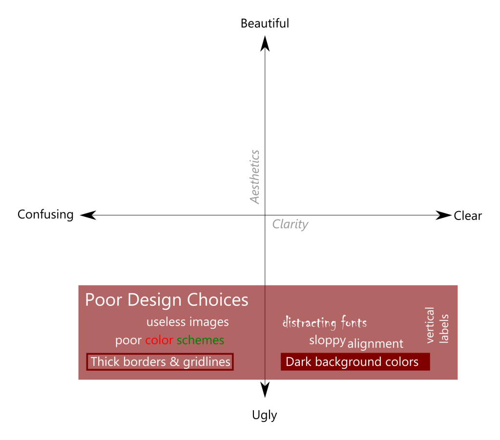
Tip #2 – Second, avoid horrifying your audience with poor design elements. Aesthetics are the icing.
Tip #3 – Third, incorporate helpful elements to increase both clarity and aesthetics. The best dessert has both.

I’d love to know what you think about these tips, and what you would add, change, or take away. What did you find to be a great tip that isn’t included here?
I hope this 3 part series was interesting & enlightening for you – I know it was helpful for me to put together and consolidate my key learning points from the great resources that are out there, and the experts who have created them. I also hope that the four quadrant system I have proposed here gives you a way of thinking about data visualizations that serves to move your work north and east!
Lastly, and to summarize: “Clarity is the cake. Aesthetics are the icing. The best desserts have both.”
Thanks for stopping by, as always,
Ben


Thanks very much for this series Ben! I am a computing teacher in Australia and in my system data visualisation is a topic in Year 11. In addition, I teach applications – like Excel – to younger students. I also teach geography, where data representation in maps, graphs and images is critical. All too often, kids are taught how to create graphs and the like badly, with no thought to the selection of which graph for what purpose, considerations of colour, labelling, etc. Many ICT or maths teachers, for example, are happy to just teach the skill of ‘creating a graph’ with no reference to the deeper issues at play and the wider skills students should be able to utilise to produce an accurate, purposeful, clear and useful representation. With the incredible rise of data visualisation and infographics on the web as a result of the medium itself and the growing availability of data, your series of articles has been very worthwhile; so thanks once again… we will be using your material as a student reference, for sure.
Hi Stephen – wow, thanks so much for your comment, and I’m so glad this series was helpful for you and your students! Teaching the next generation at a young age how to work with data is a great endeavor – I’m glad to hear there are people like you out there doing this. Let me know if there is anything else I can do to help, and thanks again – your comment was very encouraging to me.
Hi Ben
Stumbled over your blog post and really love the quadrant model. Have you ever looked at the International Business Communication Standards (IBCS) – http://www.ibcs-a.org/ I use these guidelines a lot to create charts in quadrant I. Still there are a lot of discussions going on if the kind of standardization IBCS proposes is still beautiful or tends towards ugly. What do you think?
Cheers
Raphael
No, I haven’t seen that standard doc Raphael. Thanks for passing it along. I’ll be sure to take a look. Thanks for commenting!
Thanks for this series, this is really useful even 5 years later of initial publishing! As software developer, sometimes it’s impressive hard to figure out what it’s simple but also beautiful when talking about data visualization.(Of course we don’t want to build ugly things, but we may break things putting to much “icing”).
This quadrant system will help me a lot for now, thanks!
Thanks Rafael! Nice to hear that this post is still giving people like you things to think about.