
UPDATE, May 2015: Google is constantly changing their Maps service. Nelson Davis has a recent blog post that addresses issues with the method outlined here, which doesn’t work quite like it used to. 😉
(For this post, I owe a word of thanks to Andrew Beers – VP of Product Development at Tableau, for the raw data, and Mike Klaczynski – Data Analyst on the Tableau Public team, for showing me this method).
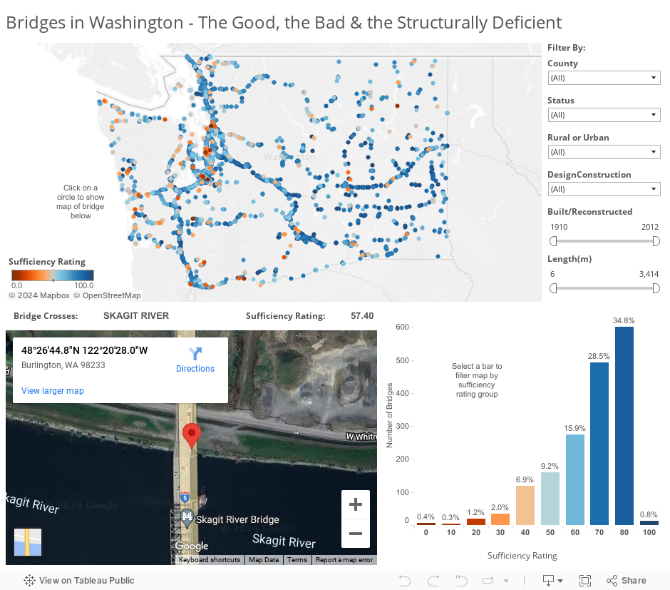
At the Seattle Hacks/Hackers event last night, we built an interactive data dashboard that allows the reader to explore bridges in the state of Washington, where a bridge crossing the Skagit River recently collapsed into the water after being struck by a truck carrying an oversize load.
What’s notable about this dashboard is that you can click on any of the 2,489 circles on the map and bring up an embedded Google satellite image of the bridge within the dashboard itself. I didn’t have to take a screen shot of each satellite image – that would be way too much fun. Instead, I used a little-known feature in Tableau Public – embedded web pages (similar to the Embedding YouTube post from a few weeks ago).
How to embed a Google satellite image in a Tableau Public visualization:
The first group of 5 steps shows you how to create a url for each bridge, and the second group of 5 steps shows you how to add a box to your dashboard to pull up the bridges.
I. Create the URLs
1. First, notice that the data file contains Latitude (“LAT”) & Longitude (“LON”) for each bridge.
2. A Google Maps search for a particular Latitude & Longitude (say, 48.445781 and -122.341108) yields a link url like this:
https://maps.google.com/maps?q=48.445781,-122.341108&hl=en&sll=48.445781,-122.341108&sspn=0.009949,0.026157&t=h&z=16
3. The url can be simplified a little bit as follows:
https://maps.google.com/maps?q=48.445781,-122.341108&z=17&t=h&output=svembed
4. Breaking down the elements of the url, we can see that after the latitude & longitude, there are three parameters in the url:
- “q=48.445781,-122.341108” – these are your coordinates. Note that if you have an address field instead of Lat/Long, you can put an address after “q=” as well
- &z=17 – this specifies the zoom level. Higher numbers zoom in, lower numbers zoom out
- &t=h – this specifies the type of map. (t=m is a map, t=h is a satellite view)
- &output=svembed – this is a key parameter that makes sure the website you embed in your viz doesn’t include the entire site – just the map itself
5. You could then generalize the url to:
- https://maps.google.com/maps?q=<LAT>,+<LON>&z=17&t=h&output=svembed
You can see that the actual numbers for Latitude and Longitude have been replaced with field names <LAT> and <LON>
The next group of steps walks you through how to add a box to your dashboard that pulls up this embedded satellite image when a user clicks on a particular circle.
II. Add dynamic Satellite Images to your Dashboard
1. First, in the dashboard tab, drag a Web Page onto your dashboard from the left-center panel (just leave the “Edit URL” dialog box blank and click “OK” for now):
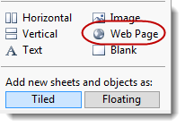
2. From the Dashboard file menu, click Actions and click the “Add Action >” button and choose “URL…”
3. In the Add URL Action dialog box, select whatever sheet you have created that includes the fields LAT and LON, and choose what event you’d like to trigger navigation to the new image (Hover, Select, or Menu). In this case, I’ve selected Map as my Source Sheet and Select as my trigger event, but you could trigger the action from a table or other type of sheet. Here’s what the dialog box looks like:
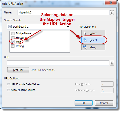
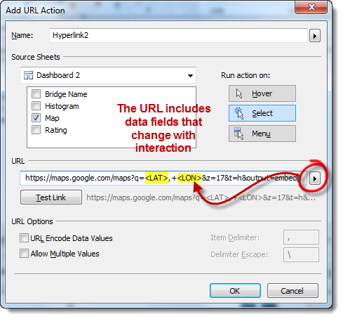
4. Now comes the magic. Copy and paste the generalized url above to the URL field of the dialog box, and replace <LAT> and <LON> with the corresponding field names in your data source by clicking the small arrow to the right of the URL text entry field:
5. That’s it! Test it out by clicking on the map circles and see the satellite image change accordingly.
I can see this being useful for organizations that would like to include images of office locations or real estate assets in their dashboards. For data journalists, it’s about allowing readers to interact with the abstract and the real in the same graphic.
If you make a dashboard with a dynamic Google map, be sure to post the link in the comments field for all to see.
Added 6/10: Here are the slides from the event:
Ben

Very helpful viz! I was there at the event. I came into work this weekend and was able to pull together a viz using these concepts. I had to do it in Tableau 7.0 since the server my employer uses is not yet at 8.0.
I’ll post a Tableau Public link to the viz after I review it make sure the data is publicly available.
Question: Under “Describe field,” there is an option to “Load.” It brings in the domain of the column. My lat./long are already in my data and don’t need to be generated. It seems like the range could be easily determined and calculable by Tableau. I checked your viz and there is not “Load” button nor is the domain listed. What’s the purpose of the “Load”?
Hi Phillip – nice meeting you last week, and thanks for commenting! Looking forward to seeing your work. As for your question – I’m not sure where you’re seeing “Describe field” and “Load”. Can you give me a little more info about what you’re trying to do?
Nice one. Waiting for the answer from you for my previous question 🙂
If my Question didnt reach you, below are the one.
1) How to fetch data from twitter into tableau.
2) how to integrate video into tableau
3) How to customize charts which are not available in tableau.
for ex : gauge chart or organization chart which are out of box. Other tools have SDK, through which a new type can be imported. What about tableau ?
Hi Hari – I answered your questions in the comment thread for the Boston Predictive Analytics group. Let me know if my reply answers your questions.
Hi, Ben. I was able to go back and right away do an embedded map with the URL action. Here’s the link to what I cobbled together:
http://public.tableausoftware.com/views/EmbeddedMapAction/EmbeddedMapAction?:embed=y&:display_count=no
I had to remove some data and sanitize it a bit, hence the jane and john doe names.
I’ll follow up in a different comment re the “Load” question.
Hi, Ben. I can’t paste images so will paste what Tableau copies to the clipboard. I can send images to you if the clipboard text doesn’t provide enough context or detail.
Notice the “The domain for this field has not been loaded. Click “Load” to retrieve.” changes to Domain -29.60517 to 59.721287″
Before pressing the “Load” button on the describe window:
F_CENTER_FACILITY_LONGITUDE
Role: Continuous Measure
Type: Database column
Remote column: [Extract].[F_CENTER_FACILITY_LONGITUDE]
Remote type: Double-precision floating-point number
Default aggregation: Average
Geographic Role: Longitude
Status: Valid
The domain for this field has not been loaded. Click “Load” to retrieve.
And next, after pressing the “Load” button on the describe window:
F_CENTER_FACILITY_LATITUDE
Role: Continuous Measure
Type: Database column
Remote column: [Extract].[F_CENTER_FACILITY_LATITUDE]
Remote type: Double-precision floating-point number
Default aggregation: Average
Geographic Role: Latitude
Status: Valid
Domain
-29.60517 to 59.721287
Hey Phillip – why don’t you send the images over via email using the email address in my “About” page (link at the top-right).
Thanks, nice use of embedded satellite images by the way!
thanks ben
You’re welcome Ramesh. Thanks for leaving a comment!
Hi Ben,
Thanks for these instructions, it’s really helpful! One question, how did you make the Google Map show a marker of the coordinates? I was able to embed Google Maps, but could not show where exactly on the map. I would appreciate your help!
Thanks!
Jihye
Hi,
I was able to connect the tableau maps to google maps through the instrcutions you have given, but i am not able to hide the panel on the left on Google maps website in Tableau where they give things like “Directions”, “search nearby” and all that.
hi,
I have another question too, How to find directions in Google maps from one standard place to the place that we click on Tableau map? I saw a sample workbook which did that, but i could not figure out how to do it, would really appreciate the help, thanks in advance!
Hi Sandhya, yes this is doable. Take a look at this restaurant finder. An example of the url with directions is: https://maps.google.com/maps?saddr=1001+BROADWAY+NASHVILLE,+TENNESSEE+37203-1001&daddr=
&output=embed where “Address to Map” is the destination address that you pull from your spreadsheet and “saddr” is the starting address, which in this case is fixed to a specific location, but could also be dynamically linked to a data field.Pingback: Feasting in Phoenix | improVIZation
Hi,
your method works fine, but whenever i click on the area which i want to see on google maps, it gives an error called “An error has occured in the script on this page”, but the maps are showing fine. Hence i want to hide this error. What do i do for this?
Thanks in advance!
Hi Sandhya, I’ve seen that same error before, but I’m not quite sure what to do to get rid of it. Have you had any luck yet?
Take a look at this link. It seems to have solved the error for my students.
http://www.dataplusscience.com/ScriptingError.html
Is there a tutorial on how to draw polygons onto the embedded webpage?
Right now I got the webpage to zoom into the location of wherever I click on the map. The next thing I want is to draw the polygons I have on the map onto the webpage.
Marco, if you want to draw polygons on a map, you can draw them on the standard Tableau maps (online kb article here). I don’t know of any way of drawing them on an embedded web page like Google Maps.
Hi Ben,
Just trying to replicate the above but after creating the blank space then going into dashboard -> action -> add action, the map option does not come up.
Hence I can not make the maps interactive.
I’m using the latest version 8.1.
Help?
Teresa
Hi Teresa, are you adding a URL action and inputting the map URL with your Latitude and Longitude fields? It might help to email me a screen shot of your Dashboard Action, as I can’t quite make out from your description what’s going on. See my About page for email info.
When I try this approach I get the message: “The Google Maps Embed API must be used in an iframe”
Is this a change that google maps has made?
I am on the latest version of Tableau, 8.1.
I did this post and it had a great result. The thing is that now Google Maps has changed and when i do the embed on Tableau it asks me to call it as an iframe. Do you know how to fix this?
Hi Ben,
Thanks for posting! When I use this method a message pops up that says: “The Google Maps Embed API must be used in an iframe.” on the URL page in the dashboard. Any ideas to fix this?
Thanks!
Hi Katie, yep, you’re right. Looks like recent changes in the Google Maps service has caused in this error. There are two ways to fix it. 1) simply change “&output=embed” to “&output=svembed” (Thanks Jeff Shaffer!). OR, change everything over to the Staticmaps format which is documented here.
Thank you!
Does anyone else get an error saying: The Google Maps Embed API must be used in an iframe.
Any help is much appreciated!
All – you can fix the Google Maps API iframe error message by changing “&output=embed” to “&output=svembed” (Thanks Jeff Shaffer!), or you can refer to the Google Staticmaps documentation here
Hi Ben – I know you have mentioned this already about iFrame error. But just as to update, even after changing from “&output=embed” to “&output=svembed”, iframe would not go. Only way is the hard way to use static URL documentation. If you can update your dashboard with output=svembed and repost, it would help all of us.
Pingback: Tableau map + Google Maps embed | At Her Desk, Probably
Hi Ben,
Excellent tutorial. Many thanks, but now I’m trying to do something forward.
If I select more than one point, do you know how to zoom this two points?
Thanks,
Luís Ramos
Thanks for the information.
I am having problem in the map; whenever I select a location it does not reflect in the google map.
https://public.tableausoftware.com/profile/ymaalouf#!/vizhome/VehicleDealersDashboard/Dashboard2
I just got a solution for the previous mentioned issue. Thanks.
I have another question, how can I change the symbol of the pins (from dots to an image). Is that possible in Tableau maps?
Thank you again.
Hi Ben,
Fantastic tutorial. Have you had any experience with enabling search by address or lat/long in the embedded Google map (or elsewhere on the Tableau map)? That way the user could compare an inputted location to mapped locations already in the Tableau dataset. Not sure if that is possible, but I figured you would be the best user to ask. I’m using Tableau 8.2.
Thanks,
Chelsea
Hi Chelsea, thanks for the kind words. I’ve never tried what you’re talking about, but agree it would be great to be able to input an address on a dashboard. It looks like embedded Google Maps has something called Search mode. Perhaps that is a good place to start.
Pingback: google maps embed iframe - Search Yours
Pingback: google maps embed iframe | Zakee
Hello Mr Jones,
I downloaded the workbook “bridges in Washington” and openened in tableau 8.3
I’m getting this error “The Google Maps Embed API must be used in an iframe.”
instead of the map
Love the tech behind this, but also wondering where did you get the bridge data for this project?
Pingback: Tableau map + Google Maps embed | Aysha Khan
Hi Ben – Can this be done in tableau server too. I mean once done on desktop, can this be published to tableau server ? Note that our tableau server do not have Internet connection but has intranet. So will the google maps work in that case.
I have adopted the following steps to make sure that it works (Thanks to Subha Prasanna Dutta) :
a. Declare the Lat & Long Fields as Dimension in the Map (In my case the Field names are Latitude and Longitude)
b. Add a Blank URL and in the Action add the URL as following:
https://maps.google.com/maps?q=,+&hl=en&t=h&z=16
It works without any API / key / Staircamp etc.
Hope this will work for everybody
Sorry guys the URL should be the following:
https://maps.google.com/maps?q=,+&hl=en&t=h&z=16
“https://maps.google.com/maps?q=,+&hl=en&t=h&z=16”
Hi Ben. Great post and happy to find your website when researching this topic.
I was wondering if you need to have the map necessary to get to the street view. For example, my dashboard would have commercial building information and i have the lat and long based on the addresss. Would I be able to bring the street view based on location name selection, Like the rest of the elements in my dashboard, without including a map?
Thanks,
Laura
Hi Ben. I found your great post around this topic and I was wondering if you have any updates from Tableau around this error “The Google Maps Embed API must be used in an iframe.”, even after using the most updated url here. I actually tried few other Url options with Google Maps, same error.
I am using Tableau Desktop 8.2
Any suggestion is much appreciated.
Thank you.
Hi Ben,
I’m getting the same error “The Google Maps Embed API must be used in an iframe.”
I tried changing “&output=embed” to “&output=svembed” and that did not work
Any idea?
Thanks
Jag
Pingback: Feasting in Phoenix | improVIZation
Pingback: Detailed Geo Viz with Tableau, Mapbox and Google Street View | Data Science Riot!
Pingback: Links for Monday, April 25 | sncdatajournalism
For me the below worked in the URL
https://www.google.com.au/maps/place/++NSW+/@,
Awesome, thanks Jag! Yeah, this is a moving target for sure, as Google continues to make changes to the Maps service. Thanks for posting the update for everyone else to see.
Hi Ben, A great article on Google map embedding with specific geo spatial points but can you give me any idea to plot several points on Google map coming after filtration in Tableau Dashboard. Thanks in advance for your support:)