
I’m a huge fan of the Pew Research Center. They consistently publish interesting statistical insights about society in well-designed visual form.
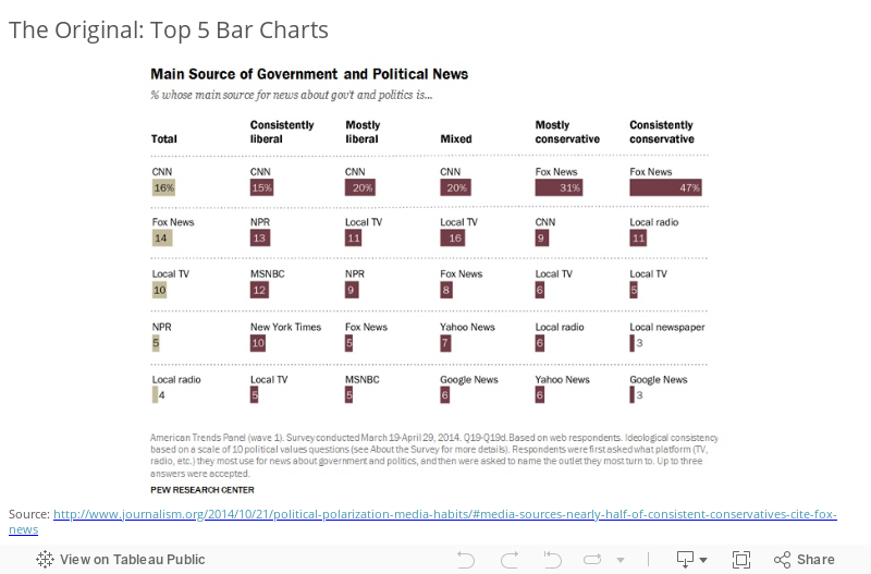
Recently I saw this chart tweeted by Conrad Hackett that Pew published about a year ago showing which news outlets Americans of different political ideologies prefer as their main source of news about government and politics:
Pluses and Deltas
Pluses: It’s a clean design and easy to see the relative proportions for each particular ideology. There is no clutter in this chart. Obviously it’s an interesting data story that is very relevant to the news in the United States today.
Deltas: I believe there’s an opportunity to improve the ease with which a reader can track the popularity of the various news outlets across the different ideology group columns. Right now it’s tough to see, for example, how the popularity of CNN, or Fox News compares across the ideological groups. You have to scan the bars and read each label to find them. To make this comparison easier, we can use color to link the outlets across the columns, and we can arrange the rows so as to make the relative popularity of particular outlets immediately apparent. Here are three different chart redesigns:
Three Alternatives:
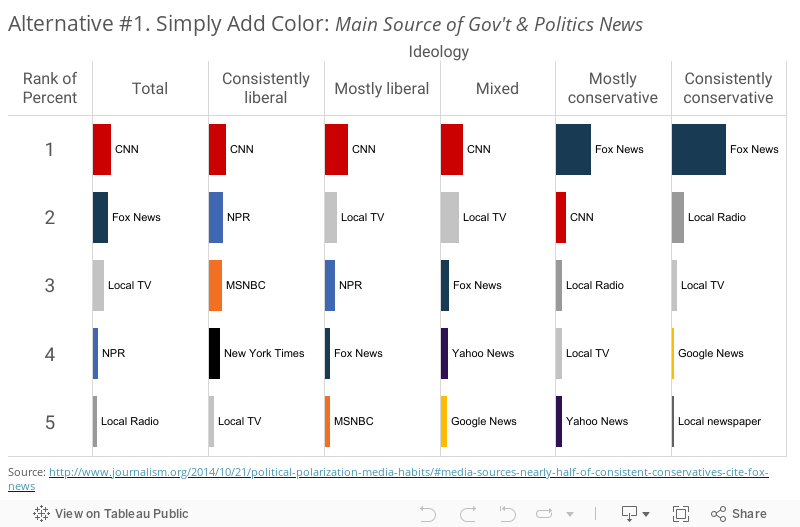
First, we can simply add color to the bars, a hover action to highlight the bars, and a URL action to open the outlet source when a reader clicks on the bars:
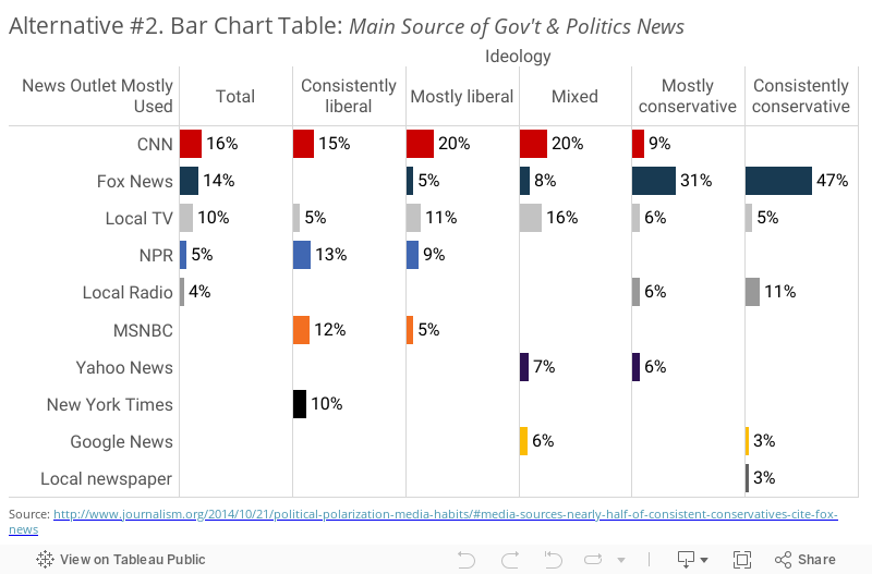
Second, we can use the rows differently, so that instead of arranging them by rank, we give each outlet it’s own row. This has the added benefit of showing us how many outlets there are in total, and which outlets aren’t in the top 5 for each group:
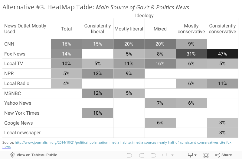
Lastly, we can keep the table format and switch the primary encoding from bar length to cell saturation:
I’m curious to know what you think, so here is an informal, unscientific poll of readers of this site:
Thanks,
Ben

Honestly the original one is the best one.
The first alternive lacks hierarchy and the numbers, the scale is too reduced to allow comparison clearly enough. Finally adding colors just bring more noise.
The second one is just too messy.
The third one is easy too read but it’s not a chart it’s a table… too me, a table is always a failure cause it’s nearly the raw data.
Thanks for weighing in!
I agree. I think the original is the best choice here.
I do like that you can see the political “leaning” on #2, but the total column throws that off.
It depends on the question being asked and story being told.
The original and Alternative #1 make it really easy to answer questions like “What is the #1 (or #3) source for mostly liberal?” Leaving out color really emphasizes a segmented and downward reading of the chart — which I actually prefer as long as that’s what you’re going for (I would probably like some vertical lines to separate ideologies).
Alternative #2 makes it easier to answer questions like “How does CNN do across the ideological spectrum?” However, I would caution that the fact that the news source and color are consistent across make it very tempting to add the percentages across.
Alternative #3 allows for the same questions as #2, but more dramatically brings out the weight that Fox News has among conservatives.
All good points. The different alternatives facilitate the answering of different questions, so “it depends”.
I think the weakest aspect of the original is that it has borders separating the rows rather than the columns. It wasn’t until I looked at the alternatives that I understood what the Pew one was showing. The 1st alternative does more than just add color distinction, it “corrects” the border lines to delineate the respondent categories (where the cells could reasonably be summed together), and it also adds the helpful axis information of Ideology and Rank-order. And I think that could be further improved to somehow clarify that the Ideology refers to the consumer and not to the source (which is what I thought when I first looked at it).
I didn’t notice the lack of column separators, and I think you’re right – the original would be improved by adding them. Thanks for commenting!