
I’m currently working on my second book, Avoiding Data Pitfalls, which I hope to complete soon so that the amazing people at my publisher, Wiley & Sons, can do their thing and get it out to the world. My editor has the patience of a saint.
An example in the book features the commonly-referenced FAA wildlife strikes data set, which is regularly updated and downloadable in state-by-state files (or as a full MS Access file) on the FAA website, and which I unioned together for all 50 states and D.C. (thank you Tableau Prep!) from January 1, 2000 through December 31, 2017 and uploaded here in case you want to play with the data yourself.
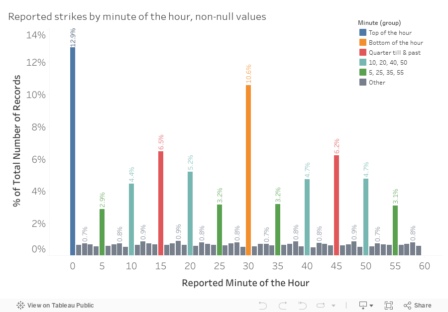
I’m interested in understanding and writing about something I call the Data-Reality Gap, and so I focused on one particular aspect of this voluntarily-reported data. If you take a look at the time of day that pilots report striking a poor creature (or creatures) on the runway or in flight, and you focus on the number of minutes after the hour that pilots provide in their report, you see a strikingly regular geometric pattern, almost like something generated by a mathematical formula as opposed to over 85,000 incidents individually reported over the course of 18 years:
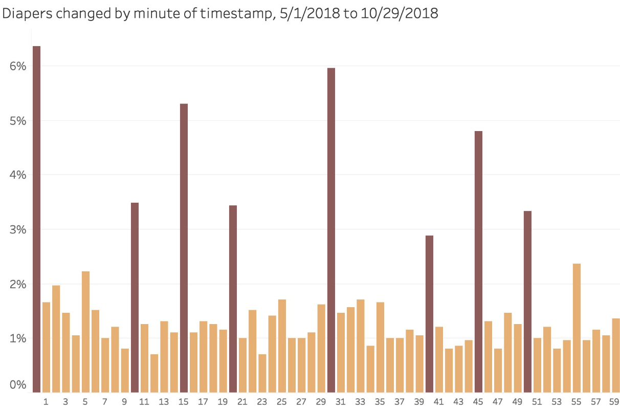
I put this out there on Twitter earlier today, and Jay Lewis replied back with this column chart of the first 1,976 diaper changings of his 6-month old baby (so, dirty data, basically). The pattern is the same:
Showing time data in a clock chart
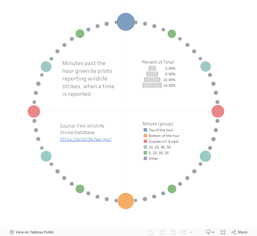
It occurred to me that this is a great opportunity to plot data using a polar rather than a linear arrangement, because we’re very accustomed to reading minutes past the hour as 1/60th of a revolution of a circle thanks to the development of the sexagesimal system by the Sumerians around 2,000 B.C.E. We don’t count using this system anymore, but it turns out 60 is a really handy number as it’s the smallest number divisible by the 10 smallest counting numbers: 1, 2, 3, 4, 5, 6 and also 10, 12, 15, 20 and 30.
So, in honor of the Sumerians as well as the Babylonians and the Greeks who carried this system forward and gave us our base-60 clocks, here is the FAA wildlife strike data in polar form, with each minute represented by a circle located at, well, it’s minute location:
How did I make it?
This isn’t a super sophisticated example, and many have done much more challenging things than this, but I’m certainly not the king of circular plots, so it was something of an accomplishment for me, personally. This wasn’t rocket science, I just used some good old 11th grade trigonometry and a steno pad to get it done:

I converted the chicken scratch on that steno pad into the following formulas to convert 0 through 59 minutes into 60 points on a circle, each located 6° away from it’s nearest neighbors, and starting a (0,1):
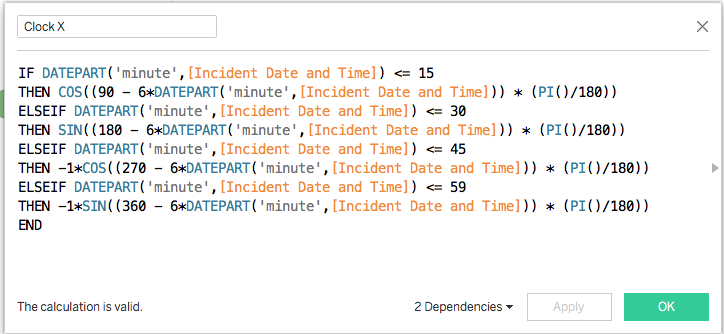
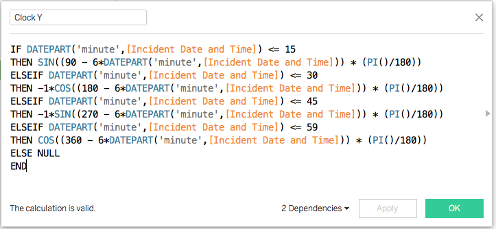
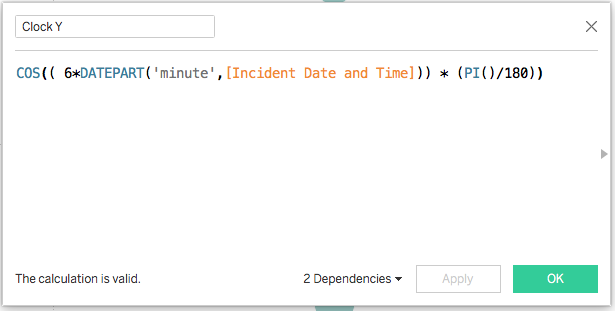
UPDATE: Let’s replace my nice Rube Goldberg style calcs with far simpler ones suggested by my friend Chris Love, who evidently has a much better recall of high school mathematics:

Here are the calculations in text form in case you want to copy and paste them (I won’t even bother putting my original ones here):
‘Clock X’:
SIN(( 6*DATEPART(‘minute’,[Incident Date and Time])) * (PI()/180))
‘Clock Y’:
COS(( 6*DATEPART(‘minute’,[Incident Date and Time])) * (PI()/180))
So Which is “Better”?
“Better” is such a loaded word. “Best” even more so, which is why I tend to avoid it. These two versions each have their relative strengths. Clearly the circular version is easy to understand due to the fact that it mirrors reality in its clock shape. But the distinct triangular ramp pattern – where the frequency of occurrence from 5 to 10 to 15 and then back down from 15 to 20 to 25 (and an identical pattern on the other side of the bottom of the hour) – is really only on display in the linear version. So even though creating the clock effect was nice, I feel that it takes away a bit more than it adds.
I tend not to create round things for the sake of them being round, even though I know they can be more visually appealing and even “irresistible“. It’s clearly not my strong suit from a technical perspective, but obviously one’s ego requires a better reason than that. So I came up with another one – round conveys notions of cycle, closure and return that may or may not apply to our data. In this case, it definitely applies – after the 59th minute of every hour, we go back to the top of the hour, an inherent trait of the data that isn’t conveyed by the column chart with minute on the x-axis. The cyclic nature of the way we think about time – hours, months, seasons – mean that there are plenty of chances to work with circles. It’s not just time data either – there are other types of data that fit into ellipses and circles. Geographic data can definitely do that, too.
So what do you think? Which version would you go with, and why? Or do you think there’s an even better solution that would capture both the cyclic nature of the data as well as the pattern in pilots choosing minutes to report? Perhaps a coxcomb or a sunburst?
Thanks for reading,
Ben
