
With the recent Facebook IPO, Facebook had to open their books to investors, which you can peruse for yourself at the SEC website here. (For an eye-opener, do a search for the phrase “Mr. Zuckerberg’s use of private aircraft in 2011” and see if you can find the total bill for flying the “friend me” skies)
These company registration statements often have dense “blue bar” looking financial tables like this:

A great way to view this type of financial information is a “waterfall chart”. Excel guru Jon Peltier shows how to make one in Excel here.
Here’s the same facebook data, visualized as a “waterfall chart” in Tableau (reverse-engineered from a Joe Mako special here):
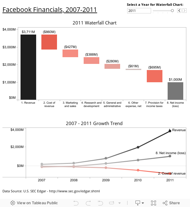
Instead of using a red-green color scheme (thanks for the tip, Steve), I went with the standard financial color scheme where “in the black” = cashflow IN and “in the red” = cashflow OUT.
Coming soon: How to Make a Waterfall Chart in Tableau!
Thanks for stopping by!
Ben

Ben,
Really nice work.
I wonder, though, why it is that people like waterfall charts. Whenever I give a Tableau training class at least one student asks me about this, usually because they have to create such a beast, not because they want to.
Steve
Steve! Thanks for the comment. I actually kind of like them. To me, there’s something about the walk-down (or walk-up) that makes me feel like I know why something started somewhere and ended somewhere else. Maybe it’s just because the bar is low (pun intended) compared to the table in the official report. Tell us more about why you don’t like them, and how you’d like to see the data presented instead. Thanks again, Ben
Hi Steve,
Like all other tools, there are times when it works better than the proverbial hammer.
I do like them for the finance audience, or for discussions surrounding the comparative cost of sales by promotion, program, discount, etc. It is very effective at getting the point across, especially to those whose actions are driving the Net lower.
I hope all is well with you!!
Ben,
I created a step-by-step tutorial for a Gantt chart last year that you might find helpful.
http://vizwiz.blogspot.com/2010/09/tableau-tip-creating-waterfall-chart.html
Also, Stephen McDaniel created a workbook with the step-by-step instructions for creating a waterfall chart.
http://www.freakalytics.com/2009/11/17/wc/
Andy
Awesome, thanks Andy! Looks like my “how-to” post isn’t needed at all. You guys are the best.
Pingback: Xcelsius vs. Tableau: The facebook waterfall | graphomate blog zu aussagekräftigen Visualsierungen
Really nice work, Ben!
I could not resist to built a comparable Dashboard with Xcelsius powered by our graphomate Addon:
http://blog.graphomate.com/2012/04/05/xcelsius-vs-tableau-the-facebook-waterfall/
Hope you like my ideas!
Happy Easter from Germany, Lars
Hi Lars – Thanks for taking the time to post about this topic, and comment here at DataRemixed! I’m thrilled to have your participation.
There are many things I like about your approach, and I believe your dashboard is an improvement over mine in many ways.
I think your suggestion to fix the y-axis on the waterfall chart is a good one, since automatic rescaling makes it difficult to see the change from year to year. However, fixing the axes makes the 2007 waterfall chart virtually unintelligible, so I left it as-is. The 2007 columns end up as tiny slivers when the y-axis is fixed at 2011 revenue levels, and what a waterfall chart is usually expected to show is the “within-year” walk down. This problem is only due to the extreme magnitude of the increase in Facebook revenues, and for more steady-state cases your advice should be followed.
As for “double coding” the values (bar height + color) I admit I do this on a regular basis as the redundancy adds emphasis in my view. Definitely a preference, and I understand that some might find this practice inefficient or even distracting. To me it does add value.
Lastly, I’m a big “trendline” guy from my Lean Manufacturing days, and prefer to show multiple year changes as line plots rather than the common “year-over-year” comparison so common in business today, so that’s why I added the plot below the waterfall chart to help the reader understand how things have changed at Facebook over the course of the 5 years shown. That being said, I must say I was impressed with your “side-by-side” waterfall charts.
As for demonstrating more of Tableau’s capabilities, I’d refer you to Robert Mundigl’s response to our efforts here:
Thanks again for stopping by,
Ben
Nice work and cool to see the jedi’s commenting. I second the finance comment. An example when valuating private equity and deriving the subsequent parts that make up the enterprise value to get at the value of equity, waterfall charts tell the story very nicely.
They are a mutha to automate in excel when certain values can flip flop signs.
Great waterfall demo – how would you add a margin against each cost as a label – not sure what the best approach is – to do in excel 1st and then overlay or use calculated fields in Tableau – any advice appreciated