
Arrow charts are an effective way of showing how values changed from one point in time to another (like slopegraphs), and they have been touted by Naomi Robbins of NBR Graphs. They have also been created using Tableau before by zen master Joe Mako. I really like arrow charts – as a mechanical engineer, I understand the language that they’re speaking.
But there’s a way that they can speak even more clearly to me. It’s more of an accent, really.
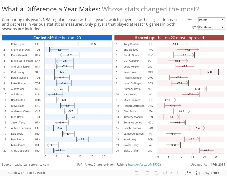
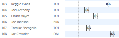
Here’s a version of what I’ll call a “dimension line chart” (“dimension” as in GD&T, not Tableau’s dimensions and measures) that I made to show which NBA players improved the most over last season, and which players’ performance regressed the most:
How is it different from traditional arrow charts?
It’s a very subtle change that has four parts to it:
- There are “extension lines” added via reference lines to show the starting and stopping points of each line
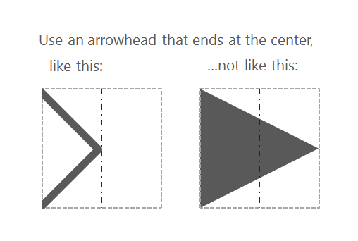
- The arrowheads are custom shapes with tips that end at the reference line instead of just beyond it
- The direction (+ or -) and the magnitude of the change is shown as a dimension in the middle of the line
- I added a light row banding to make it easier to see which arrow applies to which player
That’s pretty much it. It’s a slight dialect of the language of arrow charts, really. Translation: it’s just a fancy arrow chart.
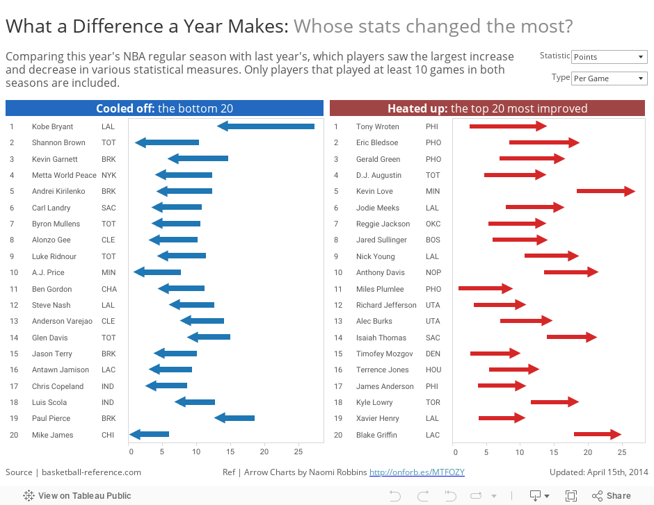
Here’s what the traditional arrow chart version looks like:
How do the changes help?
I always felt that traditional arrow charts seemed to imply movement beyond the end of the arrow, like a flow diagram (showing direction of wind, magnetic field, or water flow) or a traffic sign telling me which way to go, not where to stop. But, literally speaking, the data stops at the very end of the arrow. And with Tableau, if you use a default filled shape for the arrowhead, the data technically stops in the middle of the arrowhead, since that’s the center of the shape (more a detail about Tableau, not arrow charts themselves):
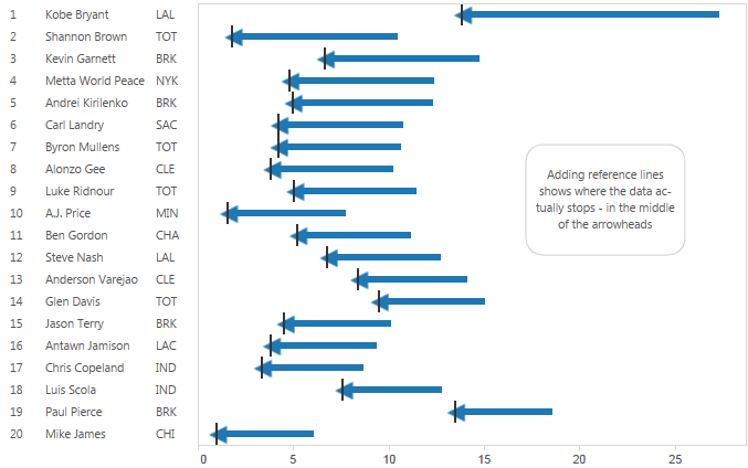
Using arrowhead shapes that end in the middle rather than the edges of the file corrects this small inaccuracy:
Nitpicky? A little, maybe. Click here to get the four centered arrowhead png files I created for this project.
What inspired this variation?
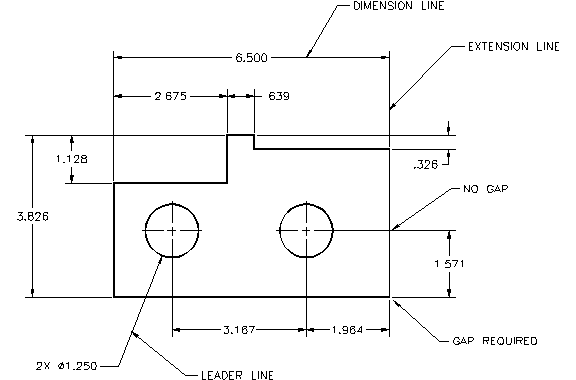
I enjoyed my drafting class in high school, and I went on to study mechanical engineering in college. Drafters and mechanical engineers draw diagrams of physical objects and indicate their dimensions so that machinists can make them in the real world.
There’s a correlation to what we’re attempting to do with data visualizations: we’re communicating the relative sizes of measurable quantities. Instead of feet or inches, the units can be dollars or population or whatever.
We’re giving a “blue print” to our audience and asking them to build an understanding in their mind.
Here’s an example of a technical drawing that the dimension line chart draws from:
Issues and Opportunities for Improvement
One weakness of this variation is that it doesn’t handle slight deltas very well. If the reference lines are very close together, the arrow doesn’t look very much like an arrow at all. If we remove the rank filter and look farther down the list, here’s what we get:
Let me know what you think, I’d like to hear your opinion. If you can think of a way to improve dimension line charts, leave a comment. Some ideas I have are to give the numerical values a white box background to break up the dimension lines and to change the styling of the arrowheads to be in line with GD&T standards. Also, I’ll be doing a “how-to” write-up on the Tableau Public blog as part of #TableauTipsMonth, so be on the lookout for that in the next few days.
Thanks for stopping by,
Ben

Hi Ben — Nice idea to try to improve on the arrow charts. I had never realized that the arrow tends to suggest that the data goes beyond the end of the arrow, but now I see it.
I’ve no grand idea to judge both models, but a few observations. I’ve to admit that I find the redesign busy visually, so I’m thinking of ways to clear it up a little. Usually, I avoid labelling the data into the graph, since the visual is supposed to convey the gist and the table, the details. Perhaps this dimension would do better in a separate column, rather than on top of the arrows. Also, how would it be to make the two ends of the arrow narrower, say only 40% of the row height? Then, the pointing end could be made even more obtuse, at around 140°, to only remind of the direction and likely reducing the visual momentum.
By the way, you ran into an interesting problem with the colours: red both means bad and hot! It took me a second to realize that the good players were in the red section.
Hope this helps your thinking. Thanks for sharing.
Thanks for commenting, Francis. I can see your points. This version incorporates a few of your recommendations – see what you think.
Ben, I like this a lot.
I agree with Francis that I would like the labeling to appear is a separate column (just turn put it on rows and make it discrete). It will also be easy for people to see the sort as the numbers will all be in one column.
Nice work.
Steve
Pingback: Data Viz News [51] | Visual Loop
Pingback: Trying to Fix “The Fix” | PolicyViz